Chococo, an award-winning chocolate confectionary brand, has been crafting delectable treats since 2002. But it’s not just about cocoa and sugar but about ethics, sustainability, and a passion for flavor. As a pioneer in craft chocolate, Chococo has set industry standards for sustainable sourcing and artisanal excellence. Yet over two decades, brand extensions risked diluting the essence of their signature brown box geometry. The brand has undergone a recent rebrand and let’s explore how it helped Chococo’s new identity modernize while embracing their iconic squares.
The Square Legacy
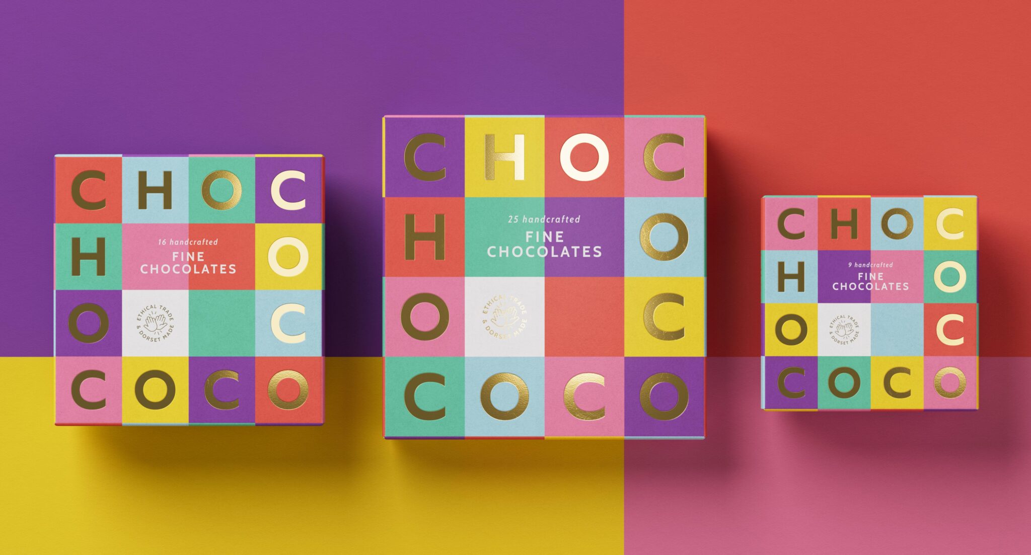
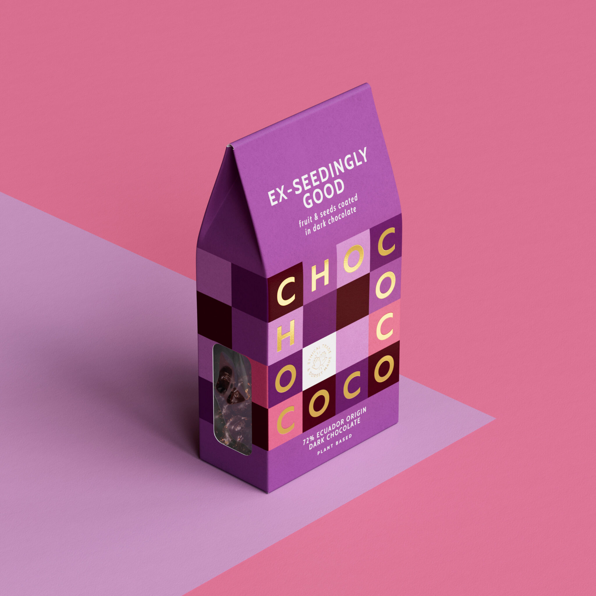
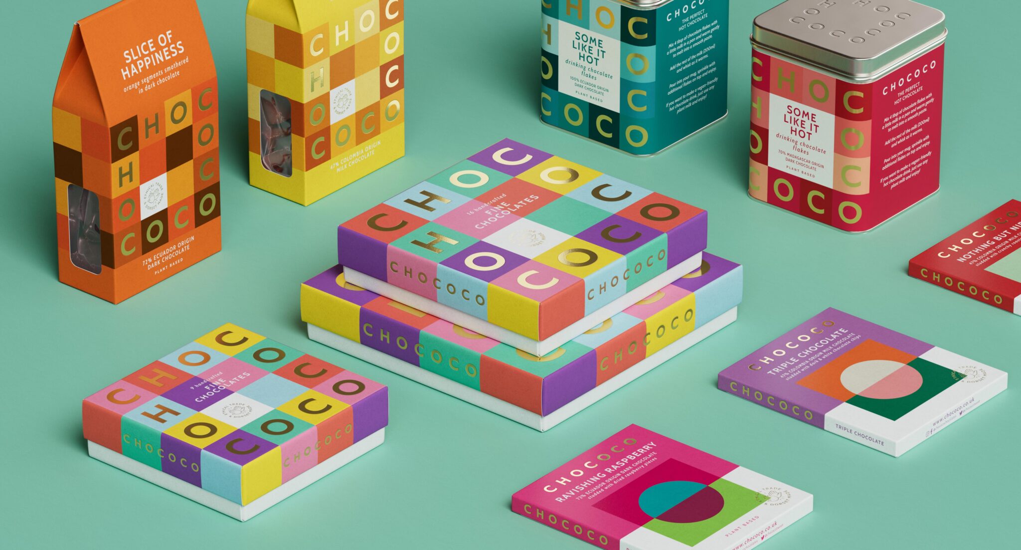
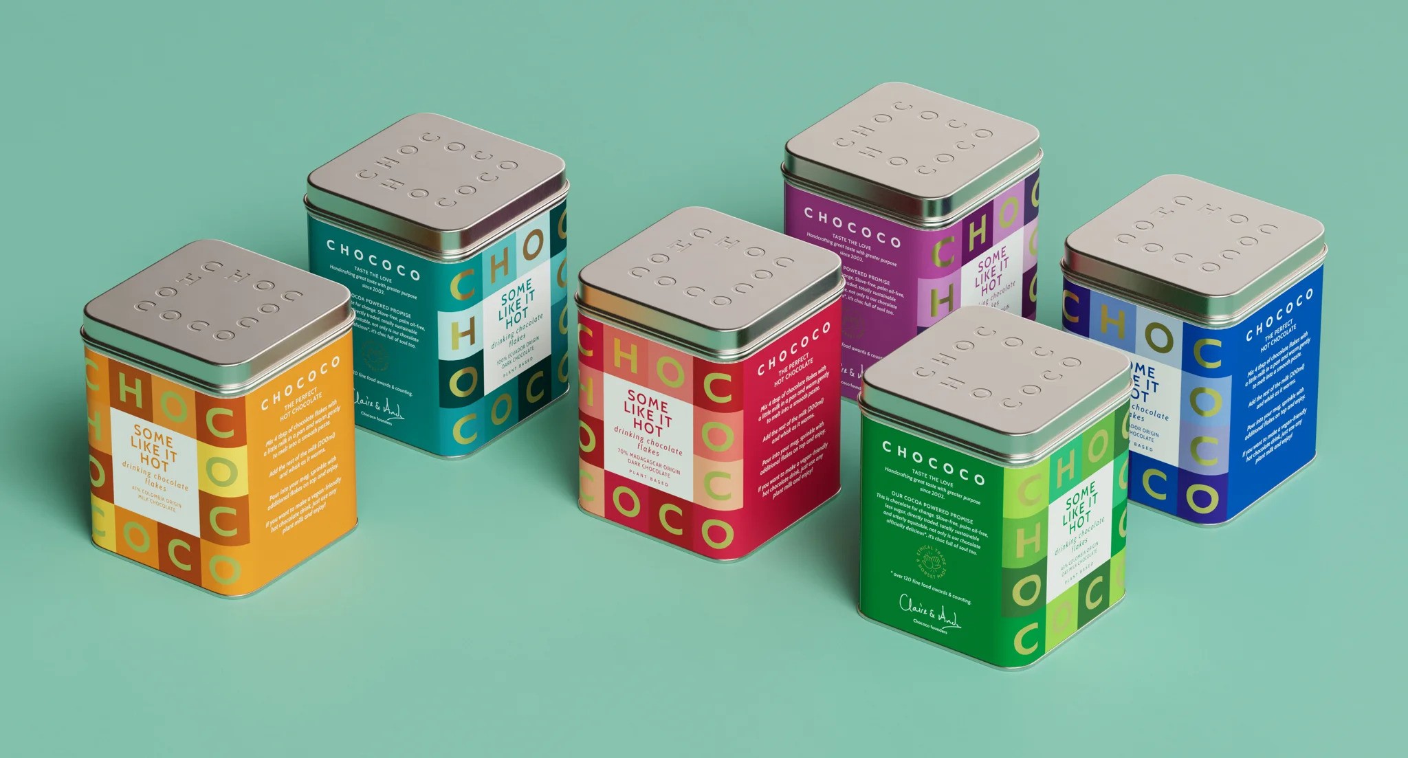
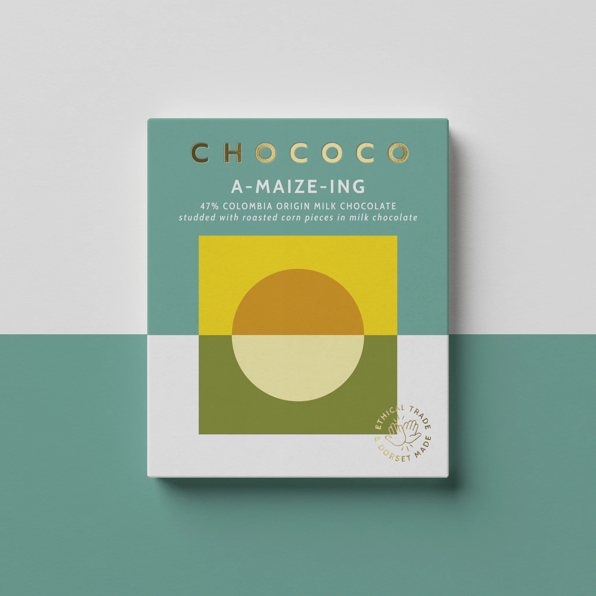
Remember those elegant chocolate boxes with perfectly arranged squares? Chococo’s original packaging, designed by the late Karen Welman, was a trailblazer. Each square held a promise—a taste of something extraordinary. But as time passed, the brand lost its way. New product ranges diluted the identity, and the magic began to fade. These classic squares shaped their brand, but piecemeal additions lacked cohesion. So, to modernize their new brand identity, Chococo hired the help of London design consultancy Buddy, who extracted the grid format to craft a logotype integrating seamlessly into core brown boxes. By underpinning all new ranges, this ‘distinctly Chococo’ square grid established design system unity.
Embracing Geometry
Chococo decided to reclaim its essence—the colored squares that once captivated chocolate lovers. They transformed their logo into a square, a simple yet powerful move. The square grid became the backbone of their design system, weaving through every product range. The energetic yet geometric aesthetic honors trailblazing founders while energizing Chococo’s perception as the soulful specialist in fine chocolate.
Playful, Vibrant, and Soulful
Buddy injected playful pops of color echoing Chococo’s passion for producers and ethical trade. The result? A distinctly Chococo experience. Their packaging now sings with color, inviting you to explore. It’s playful, like a child unwrapping a secret. Vibrant, like the first taste of dark chocolate melting on your tongue. And soulful, because every square tells a story—the story of passionate artisans and the cacao trees that bear their dreams.
Core Values Translated for an Evolving Marketplace
As Chococo expands globally, protective of early victories was not an option. By deftly layering a purposeful new face onto established equity, Buddy’s identity refresh empowers Chococo to engage new audiences while representing everything customers loved about the pioneering artisan.
A Brand Identity Lesson in Heritage Stewardship
For stalwart brands seeking refreshed relevance, this case shows how alignment with origins and values can reinvigorate perception. With care and creativity, even iconic businesses can be revolutionized respectfully. By building on rather than abandoning legacy, Chococo’s example inspires others to modernize while honoring hard-won traditions.
Customer and Industry Acclaim
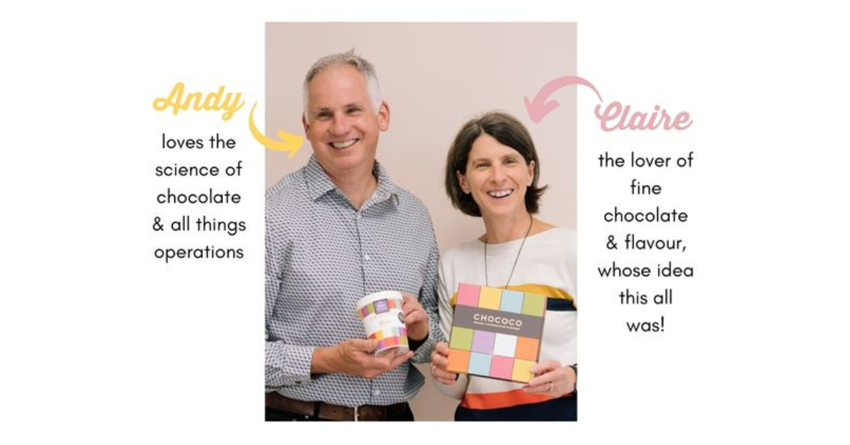
Early feedback confirms the identities’ success. According to Co-founder Claire Burnett,
“Buddy really listened, modernized our look and built upon 20-year foundations.” Their “inspired” solution to literalize the logo has received widespread praise for sophisticatedly reinventing a legacy brand.”
Final Thoughts
An award-winning specialist celebrating two decades of craft, Chococo was primed for perceptual evolution. Through careful interrogation and logical literalization of their most evocative element, Buddy has unlocked an identity that brings past, present and future into vibrant harmony. This success story illustrates how rooted reinventions can energize beloved brands for many squares yet to come.