How Burberry’s Updated Brand Identity is Path Breaking?
In the world of fashion, trends, and styles come and go, often emerging as completely new entities seemingly overnight. Many fashion labels have been changing up their brand aesthetics, moving away from the classic and traditional serif fonts and towards more modern and stylish sans-serif fonts.
Serif fonts have long been used in typography and are often associated with tradition, elegance, and authority. However, in recent years, a growing number of brands have started to embrace these fonts for their brand identities, challenging the dominance of sans-serif fonts in modern design.
Sans serif typefaces, also known as the ‘modern utility’, are increasingly being used by branding specialists for their practical benefits. They are cleaner, more legible, and better suited to a variety of media, particularly when it comes to online content. These fonts allow brands to remain adaptable to ever-changing trends and remain relevant in the modern market.
Many industry experts dubbed this trend as ‘Serif Wars’. To state a few, Balenciaga, the fashion house updated its logo in 2017 with a modern sans-serif font that has a sleek and understated appearance. In 2012, Yves Saint Laurent switched to a clean, contemporary sans-serif font for its logo. A redesigned Calvin Klein logo with a streamlined sans-serif font and no capital letters was unveiled in 2017. Saint Laurent Paris altered the name of the brand from ‘Yves Saint Laurent’ to ‘Saint Laurent Paris’ in 2012 and revealed a new logo with a strong sans-serif font.
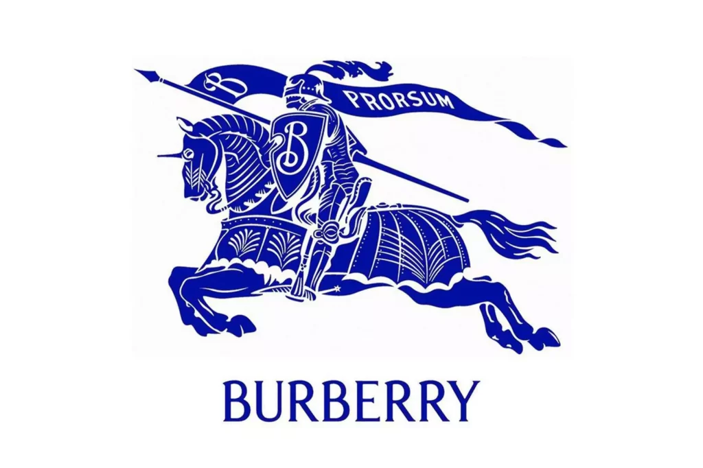
A notable example of this was Burberry in 2018 when they switched from the traditional tartan pattern and serif typography to a cleaner, more minimalistic sans-serif font. This repositioning was done to target a younger, more tech-savvy audience likely to compete with other fashion brands in the market. But, Burberry’s latest rebranding uses Serif font for their new logo adopting a change from the previously followed font pattern. This has caused a stir among the stylish corners of the internet. The updated logo and campaign pay homage to the fashion house’s British heritage, ushering in a new era under the guidance of recently appointed Creative Director Daniel Lee.
The campaign features a cast of prominent British talents, including musicians John Glacier, Shygirl, and Skepta, actor Vanessa Redgrave, models Lennon Gallagher and Liberty Ross, footballer Raheem Sterling, and South Korean actress Jun Ji-Hyun, who was named a brand ambassador in 2022.
With the new logo, Burberry has returned to the iconic equestrian knight design that was first seen in 1901, with the last change occurring in 1999 when the brand name was updated from “Burberrys” to “Burberry”.

The campaign does not feature any new designs, as all the stars are wearing existing Burberry outfits. The new creative director’s collection for the fashion house will be revealed during London Fashion Week on February 20th.
What Do the Industry Experts Say?
According to many experts in the industry, this rebranding by Burberry’s is a significant change in the pattern adopted by brands using the Sans Serif font for their Brand Identity. For many, this shift from ultra-minimalistic logos by a brand like Burberry’s is a brave move.
Naeem Alvi and Thomas Wilder, two branding agency heads based in the U.K. and the United States of America, share the opinion that Burberry’s latest logo, which features a serif font, is a positive change from their previous sans-serif design. They view this new logo as a unique and distinct aesthetic that brands can adopt. The rebrand is a convergence of two current trends in the industry: the importance of nostalgia and the necessity for brands to keep pace with culture to stay relevant. Alvi recommends that other brands should follow Burberry’s example and avoid dull brand identities. Meanwhile, Wilder argues that this rebrand has enabled Burberry to stay current and relevant in the present era.
Burberry to lead the way
From these opinions, it can be concluded that Burberry’s new logo is a commendable illustration of a brand that effectively incorporates both nostalgia and modernity to remain up-to-date in an ever-changing industry. Let’s be hopeful that this rebranding paves a way for ending the Serif Wars among brands in the future.
wake up babe new logo trend just dropped pic.twitter.com/LRcNPxj2vr
— Joseph Alessio (@alessio_joseph) February 6, 2023
The @burberry brand just took a huge step backwards… and it looks amazing!🔥
It’s great to see a brand with such rich heritage abandoning the bland, sans serif trend which has been draining character from some of the world’s biggest brands for a while#designtrends2023 #design pic.twitter.com/1fRzqyDsKD
— James Genchi (@UXyThing) February 7, 2023


