Rebranding is when you need a whole new branded look to your already established brand. But there are a lot of companies that messed up their brands-either with their logos or their concepts. Here are 4 of the lot:
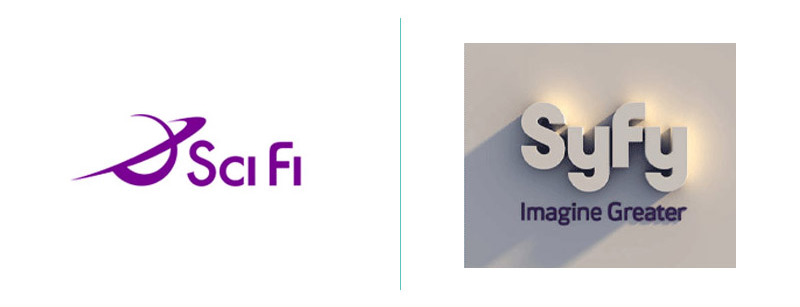
From Science Fiction to Syfy. Maybe the SciFi Channel should have checked out UrbanDictionary before it released its new name. In most parts of the world, “syfy” is a slang term for syphilis. The company’s main justification for this name-change was that, while they couldn’t trademark the term “SciFi”, they could own the less-researched, alternate spelling.
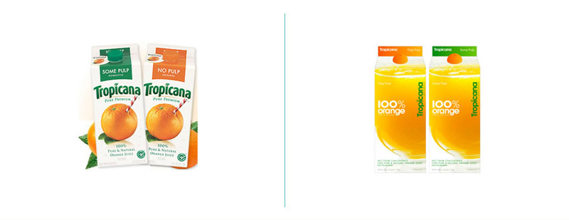 Silly PepsiCo! All it was trying to do was bring its classic Tropicana OJ into the 21st century.
When it rolled out its new package in January 2009, its customers understood that the brand had underestimated how attached they were to the old package designs. The backlash was immediate and powerful. The New York Times reported, “Some of those commenting described the new packaging as ugly or stupid and resembling a generic bargain brand or a store brand.”
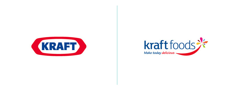
Kraft are one of the biggest food and drinks companies in the world. When they revealed their new brand identity in 2009, the design community went crazy and eventually, the food giant relented and six months later, pretty much reverted to their original concept. They used Tekton as one of their fonts. A font used in the same breath as Comic Sans and Papyrus. A dreadful decision. And the rest of the logo? It’s just so bland and generic for such a renowned company, it’s pathetic. The original logo was like a smack in the face with one of their plastic cheese squares. It said “BOOM! WE ARE KRAFT” whereas the new logo says “We’re a food and drinks giant without any true identity, we’re quite bland and very generic, we’re Kraft-ish.”
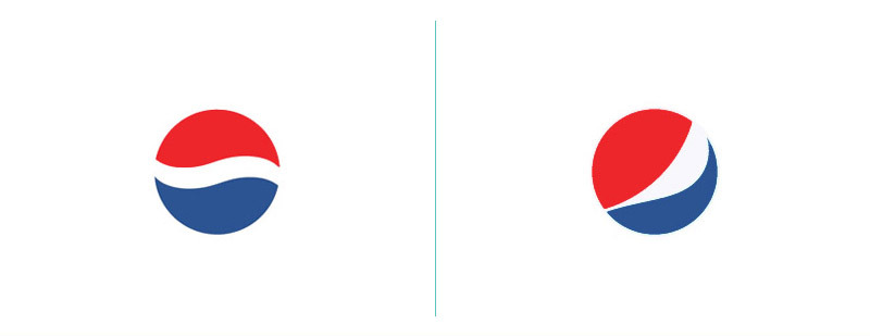
Pepsi is no stranger to logo redesigns. But the company reportedly spent $1 million on their latest reincarnation, and it turned out like this… the one on the right side. The white strip on the new logo varies across Pepsi products, getting wider or thinner depending on product. The design team that spearheaded the campaign explains that they’re supposed to be ‘smiles’, but we don’t really see it. The Pepsi logo seems to have been redone nearly once in every decade over the last century — while Coke‘s iconic logo has barely been touched. It’s not hard to see which is the better strategy here.

