Ever since Medium first launched in beta three years ago, it has sported a logo that is simple, elegant, and strong, big, bold, black-and-white slab-serif M, from the font Stag.

It served them well through their first few years, but as Medium has grown and evolved, the logo has begun to feel flat, impenetrable, blunt, and not to be toyed with. It is also not particularly distinctive, either. In short, it no longer captured or conveyed what Medium has become.

They set out to create a logo that was a better reflection of who they were and came up with a million different ideas for a new M icon. & they were on to something! This simple geometric interpretation of the M felt fun — like a delightful game or a deeply satisfying puzzle.
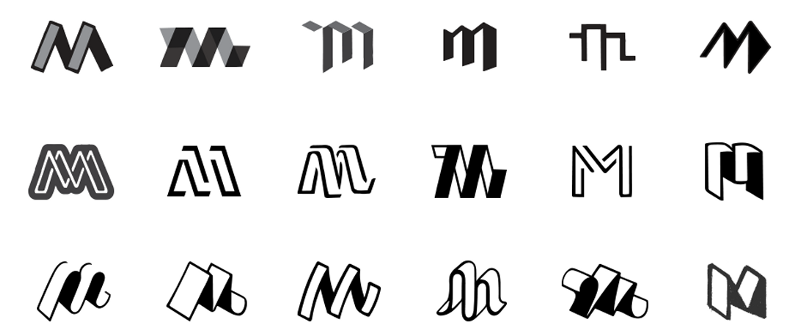
Lastly, after much design philosophizing as to whether the logo should be rendered in perspective, isometric, or axonometric projection (they went for isometric), they created a exhaustive range of different heights and angles to make sure we landed on the most steady and most optically pleasing form.
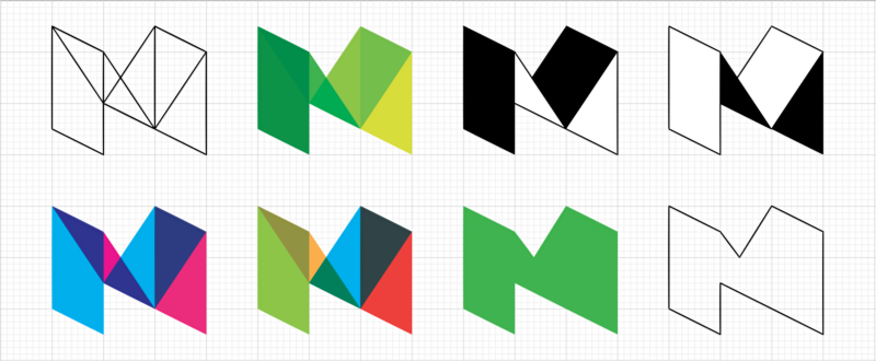
And finally, the result:


