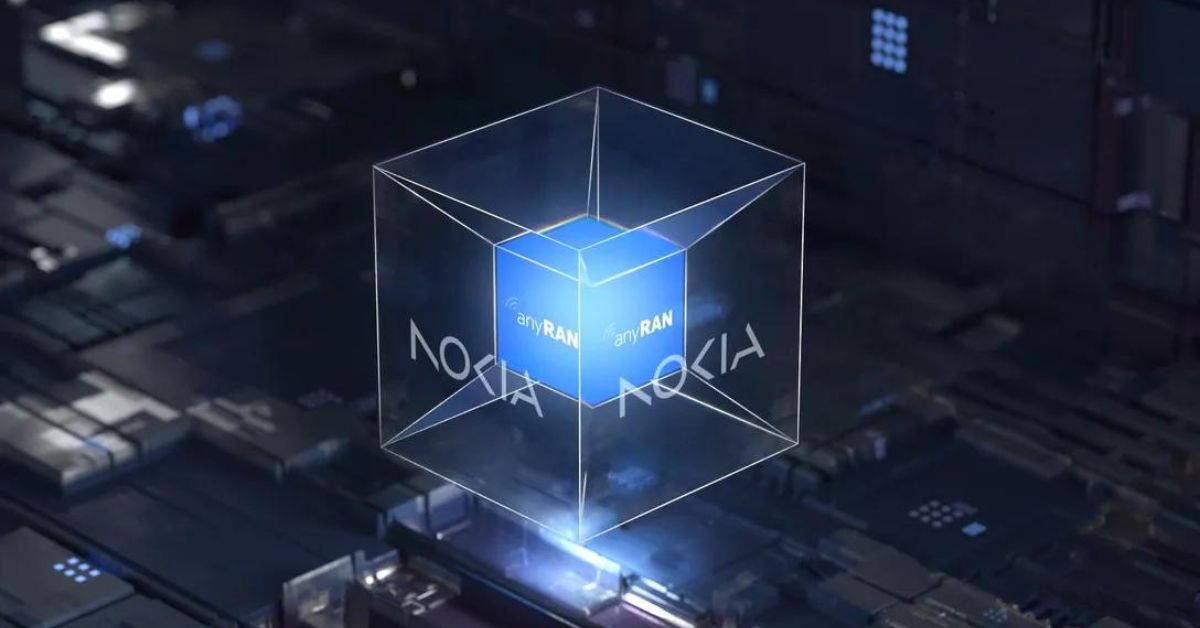
Nokia wants to break out from the “just mobile devices” zone and emerge as a B2B tech innovation leader. As such, the company roped in Lippincott for a revamp – rebranding and logo redesign.

Nokia’s blocky logo, which was created in 1979, was simplified to make it more minimalist and angular with slender characters. It features five different shapes coming together to spell NOKIA. The classic shade of blue that represented the brand has been replaced with a variety of colors depending on placement.
Contemporary and Digital
Pekka Lundmark, Nokia CEO, in an official statement said the company built on the heritage of the previous logo and made it look and feel more contemporary and digital to reflect the current identity. “We are refreshing our brand to reflect who we are today, a B2B technology innovation leader. This is Nokia, but not as the world has seen us before.” Lundmark explained with the redesign, Nokia aims to strike the right degree of visual evolution so the iconic logo is still instantly recognizable.
Nokia has also adjusted its brand purpose. It reads “At Nokia, we create technology that helps the world act together.” The CEO said the new visual identity captures Nokia as the company is today – with renewed energy and commitment as pioneers of digital transformation. “The company’s new logo is emblematic of an energized, dynamic and modern Nokia, demonstrating its value and purpose.”

However, critics believe the redesign has affected the Finnish multinational’s image. They highlighted that the individual letters of Nokia have been stripped and chopped so much, that now it’s a distant echo of the previous logo. But Lippincott said this has been done so that the letters of the logo only read as “Nokia” when they appear together. It explained the logo’s N, O and K letterforms have been repurposed as bold graphics to use across all content, so every communication from the brand is distinctively Nokia.


