“Give everyone a voice, and show them the world,” YouTube has grown beyond a video-sharing website. The brand emotes the freedom of opportunity and expression. It has build communities and a trendy platform with its motto ‘freedom to belong’. The internet’s most popular video hosting site that boasts of subscriptions over 1.5 billion monthly users has recently launched its new look.
For the first time in 12 years, YouTube flaunts its new look. The new features are flexible and adaptable, and yet, to a layman, a subtle shift. It would rightly be an evolution, rather than a revolution. Let’s take a look at the highlights of YouTube’s rebranding strategies:
Start with a Logo
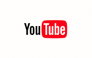
YouTube’s new logo has revamped “tube within the tube”. This adjusts the logo to adapt across various devices: squeeze it into your mobile phone, or stretch it on your desktop, you can always view the logo seamlessly.
The bright red cherry on top of this update sundae is a refreshed YouTube Logo and YouTube Icon. Designed for our multi-screen world, the updated Logo combines a cleaned up version of the YouTube wordmark and Icon, creating a more flexible design that works better across a variety of devices, even on the tiniest screens.
Spice it up with the Dark Theme

The dark background, especially for ‘night view’ enhances drama. The improved video viewing turns the background dark for a more ‘cinematic experience’. What had begun in the beta stage, has features now being slowly introduced over the year.
Adaptable Aspect Ratio
The YouTube player will seamlessly change shape to match the video format you’re watching, such as vertical, square or horizontal. The update will also allow videos to fill the screen, even if the clip is formatted horizontally, vertically, or in a square shape. The new vertical video is set to roll in soon and will be a breath of fresh air, without the crass black sidebars.
Gestures That Resonate
“Earlier this year, we introduced a gesture that allows you to double tap on the left or right side of a video to fast forward or rewind 10 seconds.
In the coming months, we’ll experiment with a feature that lets you jump between videos with a simple swipe of your hand.”
Go Neat and Clean

YouTube’s cleaner redesign uses ample white space. The white header, a striking contrast to the previous red header, lets content take the lead. Moved to the bottom, the navigation tabs are closer to the thumb, to make it easier to switch and scroll. The new Library and Account tabs that give easy access when searching.
YouTube’s shift in design is in sync with Google’s Material Design, and will add elements and features over the year. With the desktop redesign already integrated, the mobile-view is set to evolve soon.