For a brand like YouTube, typography is an important element that attracts the attention of users by creating an appealing, memorable experience for them. In February 2017, YouTube announced the launch of its digital cable service YouTube TV, an over-the-top MVPD-style subscription service available for $35 per month. The service will allow paying users to stream live TV from ABC, CBS, FOX, NBC, ESPN and other popular cable networks. To coincide with the launch of the new service, YouTube has introduced a refined play button and new brand typeface designed by brand consultancy Saffron in collaboration with YouTube’s UX team, and typeface foundry design studios Letterjuice and URW++. The video giant also revealed its first-ever proprietary font ‘YouTube Sans’, which is inspired by the design of the company’s new play button symbol.
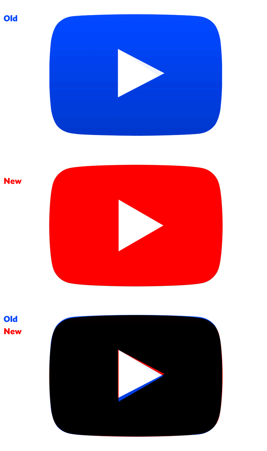
YouTube’s play button symbol that is seen in all of its videos is something that over time has almost superseded the YouTube logo as the key identifier for the brand. The existing ‘Play Button’ shape needed some minor geometric adjustments, so it was redrawn to make sure its curves and angles were perfect. The new ‘Play Button’ is now part of the font glyph set, incorporating it into the YouTube Sans font family, so that it can be typed just like any other letter or symbol.
YouTube Sans made its first appearance during YouTube TV’s launch event. The form of the typeface takes cues from the play button symbol, with the round edging on some letters being based on the curved, red outer-square, and diagonal cuts reflecting the white triangle in the centre. The curves of the play button inspired the curves that appear on various letters, as did the angles of the play symbol. The font family includes light, medium, bold, and extrabold iterations, which will be used across YouTube TV’s products and communications on every digital and physical touchpoints. YouTube Sans typeface combines the vibrant, user-friendly world of YouTube with the bold, freewheeling world of cinema and entertainment.
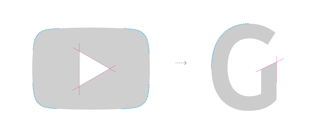
Relationship between play button and type
For now, YouTube Sans is only being used for the titles of videos, which are rendered large and bold, while Google’s informational font Roboto still takes over for all the subheads and other content. However, this new typeface has a potential to be used in a much more functional way, by replacing Roboto for responsibilities across YouTube TV. Roboto is built to have little to no personality, to adapt to any situation, and to only convey data. YouTube Sans, on the other hand, is full of personality, with joyful curves that contrast against aggressive edges. The letters are playful, sharp, and approachable–much like YouTube itself. The font is currently limited to YouTube TV and not spread entirely to the full YouTube brand.
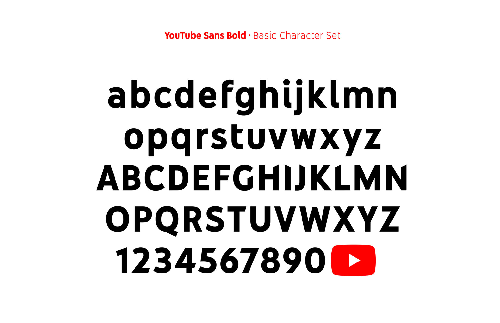
YouTube Sans will bring brand recognition to a wide variety of digital and non-digital environments. It is slightly quirky and expressive, but also simple and bold, just like the platform it calls home.

