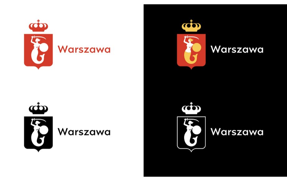
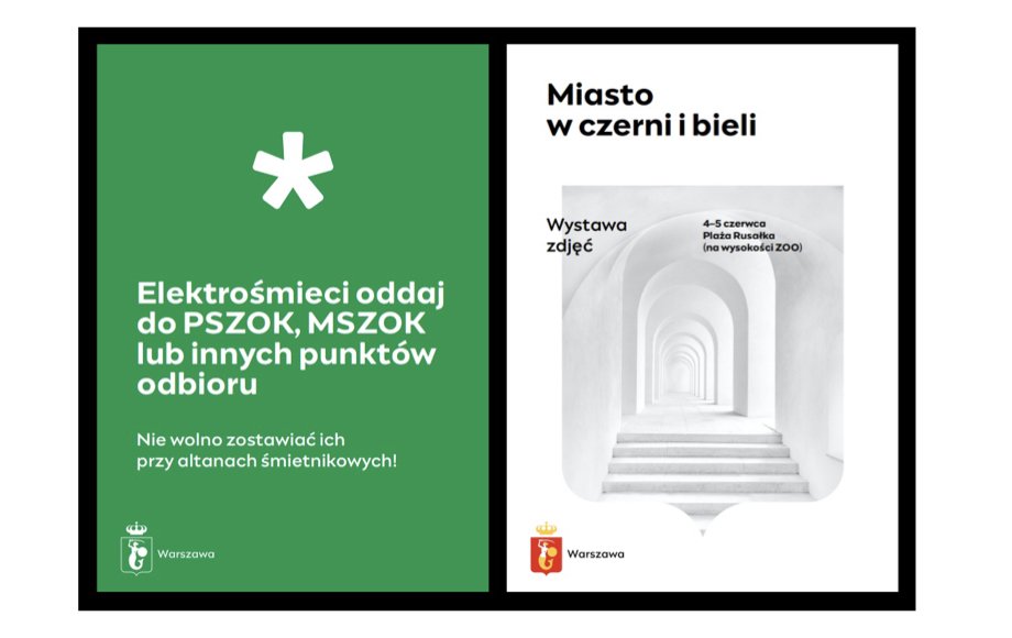
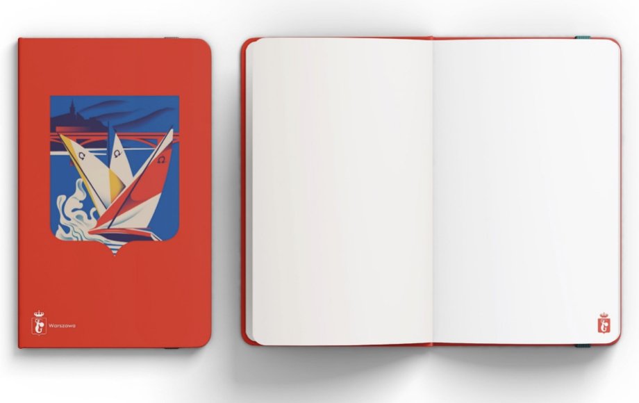
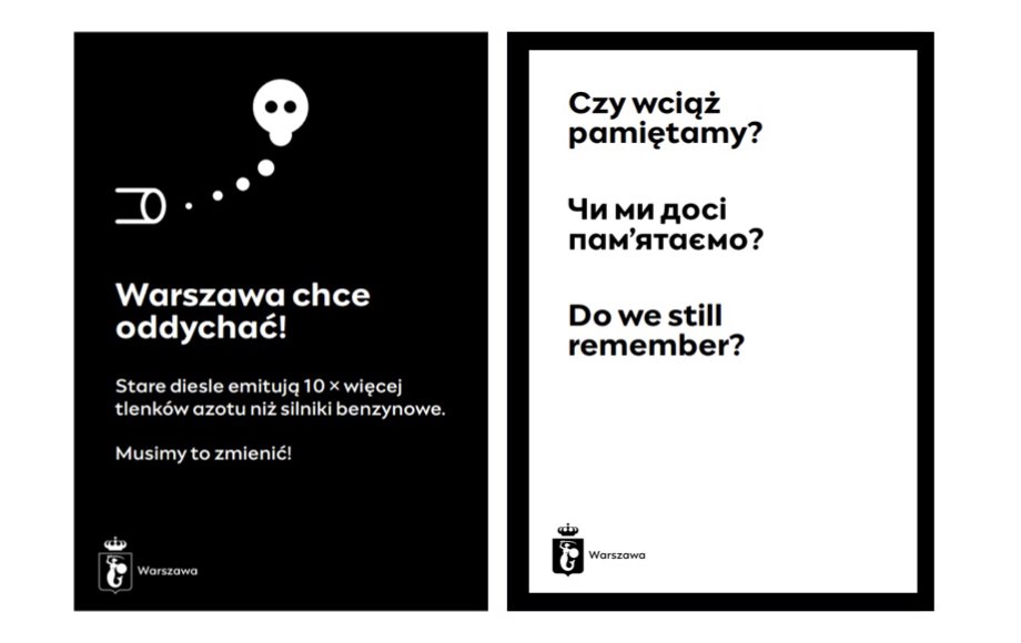
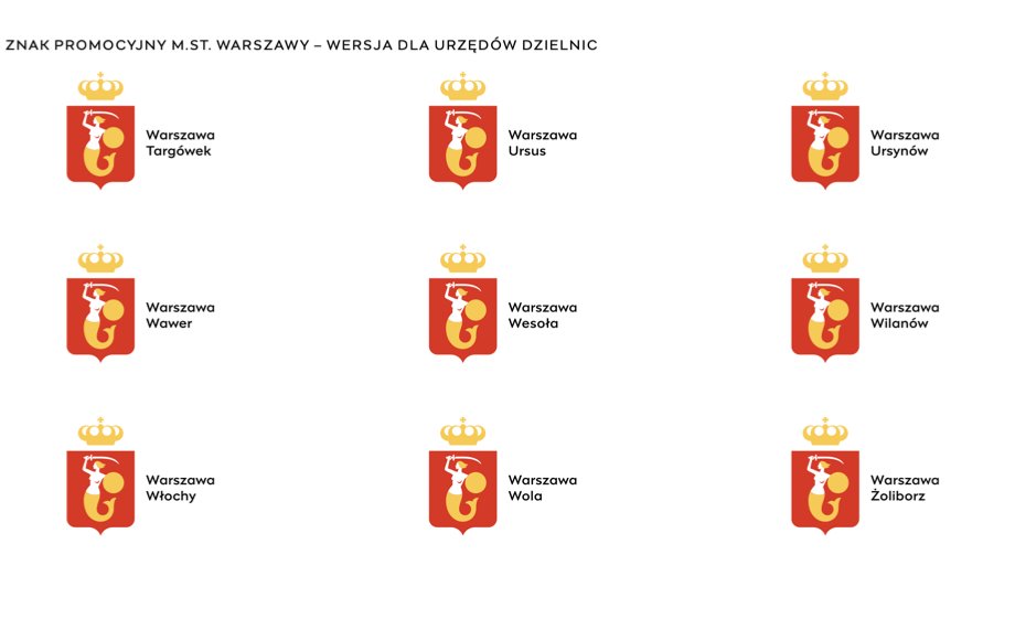
The Capital and the largest city of Poland, Warsaw has officially unveiled its new logo. The logo is designed by preserving the city’s emblem and swapping the use of two logos, plus a slew of designs for individual city departments, with a single identity.
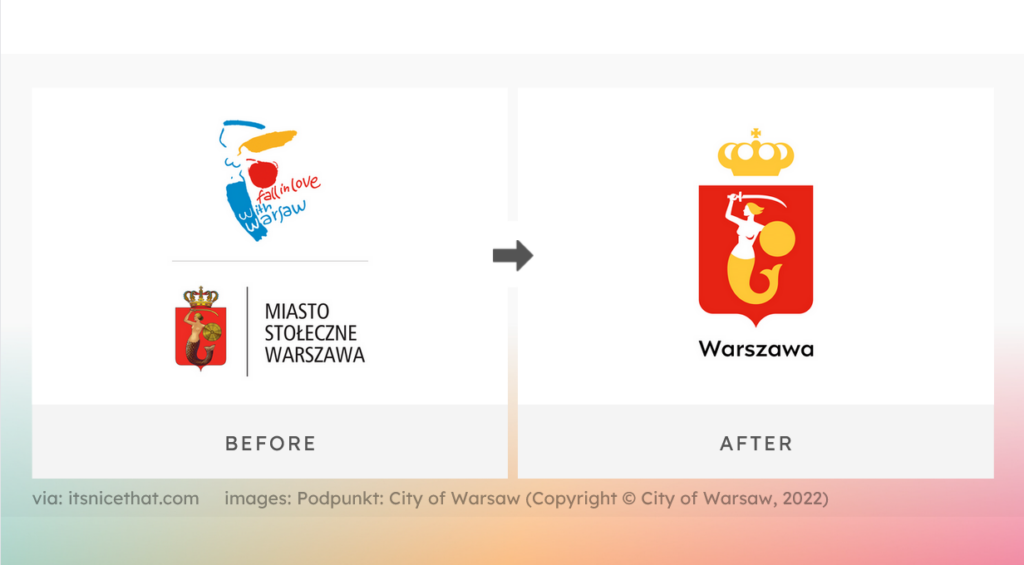
Made in consultation with a historian at the Museum of Warsaw, Dr. Krzysztof Zwierz, the new logo preserves the historic symbol of the Warsaw mermaid as well as the traditional colors of the city – red and yellow.
Because of the extensive number of touchpoints and communications involved, the design update was started by departments within Warsaw’s City Hall and is expected to take years to complete. Previously, the city had two logos: a traditional crest and a promotional logo, both of which included variants of the Warsaw mermaid in various design styles.
The mermaid is still present in the new logo, but the Polish-French physicist Marie Skodowska-Curie has been given eternal life by the logo designer studio Podpunkt. The studio continues, stating that the new piece is built on circles and geometric shapes and has elements like a historically correct sword.
The idea to refresh the promotional logo was prompted primarily by the pandemic and the conflict in Ukraine. The slogan “Fall in love with Warsaw” has been revised so that it reflects the global topics Warsaw addresses.
