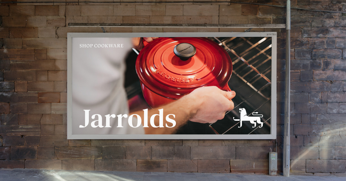
Jarrolds, a family-run independent department store, has embarked on a modern identity with an award-winning design studio The Click. Drawing inspiration from a pair of heraldic lions, Jarrolds adopted the iconic civic Norwich lion as its own.
The brand positioned the lion to lean a raised paw on the J for Jarrolds. Adam Ewels, design director at The Click, said the debate of whether to retain the lion in the redesigning logo came up during the creative process. They realized that the lion contributed a huge amount of brand equity. So, the team looked for a clever way to give it a new and more meaningful usage by integrating the “J” for Jarrolds into the lion itself.
Adam said they redrew the lion from scratch. “We were able to craft a new, more iconic, and fit-for-purpose brand mark that performs more effectively at varying scales across all channels and applications. This now means the lion is finally truly ownable by Jarrolds.” The lion is unique to Jarrolds and more memorable.

The Click executive said the studio devised a written brand story for the client to inform the visual approach. Adam explained that initially, the lion was leaning its front leg against the stem of the letter J, but this caused confusion because it was mistaken for a capital H. As such, The Click redrew the lion and the J and integrated the letter into the body of the animal.
Adam described it as a clever detail that can be fused across multiple logo variations, creating a synergy between the logomark and logotype. He believes the new design is modern and geometric with increased negative space around key forms, like the lion’s tail and legs. The executive said they used a traditional, characterful serif called Lapture for the wordmark.
It should be noted that Jarrold’s rebranding in 2023 involves the pluralization of the name Jarrold to Jarrolds. Adam said “Jarrolds” sounds more friendly and the business is also locally known as Jarrolds.
Also Read: Everything to Create Anything: Michaels Refreshed Brand Identity


