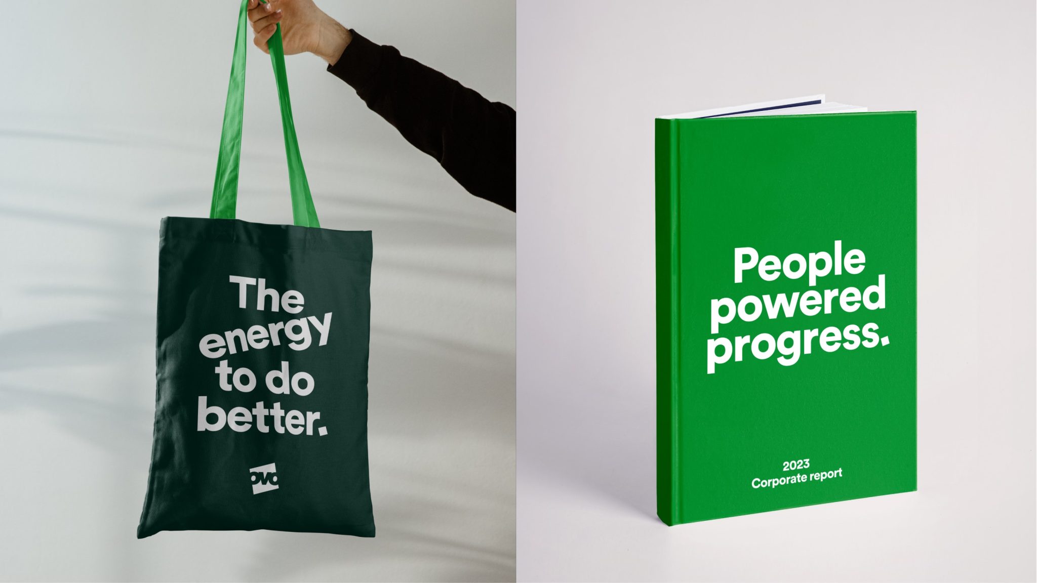
UK-based energy supplier brand OVO recently underwent a brand transformation to reposition itself as a company focused on empowering consumers and enabling sustainable energy use. The refreshed identity aims to stand out in the crowded energy market by making OVO feel more personal and approachable. Let’s check out the interests of the brand behind this rebrand.
Hero Logo Becomes a Window into Consumer Lives
OVO’s signature square logo, created in partnership with design studio Wolff Olins, works as a framing device to spotlight customers. Images within the square ‘hero’ aim to glimpse people’s daily lives and relationships with energy. This helps humanize the brand.
Dimensional Logo Creates Depth
The square gained a new dimension through layered negative space and parallax movement. This makes the logo feel tactile and volumetric when animated on screens.
Photography Captures Authentic Moments
Real, candid photos of people immersed in everyday activities reinforce the customer-centric focus. Sun-filled images connect OVO to natural energy.
Custom Motion Principles Energize the Brand
Wolff Olins established three motion techniques to inject energy and avoid visual stagnation. These unifying motions also act as intuitive guides across OVO’s digital ecosystem.
Spin Motion Reveals Messaging
The logo square spins on its axis to transition between imagery and reveal text or graphics to users. This ‘spin’ creates an engaging, dynamic effect.
Swiping Eases Transitions
Quick ‘swiping’ motions transition users between different content or screens with speed and fluidity.
Scaling Provides Wayfinding
Strategic scaling directs users through journeys and hierarchies on OVO’s various platforms and products.
Updated Visual Identity Signals Sustainable Values
OVO got a refreshed green color palette and icon system that better conveys its commitment to renewable energy and sustainability. Illustrations also add personality.
The strategic rebrand repositions OVO Energy as an approachable, customer-focused brand dedicated to enabling affordable clean energy for all. Dynamic and inviting visuals reflect the human element at the company’s core.
Final Thoughts
Wolff Olins was successful in transforming OVO’s identity and brand strategy, placing customers at the forefront of the green revolution. OVO moves towards a better, carbon-free future by offering affordable smart technology and innovative energy-saving measures. By creating a three-dimensional feel, with hero squares and revitalized iconography, and utilizing strategic motion principles, OVO’s brand messages are conveyed quickly and consistently. OVO’s photography style of capturing everyday moments complements the natural sunlight background, giving the overall design system a warm and welcoming appeal.