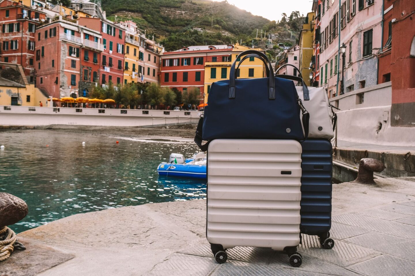
Antler, a 110-year-old Heritage British luggage brand, has re-established itself as “The British Travel Brand” in a 360-degree rebrand. In a new campaign, which was launched on May 15, Antler has re-introduced its 1920s tagline For Those Who Travel Often.
The brand has stepped into an exciting era by returning to its roots to reimagine its future. Antler says they have always innovated where it matters. “Our archives reference the early development of a cushioned grip for our suitcase handles, offering extra comfort. We were also one of the first British brands to add wheels to our cases for smoother movement. From the beginning, our customers’ changing desire has influenced our direction.”

In partnership with international creative studio Frosty, Antler has refreshed its branding to reimagine a bold new look. Kirsty Glenn, the Managing Director of Antler, said Antler wants to become the British travel brand of the future. “We have always served those who travel often. Reimagining it for today’s consumer will see this communicated through content creation, collaborations, and especially through the experiences of our customers themselves. It is also a nod to our commitment to product quality. To be able to serve our customers, we must be able to make incredibly durable and long-lasting products.”
Glenn added that Antler is re-establishing its British DNA and rich legacy in travel for more than 100 years. “This has been a period of regenerating the brand, powered by a new identity, the cementing of a new leadership team, and with the exciting relaunch campaign upon us. A big investment in new products has also been made, which will start to land this autumn as we reset this incredible brand for the next 100 years.”
Antler has upgraded the suitcase warranty from 10 years to a lifetime. Its luggage can be the traveler’s lifelong companion, designed to be passed down across generations. Antler said its suitcases are made to age gracefully, with each scuff or mark recalling a moment or place in the user’s journey.

The rebranding saw the iconic stag logo getting a more modern, universal emblem. Alistair Gibbs, an acclaimed graphic designer, said a redraw of the Antler marquee takes fresh cues from early 20th-century British artists such as Barbara Hepworth, whose work was strikingly modern and rooted in the natural world. “The icon has added functionality within our new brand imagery, pinpointing campaign photoshoot locations and drawing the viewer in.”
Also Read: Why has Kraft Heinz Company Launched ‘Homebake’?


