For over half a century, GoldBug was the reliable-but-forgettable name behind beloved baby essentials. But in its bid to captivate young, logo-savvy parents, the 56-year-old brand knew it needed a major rebrand. With a vibrant color palette, nostalgic 70s typography, and an endearing insect ecosystem, GoldBug’s rebranding efforts signal a departure from traditional baby visuals. Let’s delve into the brand’s journey, exploring its strategic new brand identity and how it aims to resonate with logo-conscious parents.


An Insect Ecosystem for All Ages
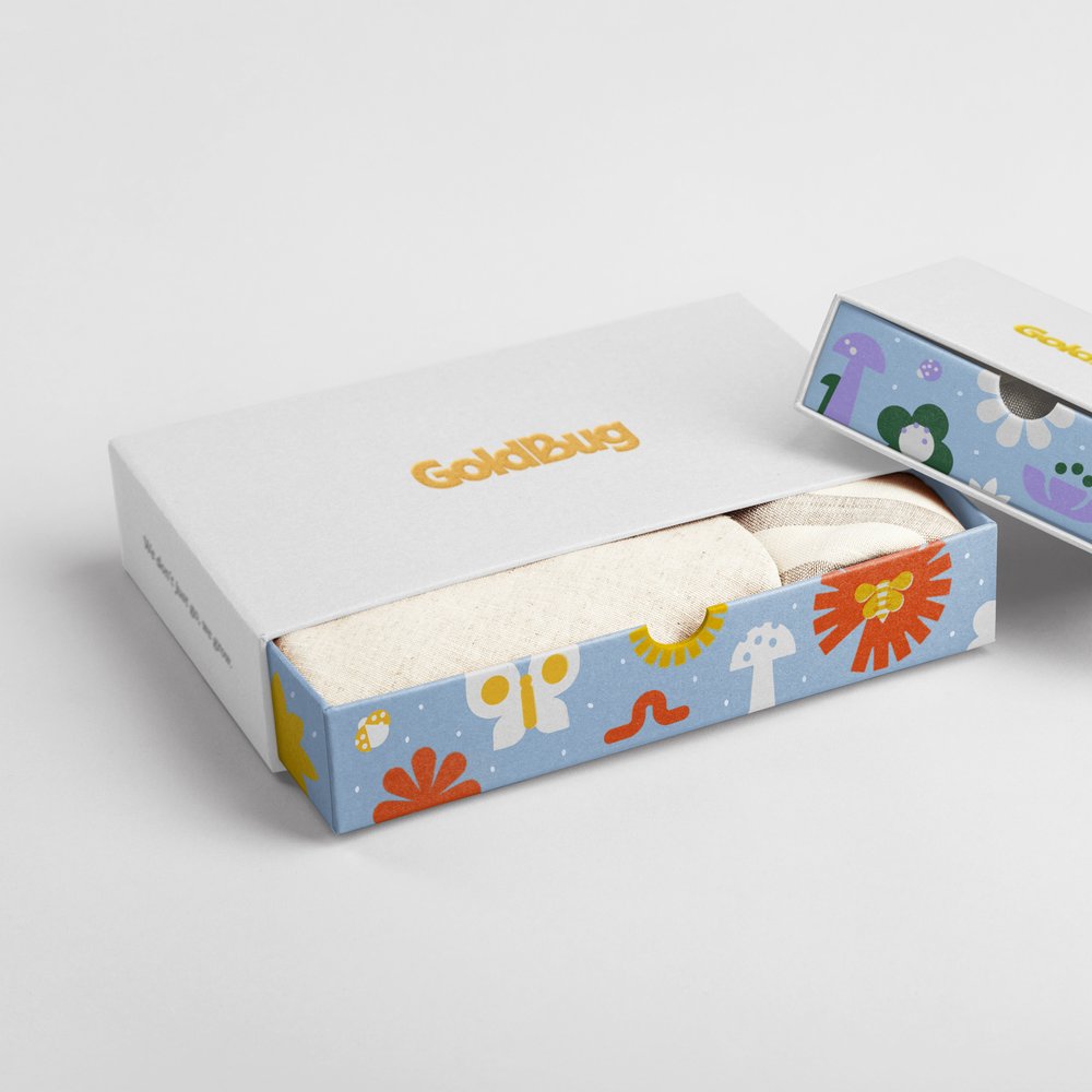
If you knew of GoldBug, it was likely you knew the name through one of its four brand faces – there was Go by GoldBug™, TravelBug™, On the GoldBug®, and, the classic, GoldBug™. For decades, these names weren’t prominently in the public eye, despite being one of the largest branded suppliers for baby and kids products in the US. Now evolving into a direct-to-consumer company for brands like Walmart, it’s had to contend with modern-day tastes. To guide customers through GoldBug’s range spanning 0-6 years, the brand introduced an”insect ecosystem” – from caterpillar (newborns) to butterflies (the 4-6 set). Inspired by the charming illustrations of Alexander Girard and print methods like Risograph, GoldBug’s illustrations exude a grown-up naivety, connecting with parents on a deeper level. The studio’s strategic vision is to not only unify the family of brands under one identity but also forge an emotional connection with logo-conscious parents.
The Plump, Punchy New Butterfly
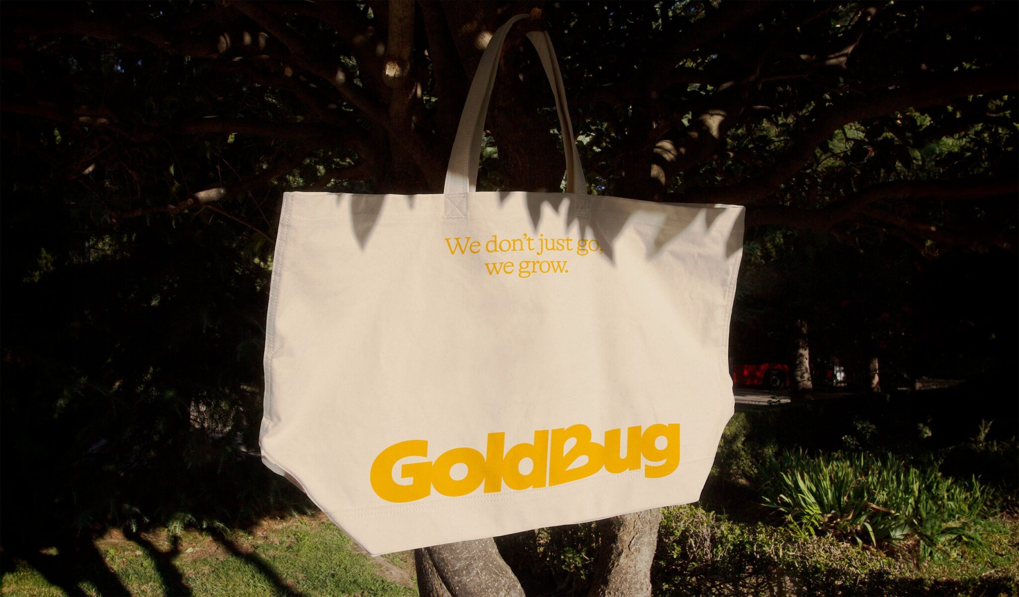
GoldBug’s rebranding journey led by Meg Jannott, head of design at Scorpion Rose Studio, aimed to move away from saccharine neutrals and introduce a more modern and dynamic visual identity. To ensure the brand’s relevance beyond the traditional children’s space, the team conducted a simple yet effective test. By showcasing the new branding on a tote bag to new parents, they gauged its appeal and whether it aligned with their contemporary tastes.
In their brand new identity, GoldBug’s iconic butterfly emblem hasn’t disappeared, but has been utterly transformed. The new conjoined wordmark-and-wings logo is a plump, punchy form with the wings cheekily poking through the ‘B’ counters. It’s a fresh, playful take that could easily pass for a modern boutique brand.
As Meg shares, “We are noticing that children’s brands are becoming more bold and vibrant, breaking away from traditional ‘baby’ visuals.” To ensure GoldBug’s new look would resonate, they ran it through a simple litmus test: “We showed our branding on a tote bag to new parents, asking ‘would you use this?'” Meg explains. “This was a clear way to establish if the logo felt modern and dynamic enough to live beyond the ‘traditional’ children’s space.”
Final Thoughts
GoldBug’s rebranding journey signifies a bold leap into modernity, breaking free from the traditional baby visuals that have defined the industry for generations. With a fresh aesthetic, vibrant colors, and an insect ecosystem, GoldBug aims to captivate the attention of new parents seeking products that embody both functionality and beauty. By embracing boldness and connection, GoldBug aspires to create an emotionally resonant brand that speaks to the desires and sensibilities of modern parents. For GoldBug, the new brand identity is doing away with sickly-sweet styling for good. As Meg sums it up, the goal is an “emotionally resonant” brand that modern parents can proudly tote around town.