Go.Compare is one of the most famous and trusted comparison websites in the UK, offering customers a wide range of choices for insurance, energy, broadband, and more. But being famous is not enough in a crowded and competitive market. With a focus on its unique selling proposition, Go.Compare aims to stand out in the increasingly competitive marketplace. That’s why the brand decided to undergo a rebrand. Let’s explore their rebrand, emphasizing their commitment to integrity, trustworthiness, and the customer’s freedom of choice.
From Go Compare to Go.Compare
The rebranding journey led by London-based design agency Ragged Edge started in 2022 when the price comparison website announced a name change to Go.Compare, as a way to fuse its brand name with a new domain name. Previously, users would have to type in gocompare.com, but the idea was to simplify the process even more by having the brand name as the URL. This was a clever move to make the brand more memorable and distinctive, as well as to align it with the latest web standards.

While an updated logo has been in use since then, a full rebrand, strategy, and website design by Ragged Edge has now been shared. Go.Compare is the market leader, with 97% awareness, but the brand felt its fame wasn’t enough in a competitive field. So the agency’s task was to persuade people to actively choose them, by highlighting their unique selling points and personality.
The Champions of Choice
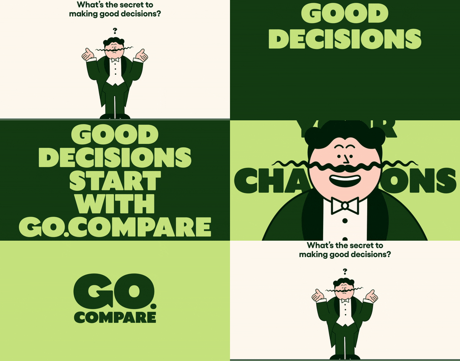
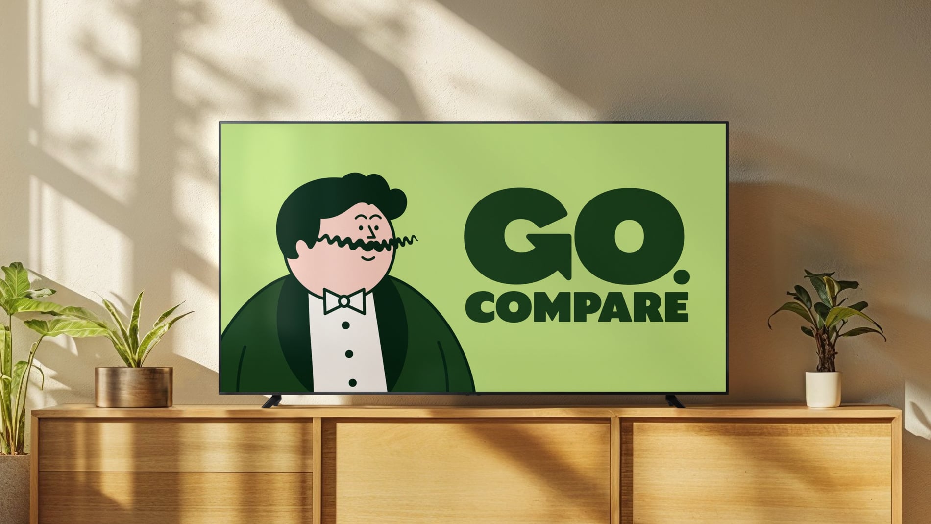
Being the only comparison site accredited by BIBA, and with a multitude of choices on offer to users, Ragged Edge has positioned the brand as ‘Champions of Choice’. This means that Go.Compare not only helps customers find the best deals but also empowers them to make informed and confident decisions. To reflect this, the new identity puts mascot Gio Compario at the heart and transforms him into a charming choice champion with exaggerated features in cartoon form. This animated version of Gio advocates for users throughout their Go.Compare experience, reinforcing the brand’s message of being a reliable guide in decision-making.
Cultivating a Friendly Brand Feeling
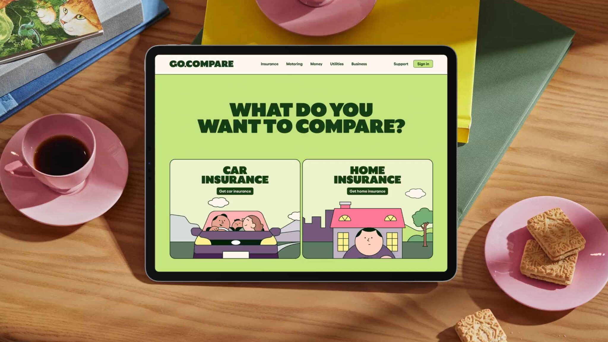
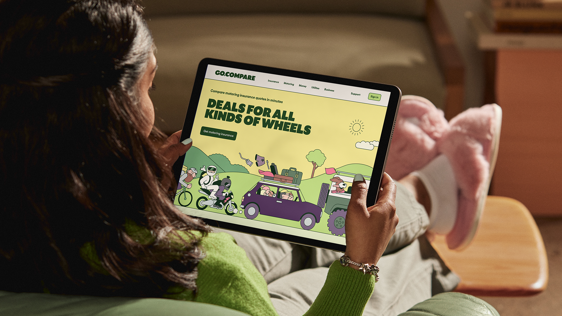
Central to the rebranding effort is the visual identity that reflects the brand’s ethos of simplicity, warmth, and accessibility. Ragged Edge opted for a soft pastel palette and a bespoke typeface to convey Go.Compare’s friendly and approachable demeanor. By incorporating a vibrant green color for the “Go” in the logotype, the brand reinforces its commitment to guiding users towards informed choices (“green for go”). This harmonious fusion of design elements not only enhances brand recognition but also cultivates a cohesive and memorable brand experience.
Breaking Free from Stock Photography
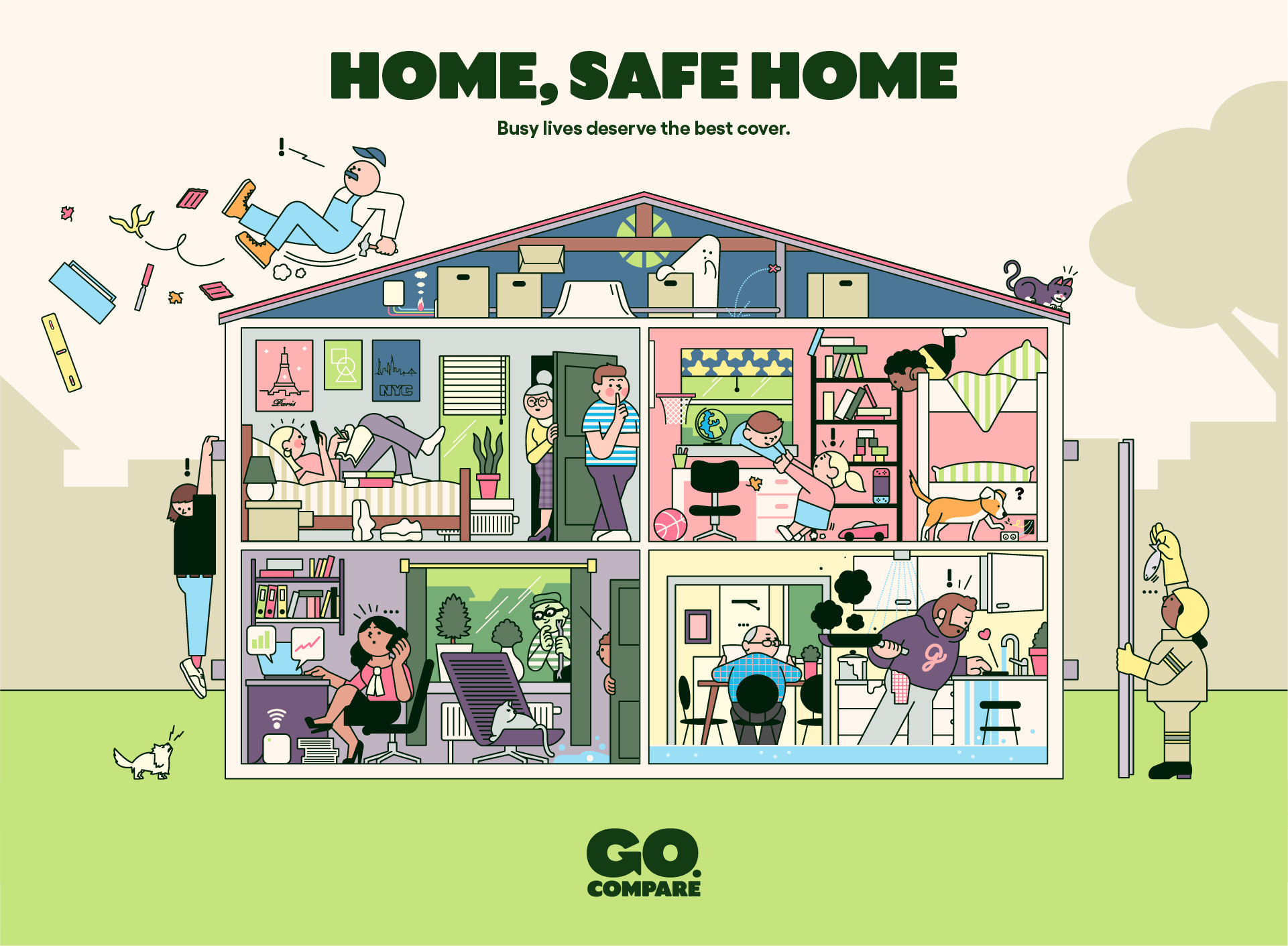
To infuse the brand with personality and relatability, and to differentiate itself in a market dominated by stock photography, Go.Compare adopted an illustrative style. Ragged Edge extended the illustrative style across various touchpoints. Collaborating with illustrator Rami Niemi, known for his fun and simple editorial illustrations, they created a suite of dynamic images that breathe life into Go.Compare’s insurance offerings. These illustrations, accompanied by animated elements, not only enhance visual appeal but also serve to make the brand’s products more tangible and accessible to users.
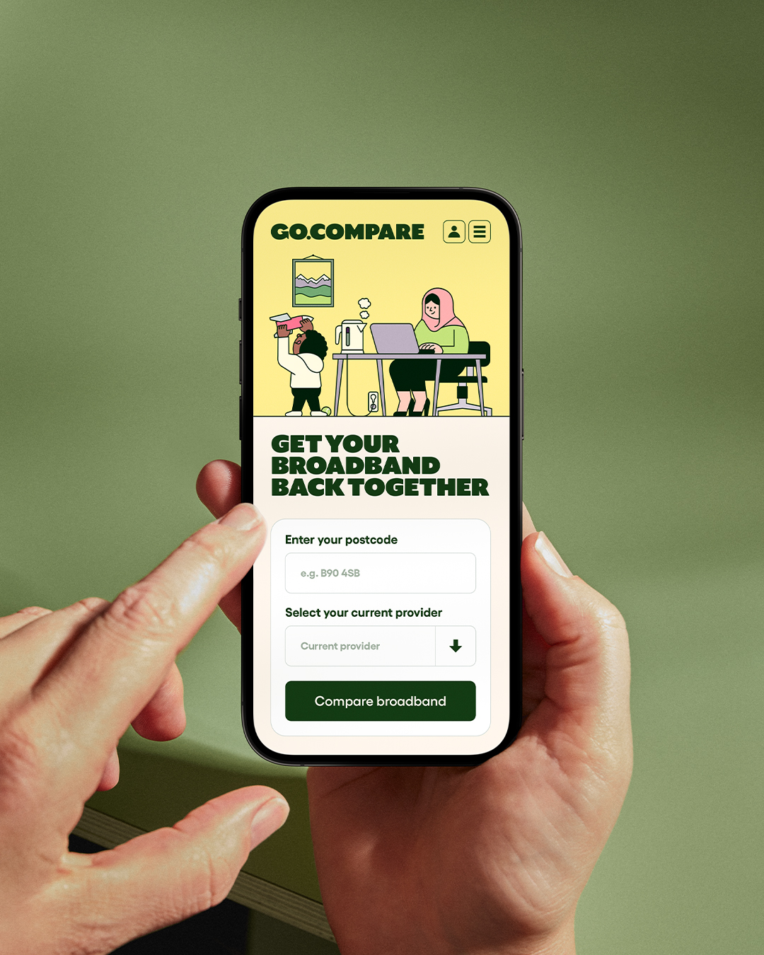
Moreover, a fresh tone of voice, characterized by ‘relatable wit’, has been introduced, fostering a deeper connection with consumers across all communications channels. These illustrations bring the brand’s insurance products to life in a fresh and engaging manner. The verbal identity, aptly named ‘the voice of choice,’ connects with customers through relatable wit and charm. A custom typeface was also designed to reflect the warmth and character of the illustrations, further enhancing the brand’s unique personality.
Bottomline
Go.Compare’s rebranding effort led by Ragged Edge successfully revitalized the brand, positioning it as a leading choice in the competitive comparison market. By leveraging recognition, emphasizing integrity, and embracing a distinctive illustrative style, Go.Compare stands out from its competitors. The vibrant color palette, playful illustrations, and engaging verbal identity all contribute to a fresh and memorable customer experience. As Go.Compare continues to provide transparency and support across a range of complex products, this rebranding effort has propelled the brand forward, strengthening its sense of purpose, authority, and momentum.
Read More: Catching Up to Acclaim: Magnum’s Rebranding Captures the Complexity of Photographic Narratives
