Crumbl, the cookie chain that has taken the US by storm, is not only known for its delicious and gigantic cookies but also for its distinctive and minimalist branding. Recently, the company unveiled a new logo and a new typeface that are both simple and stylish. The new typeface, called Crumbl Sans, is a custom-made font that reflects the company’s personality and values. Let’s delve into the evolution of Crumbl’s branding and the impact of its new typeface, Crumbl Sans.
The Evolution of Crumbl’s Branding
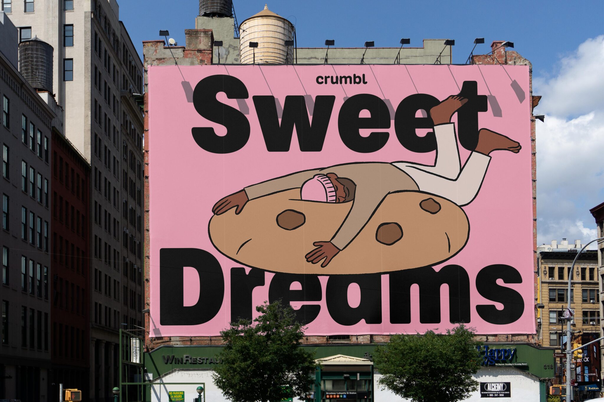
In 2017, Crumbl was born from the passion of two cousins, Jason McGowan and Sawyer Helmsley, who aimed to create the ultimate cookies. Starting with a single store in Utah, they rapidly expanded to over 950 locations nationwide, all the while crafting a distinct brand identity. The original logo, featuring a black and white design with a charming baker mascot, was endearing but lacked distinction. The company’s decision to refresh its branding in 2023 marked a turning point. The new logo, free of the word “Cookies” and the baker mascot, showcased the company name against a vibrant pink backdrop, exuding modernity and creativity. This rebranding also introduced the proprietary Pantone Crumbl Pink, adding a touch of playfulness to the sleek new look.
More Than Just a Typeface
The introduction of Crumbl Sans, a custom-made font, was a pivotal aspect of the brand’s revitalization. This elegant yet versatile typeface embodies the company’s ethos, boasting clean lines with subtle touches of character. Crumbl Sans isn’t just a font; it’s a statement, signaling Crumbl’s transition from a mere cookie chain to a lifestyle brand. By creating its typeface, Crumbl seeks to foster a sense of community and loyalty among its customers, setting a bold example for the industry.
The Impact of Crumbl Sans on the Cookie Industry
Crumbl Sans is not just a font, but also a statement. By creating its typeface, Crumbl is showing that it is not just a cookie chain, but also a lifestyle brand. Crumbl is not afraid to stand out and be different, and to express its values and vision through its design choices. Crumbl Sans is also a way of communicating with its customers and fans, and of creating a sense of community and loyalty.
Crumbl Sans is also a way of influencing and inspiring the cookie industry. Crumbl is one of the fastest-growing and most popular cookie chains in the country, and its branding decisions have an impact on how other cookie businesses present themselves. Crumbl Sans is a font that challenges the norms and expectations of the cookie industry and encourages other cookie brands to be more innovative and original.
Crumbl Gets an Indulgent Visual Refresh
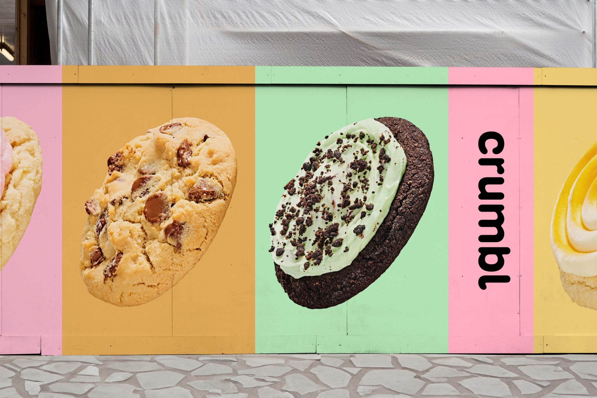
Crumbl needed its branding to match its over-the-top baked goods. Through a revamp by Global cookie powerhouse Turner Duckworth, the playful identity now mirrors its menu’s endless delicious options. Gone is the original logo‘s focus on cookies – allowing the simple, indulgent name to shine. Plus, stretching the scrumptious sans serif across boxes makes it center-stage. Playful BUCK illustrations add extra layers of sweetness.
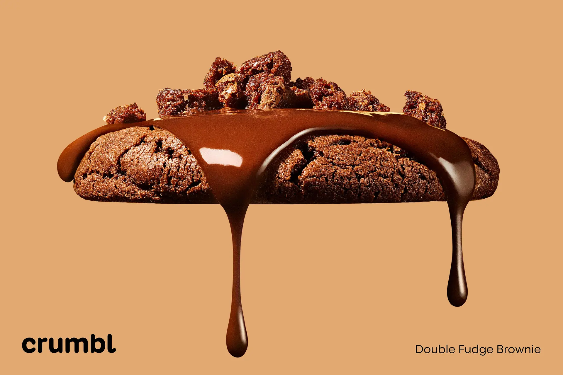
Digital flexibility through bespoke typography ensures the visuals translate across modern channels. A refined pink evokes the scent of fresh cookies lingering in the oven. The subtle pink nuances add warmth, maintaining a perfect balance between evolution and familiarity. This revitalized branding aligns seamlessly with Crumbl’s ever-changing menu, infusing optimism and whimsy into every visual element. With such an overhauled-looking logo and mouthwatering modernized palette, this rework is sure to satisfy even the pickiest of Sweet Tooth customers. Now, Crumbl’s shifting cookie menu and its visuals are equally delectable.
Staying True to Its Roots
While modernizing storytelling tools, familiar flavors remain. Evolution versus overhaul – the identity enhances signature indulgence through subtly refined elements. Crumbl’s optimism shines through with renewed visuals perfectly paired with its rotating recipes. As tasty new seasonal cookies enter the lineup, so too does this revitalized branding. With optimism and playfulness baked right in, Crumbl’s visuals are sweeter than ever.
Final Thoughts
Crumbl’s branding evolution and the introduction of Crumbl Sans not only reflect the company’s growth and vision but also set a new standard for the cookie industry. With its irresistible charm and innovative spirit, Crumbl continues to redefine what it means to be a cookie brand, inspiring others to embrace uniqueness and creativity. As Crumbl’s menu of rotating cookie recipes delights the palate, its revitalized branding promises to enchant the eyes, embodying the true essence of indulgence and innovation.
Also Read: Driving Innovation: The AA’s Modern Rebranding to Meet Changing Demands