Herman Miller, a trailblazer in modern furniture production, has undergone a vibrant branding overhaul. The new wordmark, introduced as part of the rebrand, is a nod to the late 1960s, when Herman Miller was fond of using Helvetica. This change beautifully encapsulates the spirit of Helvetica, marking a new chapter in Herman Miller’s branding journey that we’re about to explore through their rebranding.
A Nod to History
The Power of Typography Order’s meticulous rebranding process involved paying homage to a pivotal era in Herman Miller’s past. The late 1960s marked a period when the company embraced the clean lines of Helvetica, a font that became synonymous with modernism. Building on this legacy, the Brooklyn design agency Order who are behind the rebrand selected Söhne from Klim Type Foundry as a natural continuation of Helvetica’s timeless appeal. This choice represents a significant departure from Meta, Herman Miller’s previous typeface associated with the digitization frenzy of the 90s.
Embracing Evolution
In celebration of Herman Miller’s 100th anniversary, the rebrand emphasized the importance of evolution and adaptability for the company. Kelsey Keith, the brand’s creative director, highlights the necessity for a design system that can seamlessly transition across a variety of touchpoints, catering to customers worldwide, from mobile screens to physical spaces. The comprehensive approach ensures a consistent brand experience while accommodating the diverse needs and preferences of the modern consumer.
Preserving the Legacy
While the rebranding effort brought about significant changes, the renowned Herman Miller logo remains largely untouched. Designed by Irving Harper in a mere hour back in 1946, it has become an instantly recognizable symbol of the brand. Jesse Reed, partner at Order and co-founder of Standards Manual, explains that while the logo remained “off-limits,” it has found new expressions within the revitalized visual language.
The Essence of Modernism
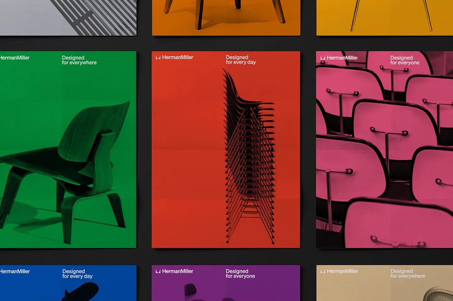
Order sought inspiration from a particular period in Herman Miller’s history, one that encapsulated the brand’s essence in its purest form. During the late 1960s, working closely with Chicago designer John Massey, Herman Miller solidified its position in the modernist canon. Reflecting this legacy, Order’s decision to reintroduce Helvetica through Söhne pays homage to the brand’s influential past. Additionally, the rebranding effort resurrects vibrant colors and emotional elements found in the brand’s archives, infusing the new design with a sense of vitality and character.

Final Thoughts
Herman Miller has recently reimagined its brand identity with a design system that combines modernism with the brand’s heritage. Order, the designers behind this new identity, paid meticulous attention to detail and respect for the brand’s legacy to create a revitalized identity that promises to captivate and inspire audiences worldwide. This collaboration between Herman Miller and Order is a celebration of the brand’s legacy, encapsulating joy, tactility, and a design language that stands the test of time. As Herman Miller enters its next century, this timeless and bold design system represents a visual evolution of the brand.
Read More: Keeping British Honey Wild: Black Bee Honey’s Nature-Inspired Rebranding