Oxford University’s Christ Church College has unveiled a new branding, meticulously. Interestingly, the inspiration for rebranding does not date back to the college’s founding year of 1546, but to a more recent chapter in history. Let’s explore how the college delicately balanced Christ Church’s rich heritage with modern academic aspirations to create an identity that pays homage to tradition while embracing the digital age.
Rediscovering a Lost Treasure in the Archives
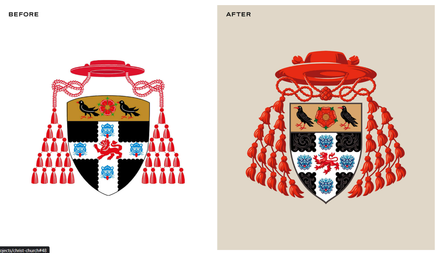
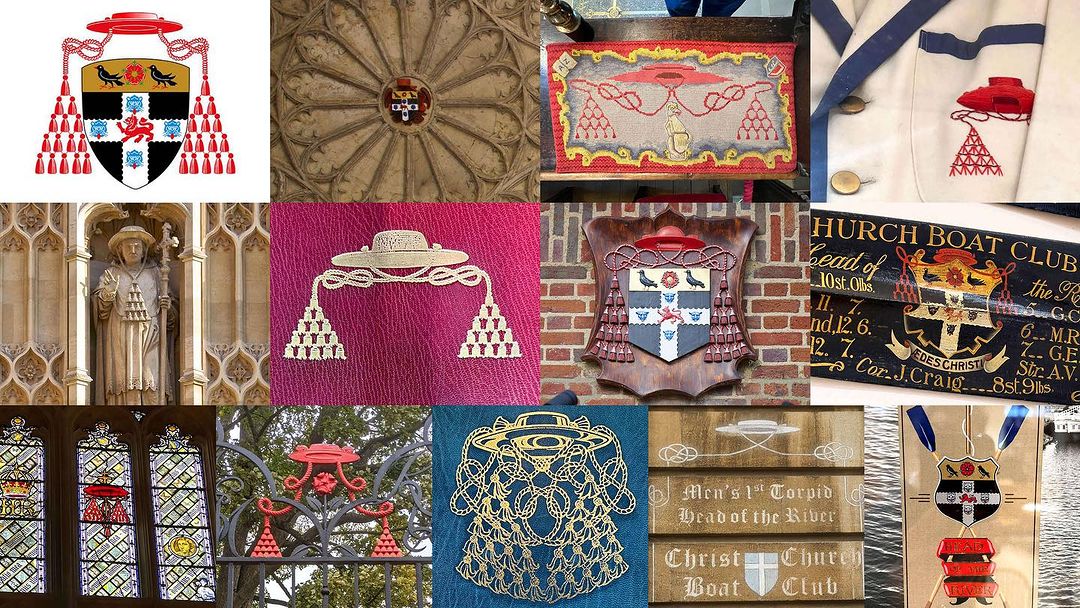
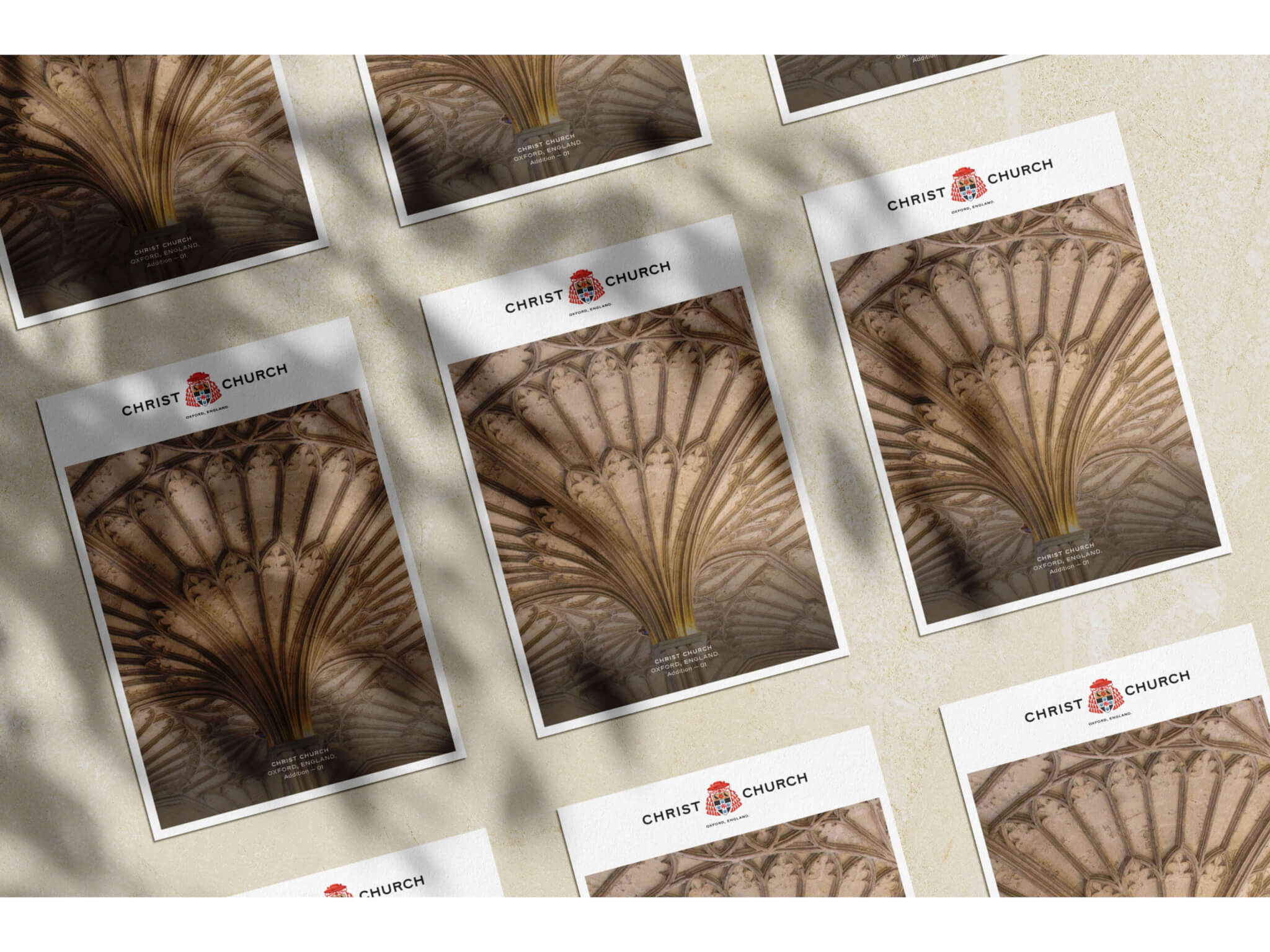
Crafted by the London-based design agency SomeOne, the rebrand took inspiration from a rare, centuries-old version of the crest uncovered in the college archives. The meticulous details of this hand-drawn artifact provided the blueprint for the redesign. Elements like the cardinal’s hat and symbolic creatures connect back to Christ Church’s religious roots and founder Cardinal Wolsey. Someone aimed to keep this unique heraldry intact.
Breathing New Life into Centuries of History
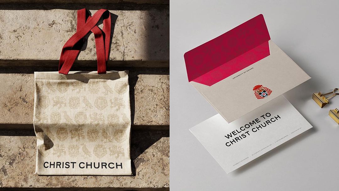
Rather than simplifying the crest, SomeOne opted to preserve its layered details. However, they rebalanced and resized it for clarity across formats. The studio also developed stylized graphic patterns from the crest. These add a decorative flair while reinforcing the college’s iconic visual assets.
Crafting an Identity as Nuanced as the College Itself
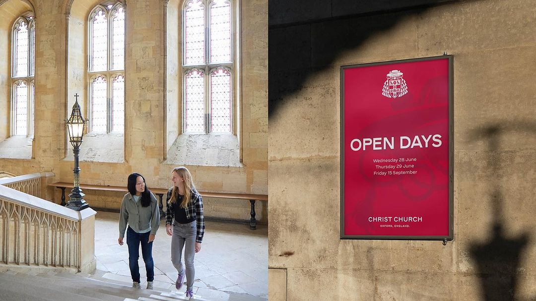
SomeOne’s identity deftly adapts a priceless bit of history into a flexible, cohesive brand system. The new crest stylishly conveys Christ Church’s heritage and principles through purposeful symbolism. Paired with tailored graphics and typography, the brand can now gracefully represent this storied Oxford institution.
The Complexity and Versatility of the Design
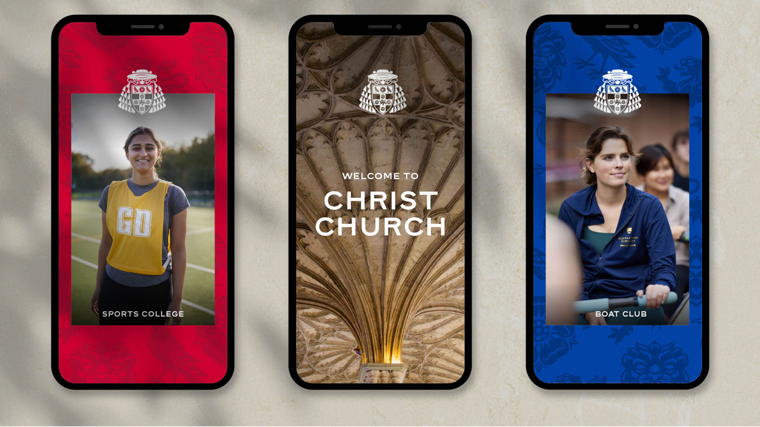
The crest is far more intricate than most contemporary designs, featuring a hat, tassels, and a shield that contains multiple motifs. Aware of the complexity of the design, SomeOne decided to create nine versions of it. The design is available in three colourways and each colourway comes in three size variants. The level of intricate detail varies depending on the scale.
Rework: The New Sans Serif Typeface
As part of the project, SomeOne developed new frameworks for color, typography, and imagery. They even created a pattern system based on the elements found within the crest. The previous Garamond typeface was replaced by ‘SomeOne’ with ‘Rework,’ a sans-serif typeface designed to perform across various scales. ‘Rework’ pays homage to typography’s rich history, drawing inspiration from multiple eras and processes. It is a customized sans-serif typeface that provides contrast and high legibility, taking inspiration from sources ranging from 19th-century signage to digital-age phototypesetting.
A Palette Rooted in Heritage
The color palette draws from Christ Church’s original heraldry, featuring cardinal red, black, blue, and gold. Additionally, a stone color, inspired by Cotswold stone, reflects the region’s historic use of limestone, known for its honey-colored appearance.
A Matter of Perspective
The new crest may not align with contemporary tastes for some; others might appreciate it as a nod to history and a resistance to oversimplification. Redesigning historic emblems always stirs debate, but this design feels in sync with a college that boasts nearly 500 years of history.

Bottomline
SomeOne’s’ remarkable rebranding of Christ Church Oxford harmonizes tradition and innovation, paying homage to the college’s storied history while embracing the digital age. With precision, craftsmanship, and a keen eye for detail, the agency has revitalized the identity of an institution that continues to shape academia, politics, and culture.