In the latest design overhaul, UK-based charity, Cats Protection has sculpted a fresh visual identity breathing new life into its essence with a blend of sophistication and warmth. The rebrand is a powerful example of remarkable branding that creatively conveys the brand’s vision. Let’s get to know how the brand made this work.
A Fresh Take on Branding
Design studio Lukecharles has breathed new life into the brand identity of Cats Protection, infusing it with warmth and authority through bespoke typography and a unique color palette. Since its inception in 1927, Cats Protection has been dedicated to rescuing and rehoming stray, unwanted, or homeless cats, while also educating people about cats and their welfare. Lukecharles saw an opportunity to modernize the brand and showcase its scale and expertise.
Redefining the Feline Presence
Since its inception in 1927, Cats Protection has been a stalwart in rescuing and rehoming stray and homeless cats while promoting cat welfare. The design studio recognized the untapped potential within the brand, aiming to modernize its image while highlighting its scale and expertise.
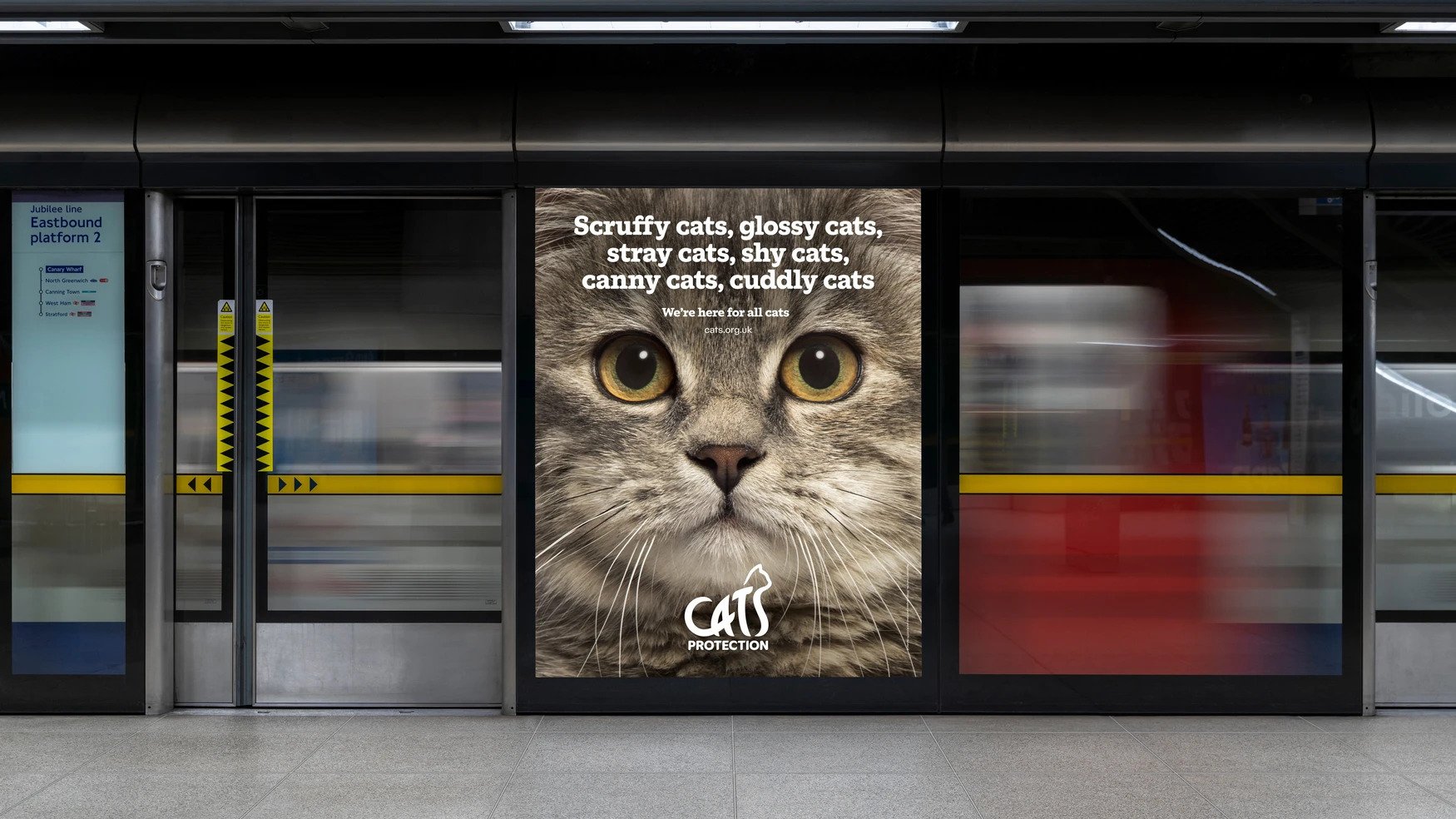
The new brand identity pulsates with a balance of elegance and authority. Lukecharles carefully intertwined an “elegant feline form” into the wordmark, infusing bespoke typography with unique feline nuances. This bespoke headline font breathes life into the brand, resonating with the charity’s ethos.
Unveiling the Strategic Shift
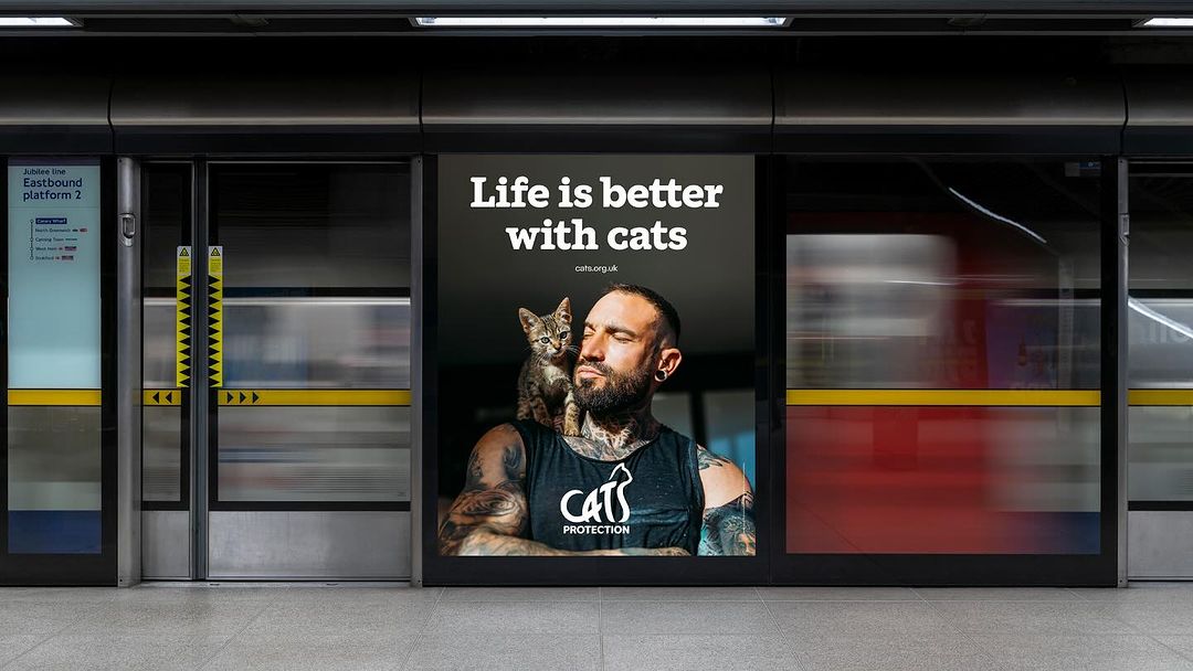
The reinvigorated strategy aims at reshaping perceptions and attitudes toward cats, fostering a deeper understanding of the charity’s role. Lukecharles played a pivotal role in revising Cats Protection’s messaging, steering it away from confusion toward a clear narrative centered on ‘making a better life for cats’.
The studio’s collaboration with the charity extended to crafting a compelling longer narrative and refining messaging for a unified voice across communications. This new tone, anchored in authority and warmth, bids farewell to clichéd cat puns, ushering in a more mature and impactful communication style.
A Visual Symphony of Authority and Sophistication
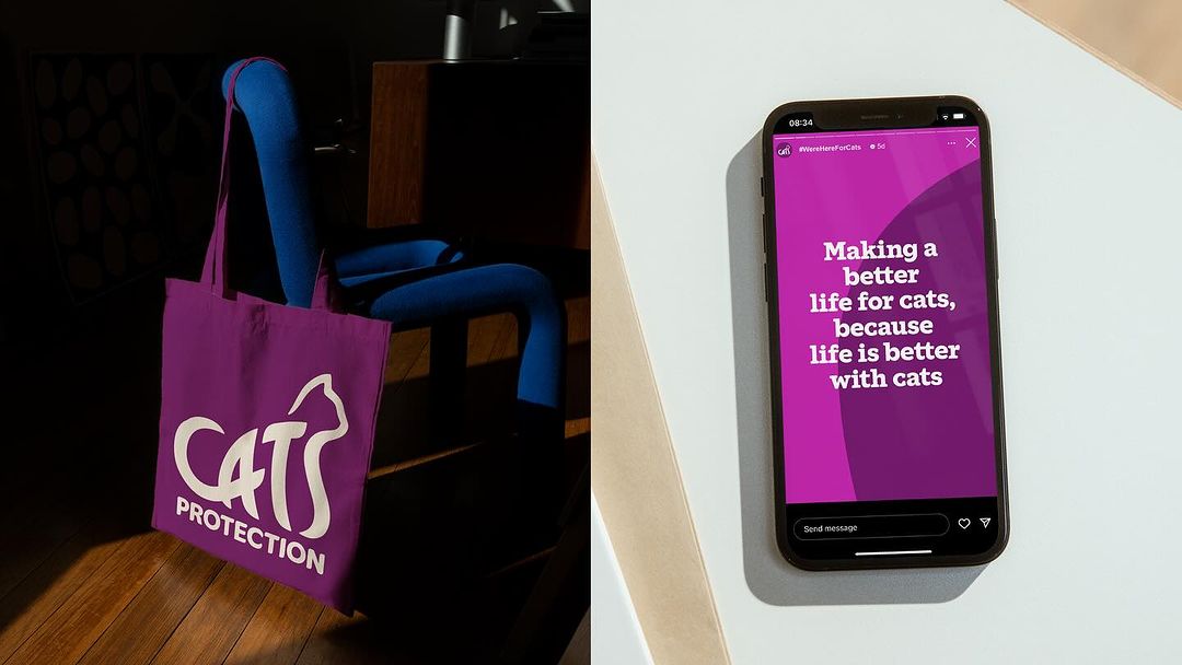
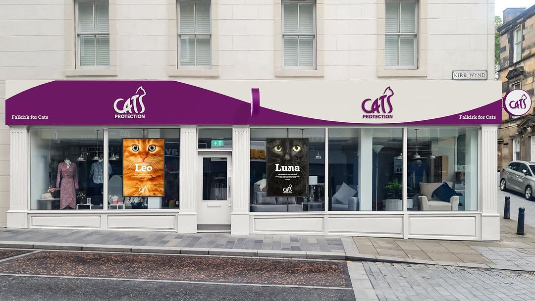
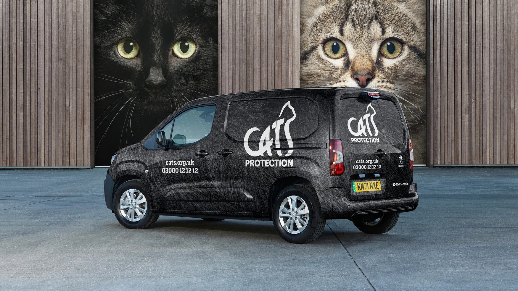
At the heart of the redesign lies a logo inspired by the dynamic elegance of feline forms. By seamlessly integrating the cat form into the wordmark, the design establishes an immediate emotional bond with all those devoted to cat welfare.
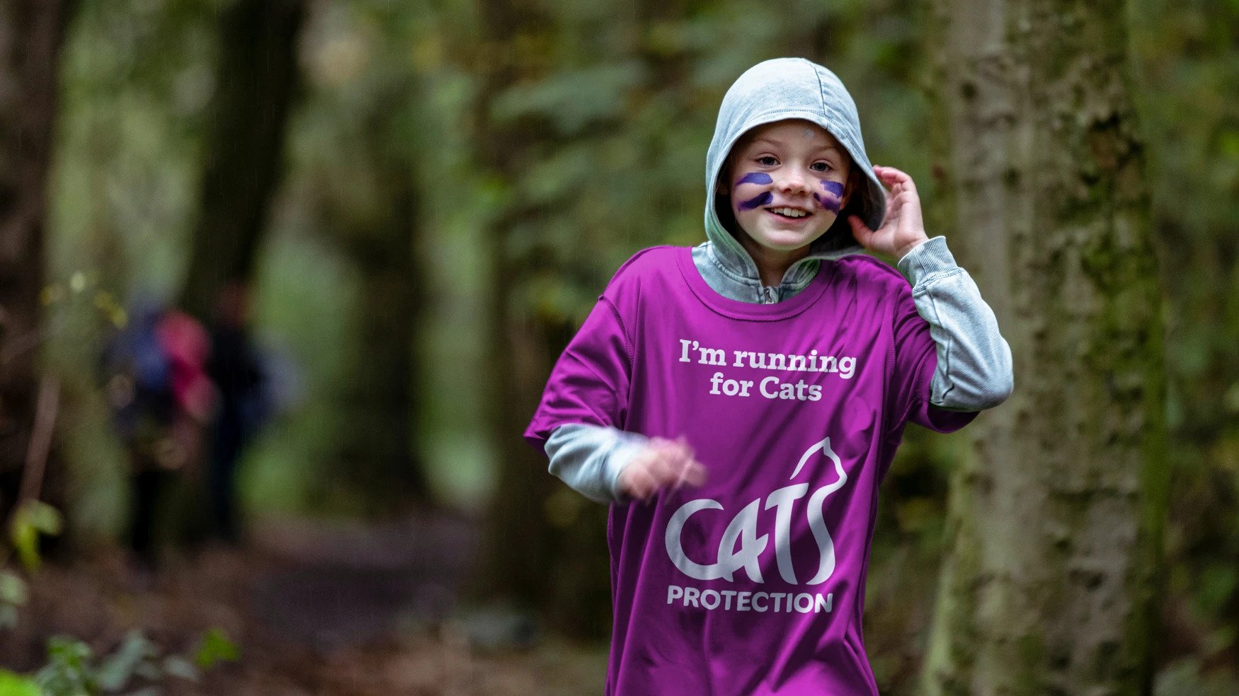
Cats Protection Purple emerges as the emblem of sophistication, representing the charity’s warmth and authority. This distinct color choice, in conjunction with the bespoke slab-serif headline typeface, strikes a chord between expertise and empathy.
Resonating Visual Elements
The challenge of an inconsistent photography style in past communications met a solution through a range of tailored photography approaches, providing a unified visual language for various purposes. Lukecharles curated an ownable illustration style, enhancing the brand’s sophistication with an artistic reimagination of feline forms.
This transformation ushers Cats Protection into a new era, blending authority with affection, and encapsulating its values in a visual symphony that resonates with feline admirers and advocates alike.
Final Thoughts
Lukecharles’s collaboration with Cats Protection has resulted in a brand identity that reflects the organization’s scale, expertise, and commitment to making a better life for cats. The new visual elements, messaging strategy, and authoritative tone position Cats Protection as a leading force in feline welfare, inspiring support and engagement from cat lovers and advocates alike.