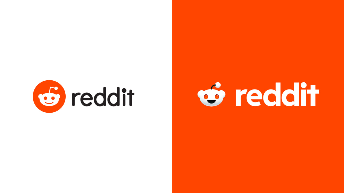
Reddit, one of the internet’s most popular social platforms, is undergoing a transformative rebrand. With a new logo, typeface, brand colors, and an updated version of its beloved alien mascot, Snoo, the rebrand signals a significant change for the platform. Let’s explore the motivations behind Reddit’s rebrand and how it prepares for a potential 2024 IPO.
Bringing Life to the Iconic Mascot
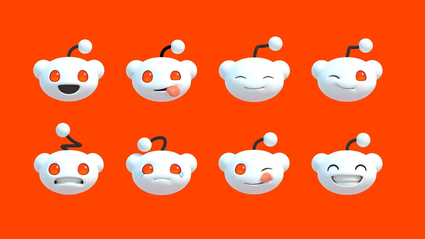
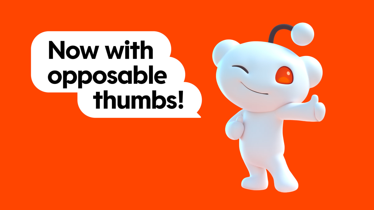
Reddit’s mascot, Snoo, has traditionally played a more subdued role within the platform’s brand identity. However, Snoo has been given renewed focus and an evolved, formal 3D shape by the award-winning design agency Pentagram. In the rebrand, the iconic alien mascot has been lifted from the logo and rendered in 3D, akin to the level of character development seen in designing Pixar characters. This transformation aims to position Snoo as an iconic figure on par with Mario.
The Evolution of Snoo
Snoo, has traditionally played a more subdued role within the platform’s brand identity. Unlike its more flamboyant counterparts in the digital realm, Snoo has often lingered in the background of Reddit’s brand narrative. However, the Pentagram rebrand propels Snoo into the spotlight with a sophisticated 3D makeover, signaling a shift in Reddit’s visual identity.
Typographic Transformation and Color Palette Revolution
Pentagram, led by partner Natasha Jen, took Reddit’s rebranding challenge head-on. The first major transformation lies in Snoo’s evolution from a 2D icon to a nuanced 3D character, showcasing the meticulous character development akin to designing Pixar favorites. The accompanying typographic overhaul is equally significant, with Reddit Sans reimagined to feature speech bubble-inspired counter forms in lowercase letters—a nod to the platform’s genuine exchange of ideas in discussion threads.
The rebrand doesn’t stop there—Reddit’s vibrant color palette undergoes a trim, transitioning from a vast array of 100 colors to a more modest and refined selection of 15. This strategic move by Pentagram aims to streamline the visual communication on the platform.
From Conversation Threads to Cartoon-Like Personality
One of the standout changes introduced by Pentagram is the integration of conversation bubble elements into Reddit’s visual communication. Acting as a framing device for text and images, these bubbles reflect the authentic and dynamic discussions found on the platform. The motion design mimics the fluidity of Reddit conversations, adapting to the shape of subreddits or lengthy comments.
Despite the streamlining efforts, Pentagram injects an almost cartoon-like personality into Reddit, a departure from the prevailing trends in other social media platforms. The decision to elevate Reddit’s conviviality and joy aligns with a broader brand methodology crafted collaboratively with Pentagram, encapsulating a cohesive vision for Reddit’s future.
Dawn of a New Era for Reddit
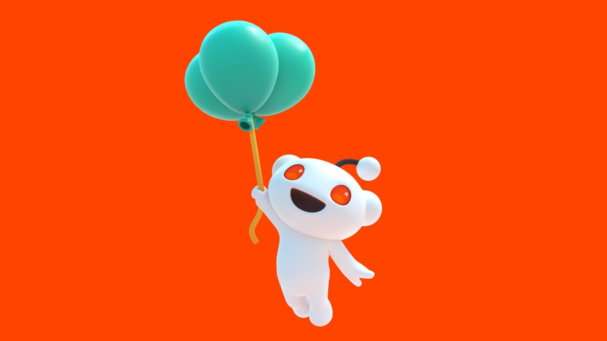
As Reddit gears up for a potential 2024 IPO, this rebrand not only signifies a visual transformation but also suggests a maturation of the platform, marking the beginning of a new era for one of the internet’s most iconic communities.
Final Thoughts
As Reddit embarks on its rebranding journey, it is clear that the platform is embracing change and looking towards the future. With a polished new logo, an evolved Snoo as its iconic figurehead, and a revamped visual language, Reddit is positioning itself for a new era. The anticipated 2024 IPO adds an extra layer of significance to these changes, reflecting the platform’s ambitions and aspirations. As users and enthusiasts, we can look forward to a fresh and visually cohesive Reddit experience in the years to come.
Also Read: Doritos Launches Crunch-Cancellation Technology – Doritos Silent
