The IBM TechXchange Conference connects developers and technical professionals through shared learning and community building. To reflect this mission, IBM created a dynamic identity system that brings technology to life. Let’s explore this innovative collaboration and the thought process behind the project.
Translating Innovation Into Design
The core challenge was building a flexible system that could represent IBM’s wide range of innovations across mediums and environments. Athletics devised a modular grid framework with four key components:
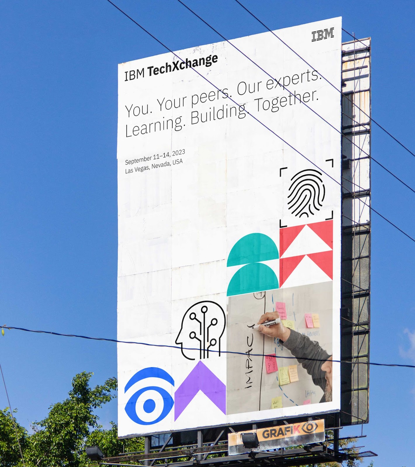
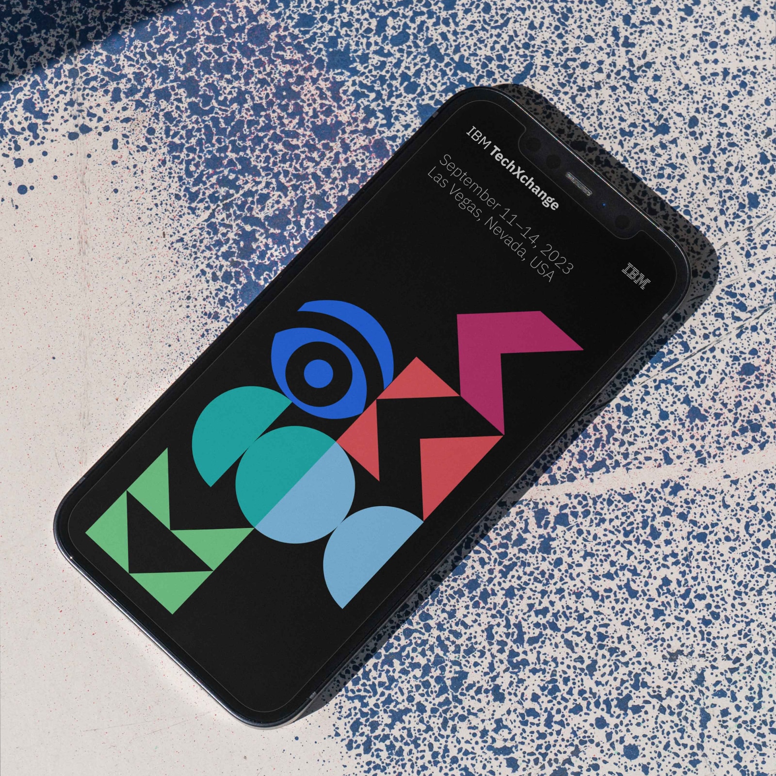
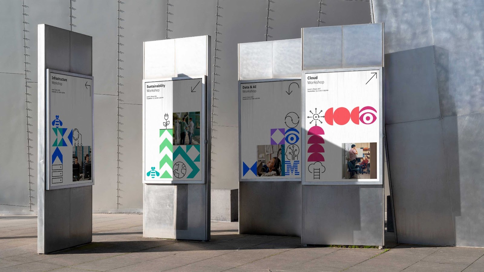
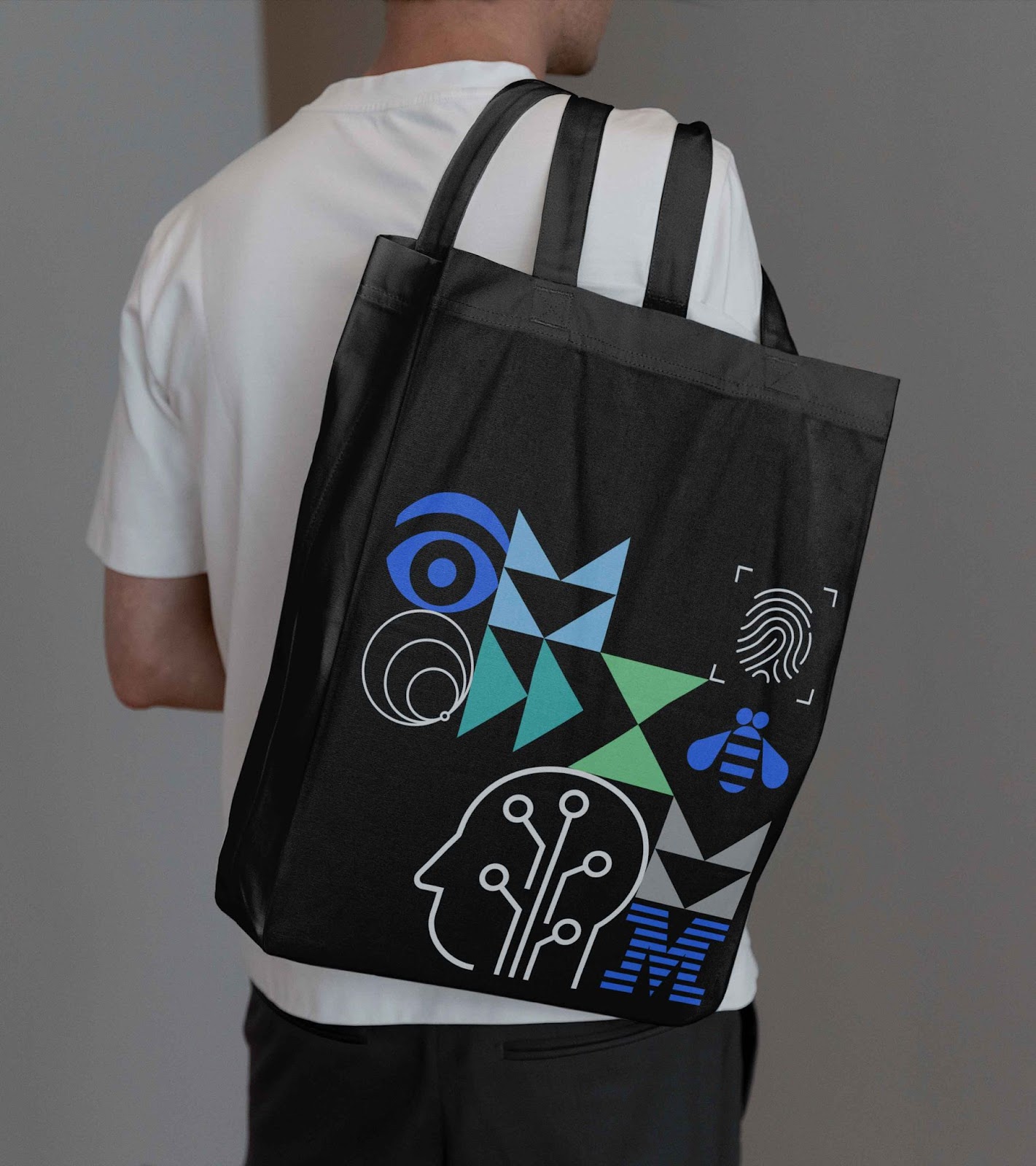
1. Shapes: Abstract yet illustrative forms representing connections. These shapes symbolize the concept of “connection,” a fundamental aspect of the conference’s message. The choice of these shapes is not arbitrary; each one is carefully considered to convey the idea of connectivity.
2. IBM Rebus: Iconic pictograms from Paul Rand’s 1981 rebus design for IBM. This rebus, created in 1981 for Rand’s Eye-Bee-M poster in support of the IBM THINK motto, uses images to represent letters. It’s a piece of IBM’s rich history that’s been elegantly integrated into the modern design system.
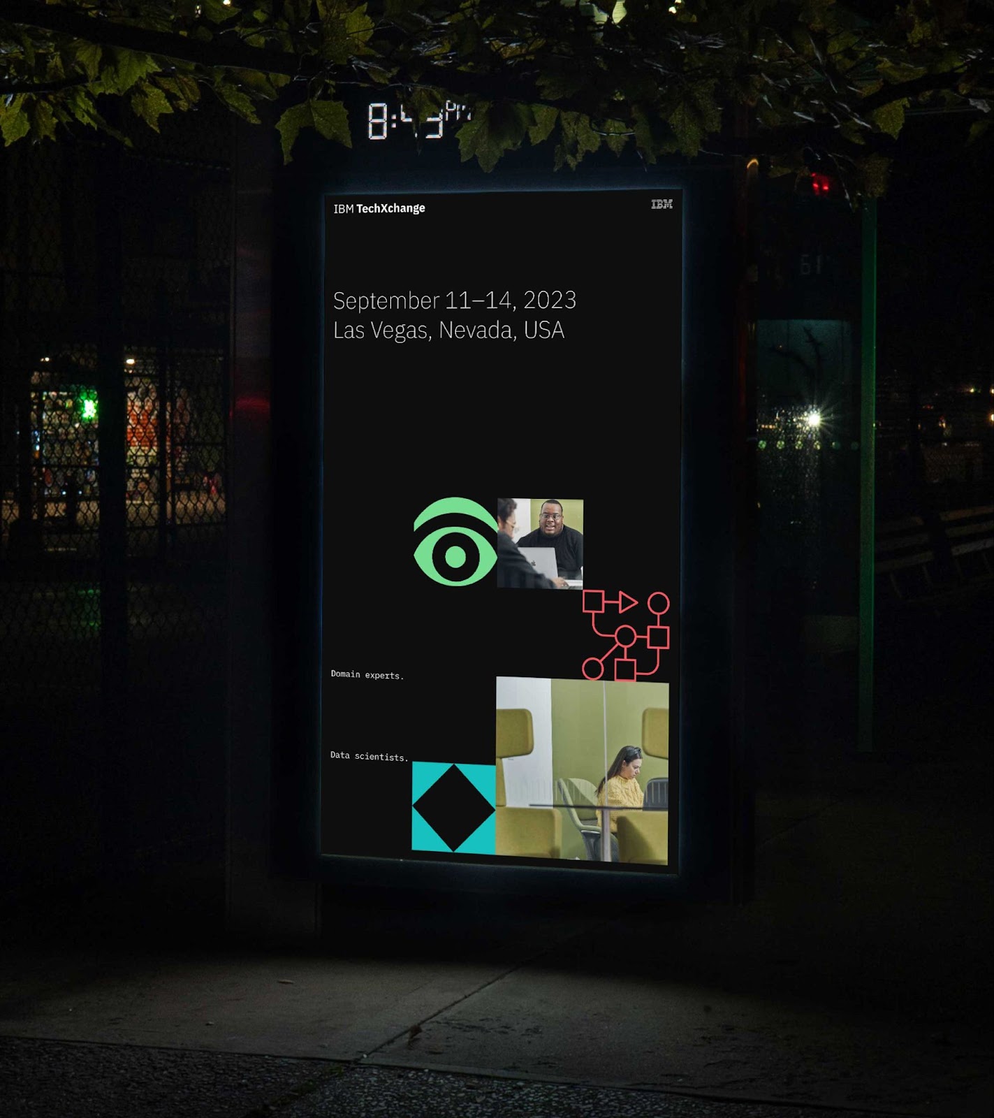
3. Pictograms: Visual symbols of both general and specific technologies. These pictograms represent technology, both in general and specific to the technical tracks discussed at the conference. They add depth and relevance to the identity, connecting it with the subject matter.
4. Photography: Images showing human collaboration and tech interactions. These photos capture moments of interaction, collaboration, and learning – all integral elements of the IBM TechXchange experience.
Motion Adds Dimension
IBM tapped design studio Athletics and their Brand Experience Team Blue Studio to develop the brand identity. Motion is a critical element of this identity. The system comes alive through motion design evoking the responsive nature of technology. Cuts, snaps, and loops imbue the identity with a technical yet approachable sensibility.
Consistent Yet Versatile Brand Integration
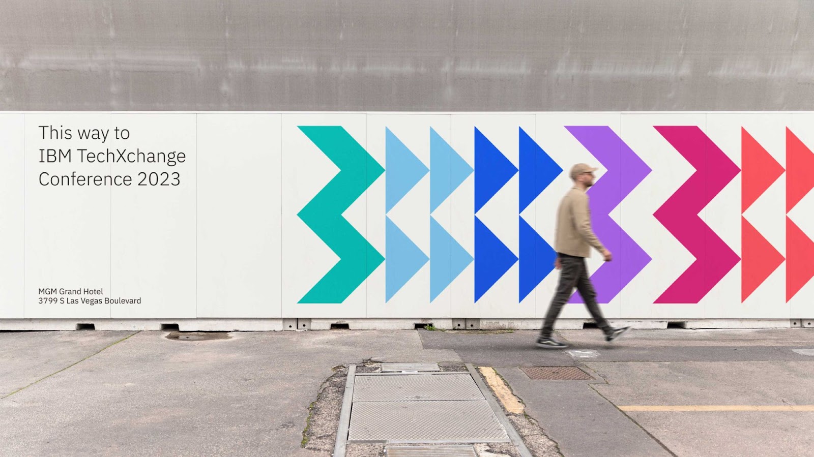
The logotype appears alongside IBM’s iconic 8-bar logo, unified by the parent brand’s color palette. The wide spectrum of hues reflects the diversity of the conference’s attendees and topics.
Built For Scalability
With its modular components, the grid framework can expand as needed for future events. The comprehensive base ensures visual consistency across mediums and environments.
Celebrating Tech and Community
Ultimately, the IBM TechXchange identity brings innovation to the forefront while keeping the human element top of mind. It highlights technology as a platform for collaboration, learning, and progress.
Challenges and Achievements
One of the primary challenges faced in this project was ensuring that the system was complete and comprehensive ahead of time. The identity had to be ready for the creation of conference materials, which was no small feat. However, the result is a seamless, cohesive visual identity.
Final Thoughts
The collaboration between Athletics and IBM Blue Studio has breathed new life into the IBM TechXchange Conference identity, infusing it with technology and modernity. The grid system, comprising shapes, the IBM rebus, pictograms, and photography, serves as a dynamic framework for future events. The integration of motion and a carefully selected color palette adds depth and energy to the identity. This forward-looking approach ensures that the IBM TechXchange Conference continues to represent innovation and connectivity.