Antwerp’s renowned photography museum, FOMU, has unveiled a striking new visual identity as part of its ambitious rebranding efforts. The museum’s initiative to challenge perspectives and stand out among peer institutions has culminated in a fresh, dynamic identity that captures the essence of its programming and engagement with the photography community. Let’s delve into the details of Fomu’s rebrand and how it aligns with the museum’s goals.
Redefining the Visual Identity
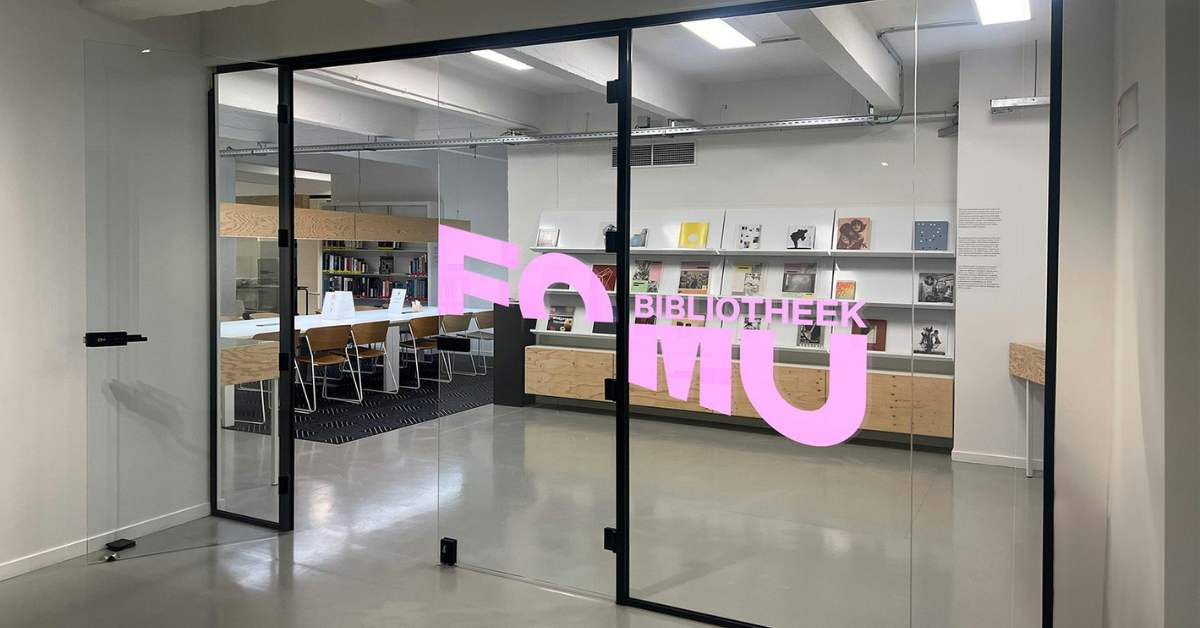
Belgian creative studio Mutant, known for its expertise in cultural projects, was entrusted with redefining FOMU’s visual identity. Departing from conventional camera-related symbols, the studio opted for a bold, unconventional approach. The wordmark, sliced on the diagonal, is brought to life through motion design, creating a visually compelling impression of a shattered lens. This intentional departure from the expected symbolizes FOMU’s commitment to challenging norms and embracing a less literal, more innovative vision.
A Wordmark with Edge
Gone are the days of predictable camera symbols and lens-inspired logos. FOMU’s new identity, crafted by the innovative minds at Mutant, a Belgian creative studio, takes a refreshingly abstract approach. The wordmark, sliced on a diagonal, creates a visual metaphor that’s both jarring and intriguing. It’s as if we’re witnessing a shattered lens, making way for a new vision that defies the literal and embraces the unexpected.
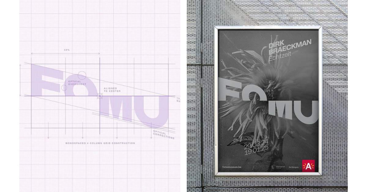
This bold design choice isn’t just for show. It’s a deliberate move to mirror FOMU’s mission of challenging perspectives through its programming. As the wordmark comes to life through motion design, it creates a dynamic visual experience that captures the essence of the museum’s forward-thinking approach.
Connecting Institution and Artist
But FOMU’s rebranding goes beyond mere aesthetics. The new identity seeks to blur the lines between the institution and the artists it champions. Rather than simply framing the work, the visual elements engage and intertwine with it, creating a symbiotic relationship that speaks to FOMU’s deep-rooted presence in the photography community.
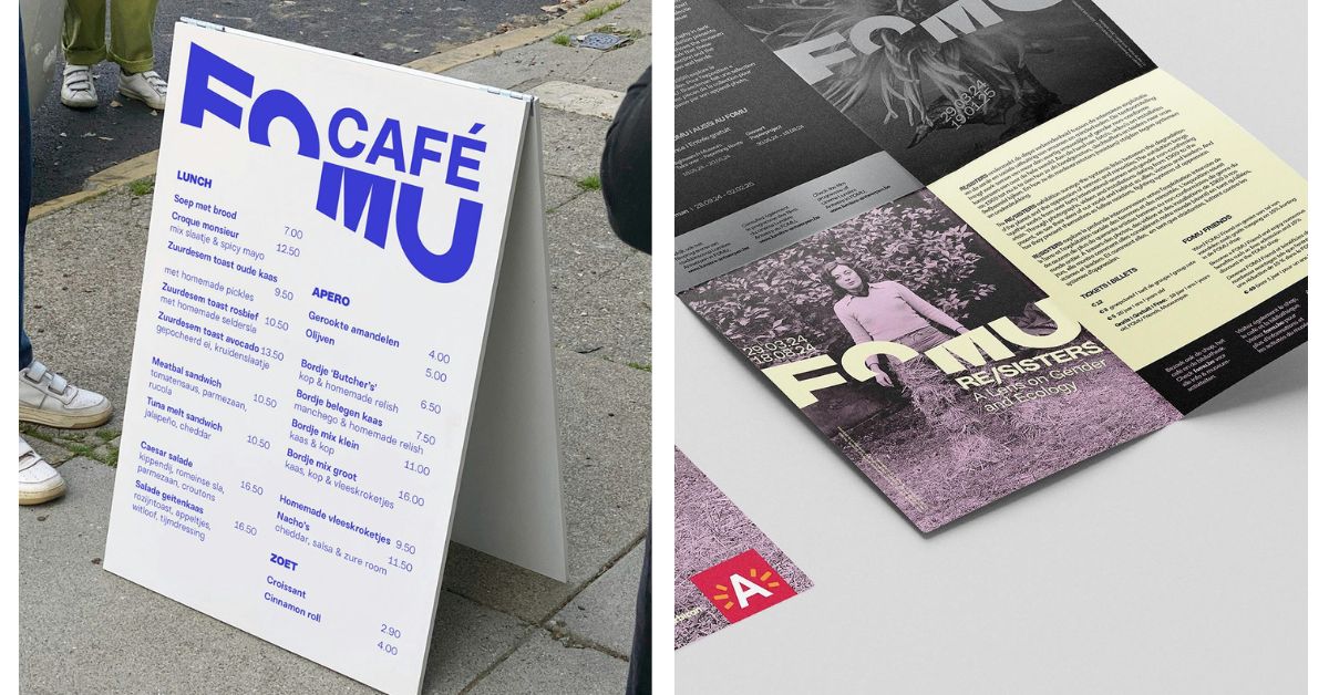
This approach is a masterclass in brand storytelling. It’s not just about looking good but about conveying FOMU’s values and ambitions through every visual touchpoint. The result is an identity that feels alive, dynamic, and intimately connected to the art it showcases.
Final Thoughts
Fomu’s new visual identity, crafted by Mutant, represents a bold step towards challenging perspectives and standing out in the photography museum landscape. By embracing a unique approach to visual identity and integrating it seamlessly with the work of photographers and artists, Fomu creates a cohesive brand narrative that resonates with its target audience. As FOMU prepares to host blockbuster exhibitions like the Cindy Sherman retrospective, this new identity positions the museum not just as a venue, but as an active participant in the ongoing dialogue of contemporary photography. In a world where cultural institutions often play it safe, FOMU’s bold new look is a breath of fresh air. It’s a testament to the power of design to communicate complex ideas and challenge our perceptions. As visitors step into FOMU, they’re not just entering a museum, they are stepping into a new way of seeing.
Also Read: Celebrating Legacy with a Modern Twist: The Dinner Ladies New Brand Identity

