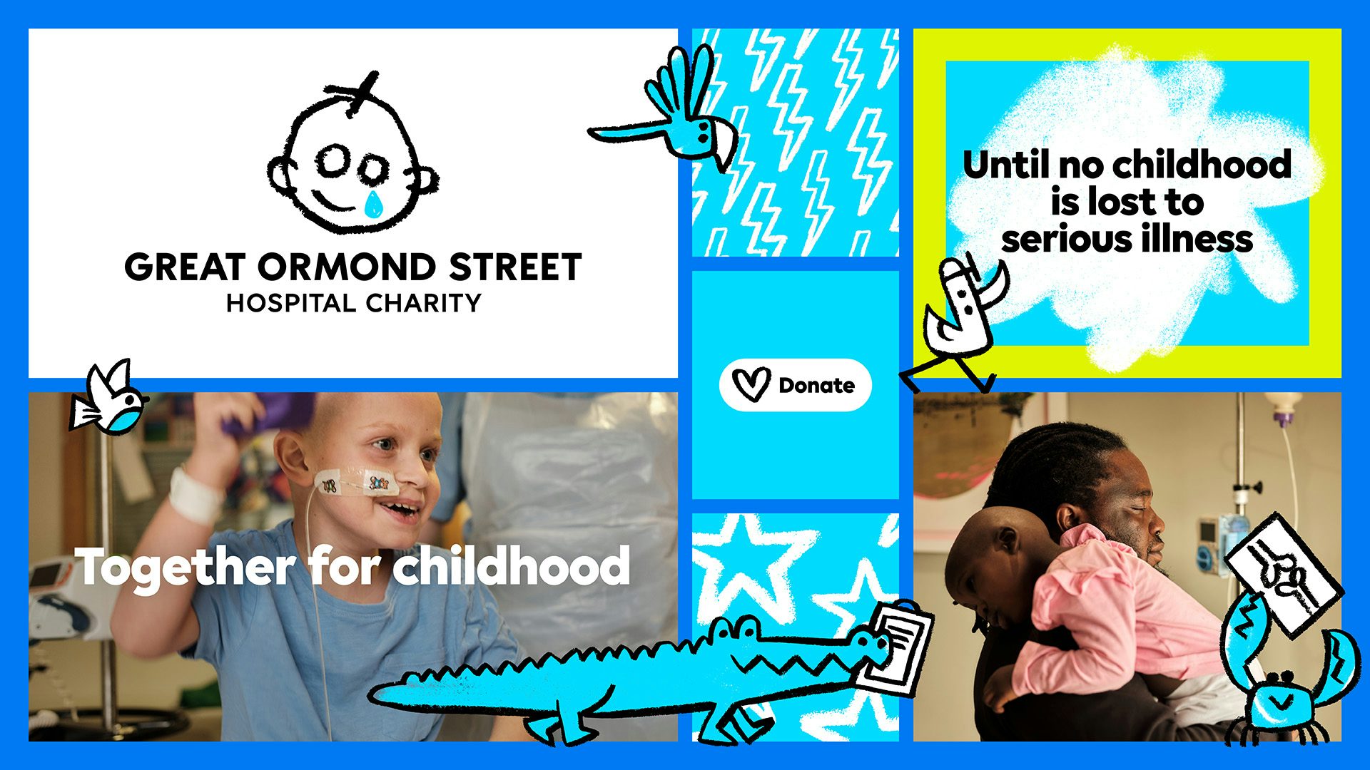
Great Ormond Street Hospital Charity (GOSH) has recently revealed a refreshed brand identity that aims to better represent its mission of transforming the lives of seriously ill children. This thoughtful rebrand, developed in collaboration with several creative agencies, brings a more vibrant and child-centric approach to the charity’s visual and verbal communication. Let’s delve into the collaborative process, the key elements of the rebrand, and the impact it will have on the charity’s mission to support children and their families.
A Collaborative Journey to Empower Children
The GOSH rebrand journey began with extensive consultation and collaboration involving over 3,500 stakeholders, including patients, families, staff, employees, donors, and the public. This inclusive approach ensured that the refreshed brand resonated with everyone involved. By incorporating the voices of children and families directly, the new brand places their lived experiences at the forefront. From joyful moments of play to the harsh realities families face, the rebrand aims to reflect the full spectrum of emotions experienced within the hospital.
Evolving a Beloved Symbol
Partnering with creative experts Stuart Gough, Ashley Johnson, and Ruth Jamieson of award-winning design agency Pentagram, has GOSH launched its refreshed look built on a brand strategy developed by Impero. Global branding agency Jones Knowles Ritchie (JKR) brought the brand to life through motion. At the heart of the new identity is an updated logo that pays homage to its origins. The iconic design, inspired by a patient’s drawing from 1987, has been carefully modernized to suit digital platforms while retaining its original charm. A fresh blue color scheme adds vibrancy and recognition to the brand.

Bringing Childhood Joy to the Forefront
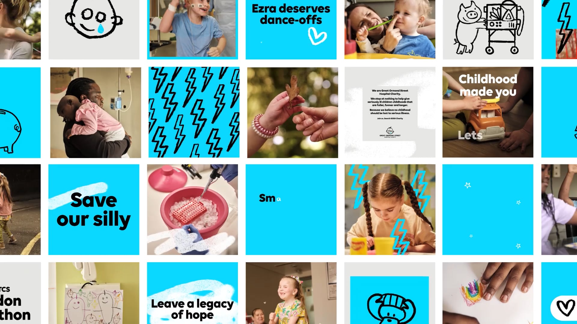
The rebrand introduces playful elements that reflect the spirit of childhood. New animal illustrations, based on the hospital’s ward names, add a touch of whimsy and represent the collective effort to support children under GOSH’s care. When animated, these illustrations create a sense of movement and togetherness, perfect for digital engagement.

A Voice That Speaks to All
GOSH’s new verbal identity strikes a balance between authenticity and optimism. It aims to convey the realities of serious childhood illness while maintaining a hopeful and supportive tone. This approach allows the charity to communicate more effectively with supporters and beneficiaries.

Capturing Genuine Moments
Photography plays a significant role in showcasing authentic moments at GOSH. The essence of spontaneity among patients shines through natural light and unposed shots. These images accentuate textures and intricate details, providing a glimpse into the heartwarming interactions within the hospital.
The Takeaway
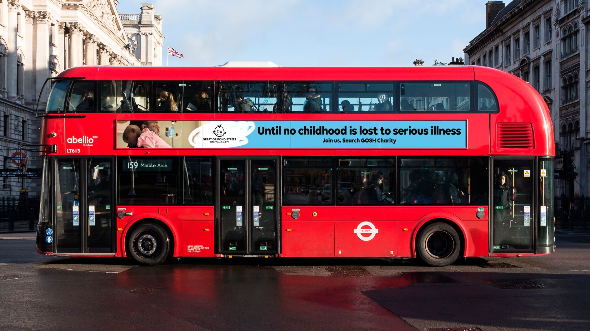
Great Ormond Street Hospital Charity’s rebrand represents a powerful commitment to transforming the lives of seriously ill children while protecting their childhoods. This collaborative effort, led by creative experts and incorporating the voices of children and families, has resulted in a vibrant and impactful brand identity. By embracing the energy and authenticity of childhood experiences, GOSH aims to advocate, challenge, and champion the vital work they do. With playful design elements, a renewed tone of voice, and animated animal illustrations, the charity now has powerful tools to create a greater impact on digital platforms. This rebrand reflects GOSH’s unwavering dedication to ensuring that no childhood is lost to serious illness, putting children and their families at the heart of their mission.
Also Read: A New Identity for SEHA: Strengthening Patient-Centric Care in Abu Dhabi

