Johnson & Johnson has dropped its famous signature scripture it has used since 1887 to keep up with the present-day trends with a modern look. The health company was widely recognized for its cursive design for more than 130 years.
The new logo uses sans sans-serif font for a cleaner, simpler design. It keeps the ampersand and lack of word spacing to ensure continuity. The change depicts that Johnson & Johnson is trying to keep up with the times. The company said the new logo delivers a sense of unexpectedness and humanity. The ampersand demonstrates “a caring, human nature”.
The Significance of Red in Swift Health Responses
Johnson & Johnson said red will remain a key color for the company because it’s a contemporary color that speaks to the ability to urgently respond to health challenges, evolve with the times, and set the pace.
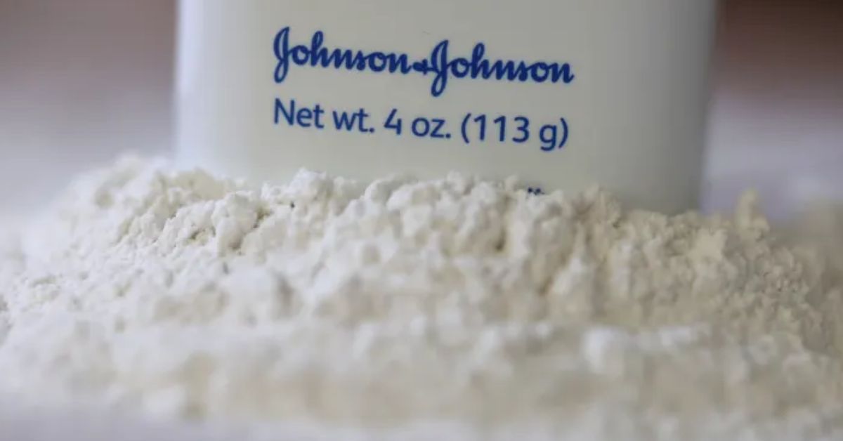
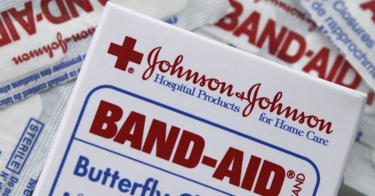
The old logo, the original script – James Woods Johnson’s signature – will still be seen on the company’s products like baby shampoo, Band-Aid, and Tylenol. The new logo will roll out over time on J&J’s medical equipment and pharmaceutical products. The look aims to recognize the company’s shift into a pure-play healthcare company.
A Design That Demands Attention | Johnson & Johnson
Laura Ries, a marketing consultant, believes the signature logo started showing its age in an era of texting and emojis. “Many children no longer learn to write cursive in school. People may recognize the signature, but they weren’t necessarily reading it. The new logo is easier to process. Because it’s easier, it almost even draws the attention to it.”
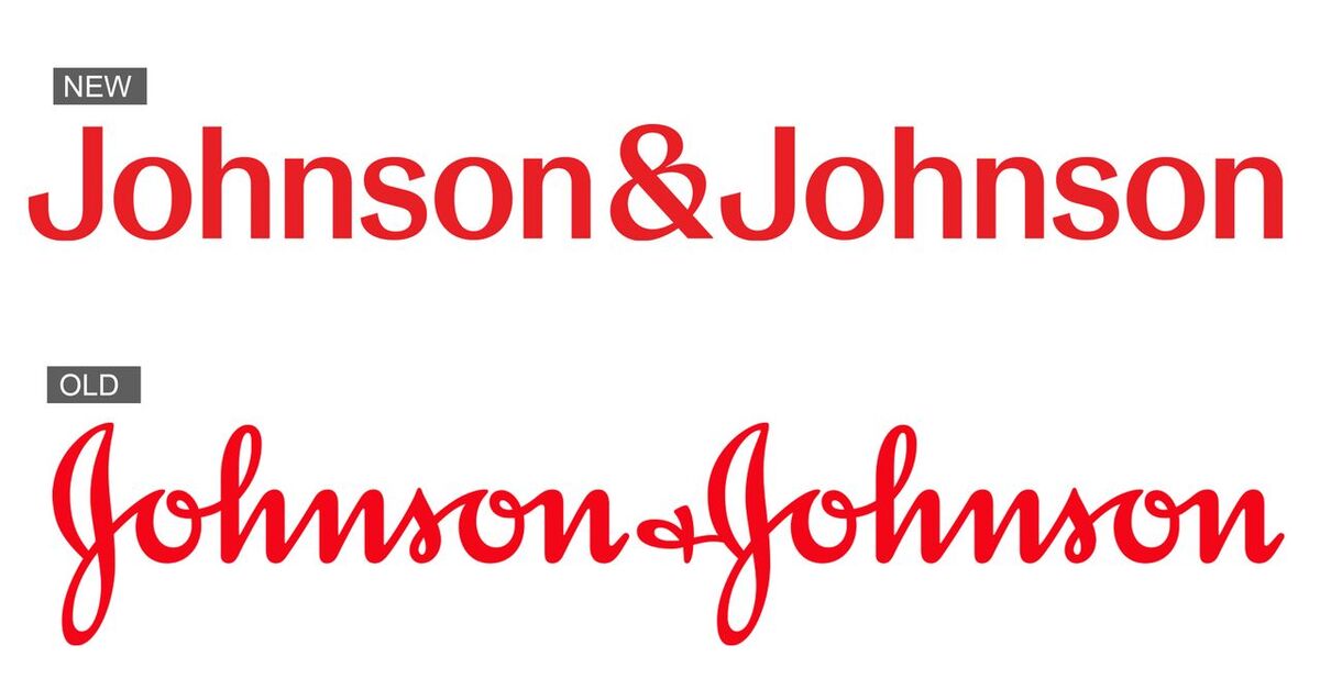
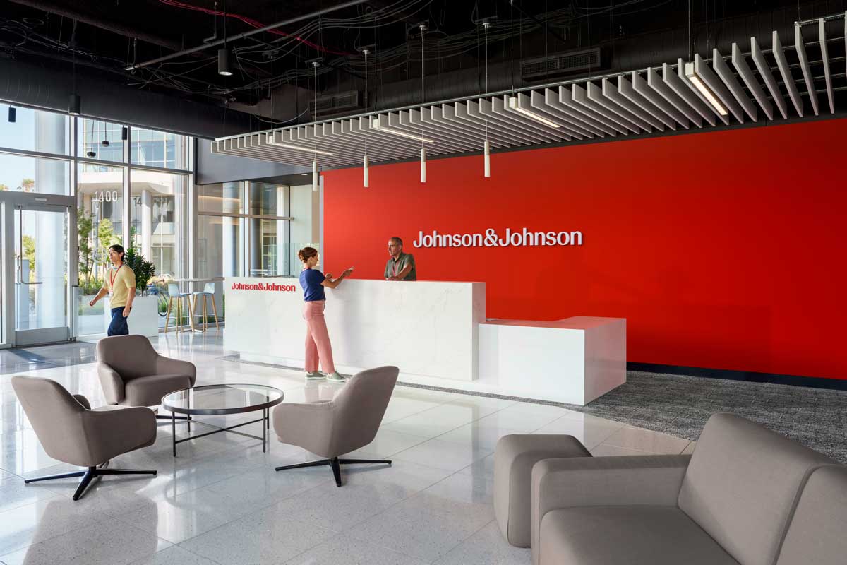
J&J said it will embrace both the long- and short-form versions of the logo, expanding and building more equity around a short-form “J&J” to show up in a more personable, contemporary way, especially in digital interfaces. The new Johnson & Johnson brand identity builds on the company’s legacy, while also modernizing key elements to showcase healthcare innovation that’s inclusive and brings its warm, caring nature to life.
Also Read: Jell-O Rebrands First Time in 10 Years With New Logo and Packaging

