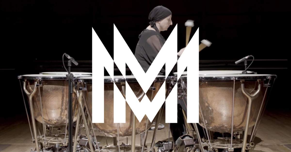
Milan Symphony Orchestra, one of Italy’s most important orchestras that has a deep emotional connection to the city, underwent a multi-sensory rebrand with Landor. The rebrand drew inspiration from Milan’s design, architecture, artworks, and art movements.
Ambra Redaelli, president of Orchestra Sinfonica di Milano, said the rebranding was targeted at young people. She explained that the rebrand projects the Milan Symphony Orchestra in an innovative and inclusive way. “This is thanks to the combination of elements such as the Duomo, which is the image of Milan – the word ‘Milan’ enclosed in its initial, and the color palette that recalls Futurism (a period of innovation like never before experienced).

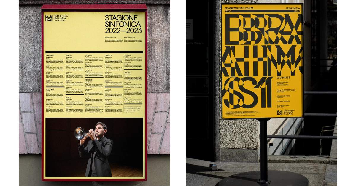
Landor refreshed Milan Symphony Orchestra’s communication strategy by embracing its deep ties with the city of Milan – under the theme ‘Growing Unptempo’. This resonates with Milan’s essence, the heart of music itself to make the brand more accessible to the wider audience. Landor also created a custom typeface TUMB TUMB, wherein it blended elements of classic Futura with architectural motifs from Milan’s Duomo, capturing Milan’s rich heritage injecting energy into the typography to reflect the orchestra’s diverse musical range.
Moreover, the brand’s color palette highlights Milan’s cultural diversity and creative energy. It allows the brand to expressively navigate various genres and Milan’s inclusive creative ethos. Landor also took up synesthesia for Milan Symphony Orchestra; synesthesia is a neurological phenomenon in which stimulation of one sensory pathway leads to automatic experiences in another sensory pathway. Basically synesthesia is when you hear music but see shapes, or hear a word and see a color.

In regards to the logo, it represents a sound wave generated from the M glyph – emulating the shapes of Milan’s Cathedral. Furthermore, a coordinated image and custom typography (capable of playing music) were developed in-house for a touch of contemporary demeanor to the identity.
Also Read: Mercado McCann’s Hotel La Argentina Bags Best of Show: NYF Advertising Awards 2024


