In a world where ethical and conscious living are becoming paramount, Kindred Black, the eco-conscious brand known for its handcrafted ‘slow beauty’ products, recently received a stunning visual makeover. This rebrand celebrates Kindred Black’s commitment to sustainability and unique, narrative-driven products. Let’s explore more about their new identity which encapsulates the brand’s ethos of slow beauty, rooted in culture and ritual, and its commitment to caring for the planet.
A Tribute to Apothecary Roots
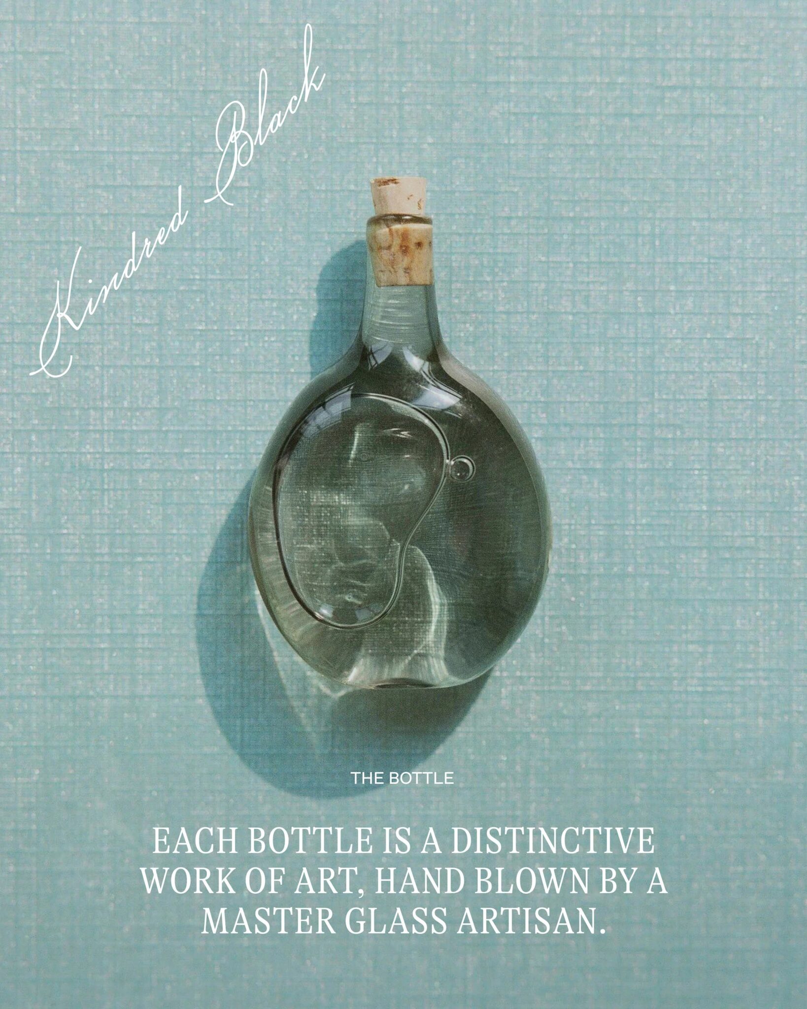
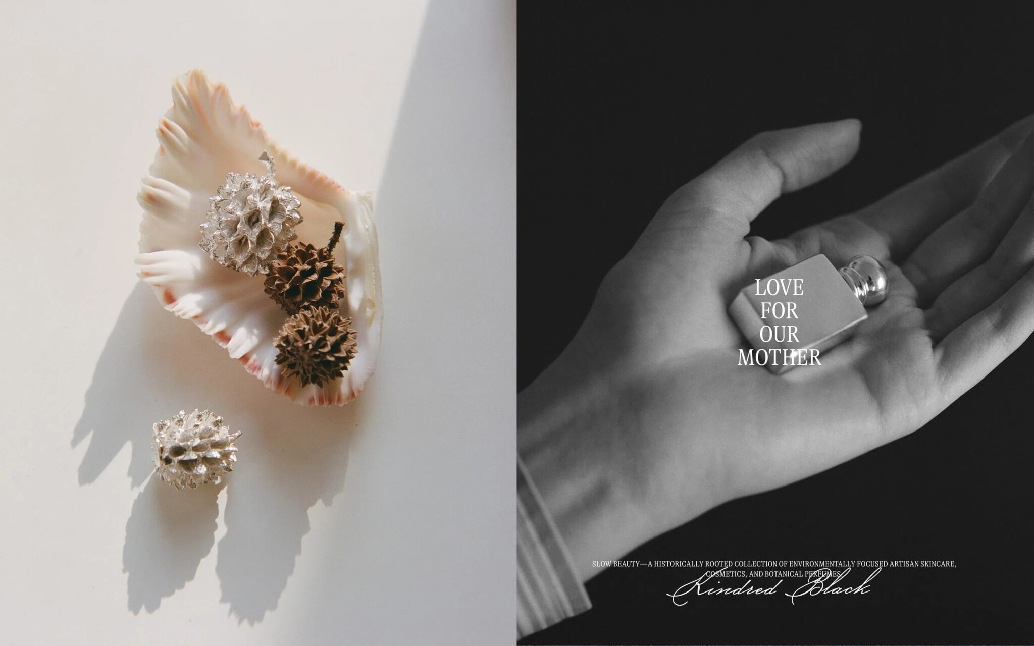
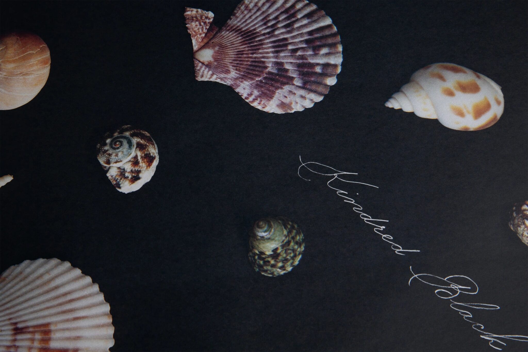
The new visual identity of Kindred Black, crafted by the multidisciplinary creative studio Ania et Lucie, pays homage to the old apothecary world while embracing modernity. The signature ‘Love for our Mother’ echoes the brand’s mission to nurture the planet while sharing products and rituals that transcend mere skincare. This echoes the brand’s profound mission to care for the planet and extend the narrative of products and rituals beyond mere skincare, resonating with different domains of life. Inspired by hand-addressed envelopes from the late 1800s, Ania and Lucie’s design approach has resulted in a delicate logotype and brand mark ‘KB’ that exude elegance and continuity, reflecting the brand’s commitment to timeless quality and sophistication.
Eco-Friendly Packaging Solutions
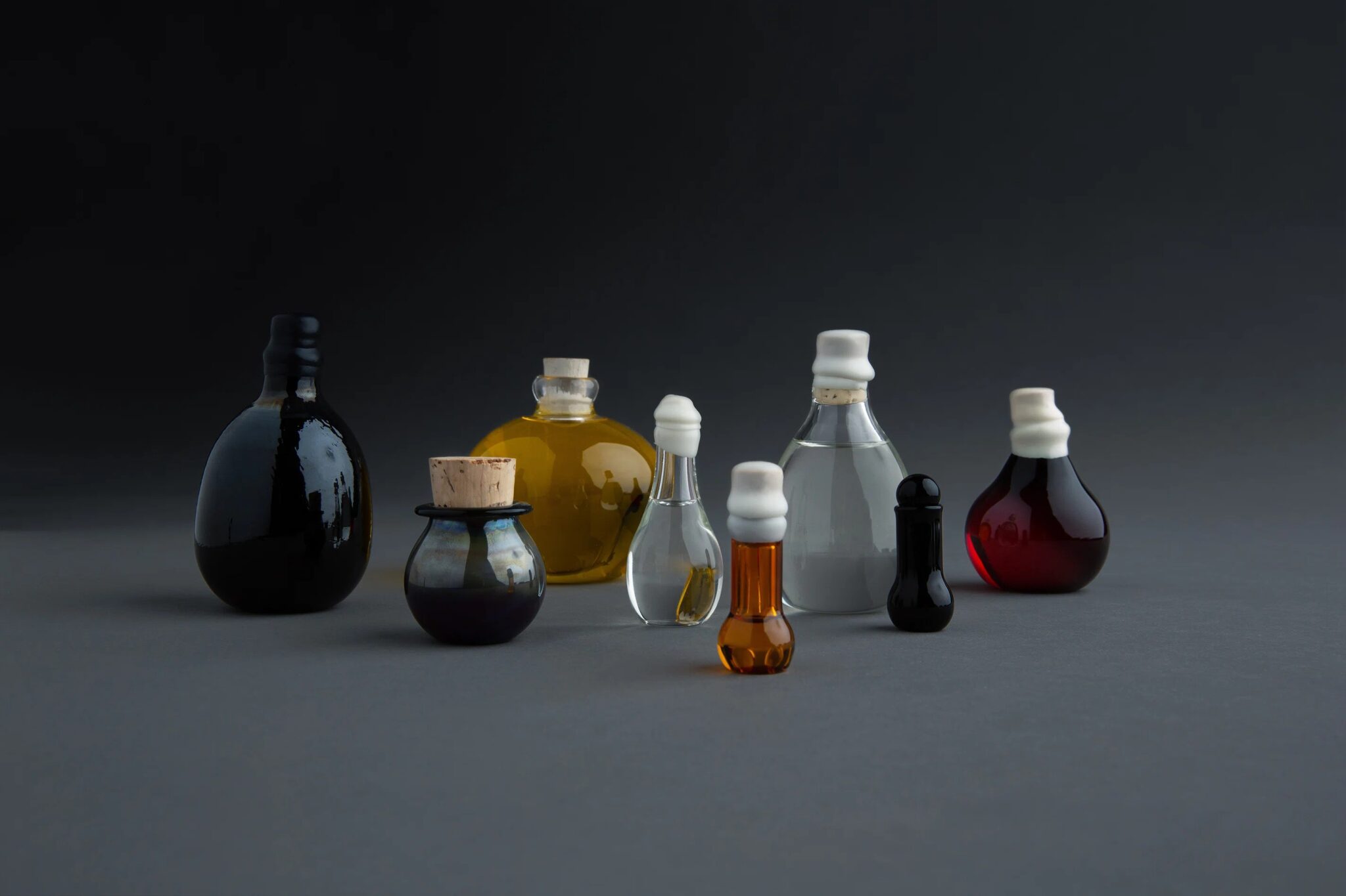
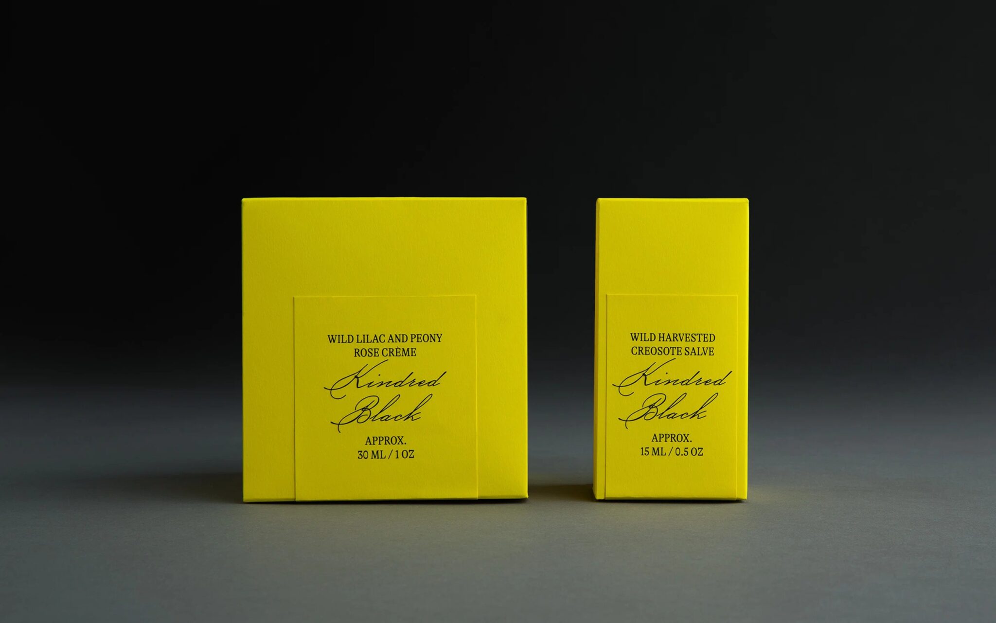
One of the biggest challenges for Ania and Lucie was designing packaging that could accommodate Kindred Black’s diverse product line. From tiny glass jars to larger vessels, the solution called for innovation. As a solution for housing their diverse range of 70 bespoke products, including a variety of hand-blown glass bottles, Kindred Black introduces an ingenious packaging system. These adjustable and reversible inserts accommodate everything from tiny jars to larger vessels within two box shapes. This sustainable approach, developed in collaboration with Imprimerie du Marais, reflects the brand’s commitment to reducing excess without sacrificing elegance.
A Palette of Purpose
The brand’s new color choice is a vibrant, radiant yellow that exudes warmth and modernity. This color reflects the thoughtfulness and ethical values that are integral to Kindred Black’s products. It’s a hue that commands attention and encourages interaction, harmonizing seamlessly with the brand’s overall mission and outlook.
Crafting Identity with Ania et Lucie
Ania Nowak and Lucie Gris of Ania et Lucie, based in the vibrant city of New York, have reached an impressive five-year milestone of showcasing their exceptional creativity. Their collaboration with Kindred Black has been nothing short of inspiring, as they have redefined the brand’s identity with their masterful and storytelling-driven design approach, perfectly capturing the essence of Kindred Black’s philosophy.
Final Thoughts
Through meaningful implementation of the brand’s message of reducing excess, the new visual identity and packaging solutions represent an elegant and streamlined system that propels Kindred Black forward in its mission as a sustainable and conscientious slow beauty brand. With this rebrand, Kindred Black has encapsulated the brand’s soul and the founders’ personalities. The visual identity and packaging solutions embody the essence of slow beauty, mindful living, and a deep reverence for nature, inviting consumers to embrace a more conscious approach to skincare and self-care.
Also Read: A Window into Sustainability and Style: Primark’s Refreshing Rebrand

