Aero, a company that specializes in sustainable paint and coating material technology for automotive, aerospace, and military applications, has recently refreshed their brand identity. Aero’s commitment to sustainability and innovation extends to its rebranding as well.
The new identity takes inspiration from Aero’s environmental advantages while incorporating new graphic elements inspired by science, technology, and data. Let’s get to know more about this rebranding and know it reflects the paint brand’s vision.
Sustainable Paint and Coating Technology for a Greener Future
For those who are unfamiliar, in collaboration with manufacturers, Aero delivers paint and materials that do not release microplastics, emit CO2 or Volatile Organic Compounds (VOCs), and do not require water usage. Moreover, Aero’s sustainable paints are lighter, resulting in less fuel consumption and greenhouse gas (GHG) emissions.
Aero’s sustainable technology revolutionizes the painting and coating industry by providing an eco-friendly alternative. Unlike traditional paint, Aero’s paints and coatings do not release microplastics, which pollute oceans and harm marine life. Additionally, Aero’s sustainable paints do not emit CO2 or VOCs, which contribute to air pollution and harm human health. By eliminating water usage in its manufacturing process, Aero also conserves a precious resource.
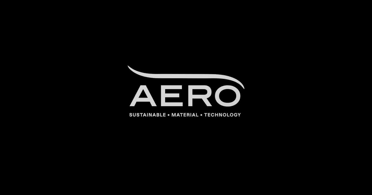
New Logo and Typography
Aero is revolutionizing the way we think about paint with its brand refresh in collaboration with UK-based Magpie Studio. Their rebranding of Aero is a perfect reflection of the company’s sustainable practices. The new branding incorporates graphic elements that communicate technical details quickly and efficiently while lending the Aero brand a high-tech character. The bright lime green color used in the rebrand is a nod to industrial safety colors and the environment. Icons reminiscent of data presentations are included throughout the new branding, adding a touch of science and technology to the overall design.
The updated typography gives the Aero logo a more modern, high-tech look, while retaining the wind tunnel-like swoop over the text. Graphics like molecule fragments, sprockets, and a rainy cloud replace letters on items like tote bags, making them instantly recognizable as belonging to the Aero brand. The amorphous text mesh used throughout the branding is an elegant backdrop that simulates a textured surface, adding depth and interest to the design. A striking feature of the Aero text mesh is that it bends and changes into rotating and moving shapes like a paint drop or sphere during animations.
The Big Picture
Aero’s sustainable paint technology is a true game-changer in the industry, and the company’s commitment to sustainability is inspiring. Magpie Studio’s rebranding of Aero perfectly captures the company’s environmental advantages while adding new graphic elements that reflect science, technology, and data. The new branding is a perfect representation of all these qualities of the brand coming together.