Sarson’s has added more bang to its Dip & Drizzle thanks to its new visual identity by Robot Food Studio. Dip & Drizzle is a versatile tangy condiment that consumers can put on anything in need of a kick.
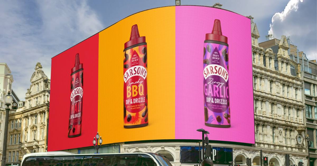
Food Studio has celebrated endless food possibilities by giving Sarson’s Dip & Drizzle that much-needed fun and energy. It took inspiration from burger bars and dinners. The agency created a bold ‘drip’ to act as a beacon on the shelf, along with a zingy color palette topped with expressive patterns.
Simon Foster, Robot Food founder and executive creative director, believes the new generation of consumers is more nostalgic than ever. “Sarson’s is up against some big names in the retail space, situated on-shelf between hot sauces and table sauces,” he said. “So we had to make sure the identity would really pop in-store and be irresistible to shoppers.”

Robot Food Studio Showcases Sarson’s Fluid
Robot Food used distinctive brand assets and clear taste descriptors to make the product seem too good to buy. The studio tapped into popular food trends. Its research revealed that consumers are reducing eating-out spending to recreate a restaurant experience at home.
Foster said premium condiments and dressings play a big role in making these home-cooked meals more special. He pointed out that three-quarters of consumers prefer versatile condiments. This created an opportunity for Sarson’s to highlight that Dip & Drizzle can be used in various ways to transform food.
Robot Food executive pointed out that visual codes associated with nourishment have changed – bright and bold colors no longer mean artificial. As such, the studio experimented with more radical colors and fonts to emulate nostalgia, escapism, and pleasure.
The Right Tang for Sarson’s
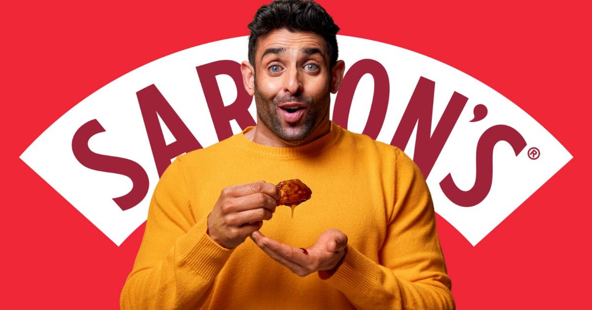
Robot Food designer Sam said they boosted fun and energy with bright colors and used close-up, crave-worthy photography to capture how Dip & Drizzle adds excitement to any eating occasion. “For the tone, we created rhythmic lines stuffed with sensory language, and brought them to life through dynamic type and the iconic Sarson’s arc,” he explained. “We created an omnichannel campaign to capture the moment where the tang hits – time slows down, color intensifies, and you can almost taste it in your ears!”
Client Director Jess said tang can be hard to explain but with Sarson’s team, they ran with the theme to celebrate tanginess in all its glory. “It’s not something you’ll be passive about, it’s flavor you can feel. The studio made Sarson’s synonymous with big flavor experiences heroing satisfyingly saucy food and playfully reactive facial expressions.
Also Read: Oh My Cat! SHEBA Goes 3D With Connected Screen Outdoor Campaign

