Asda, a prominent UK supermarket brand, has undergone a transformative visual and verbal identity update to set itself apart in a competitive market landscape. The revamp introduces a new design language and brand ethos aimed at elevating Asda’s presence in the lives of its 19 million daily customers. Let’s explore the key elements of Asda’s rebranding journey, from the evolution of its visual identity to the strategic considerations that underpin this bold transformation.
Unifying a Fragmented Brand Identity
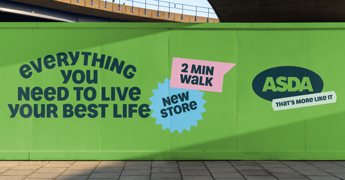
In a bold move to reinvigorate its brand identity, UK supermarket giant Asda has unveiled a comprehensive rebrand, courtesy of its advertising agency Havas London. As part of their ‘Serious About Summer’ campaign, with this strategic overhaul, Asda aims to create a more personable experience that unifies the brand’s fragmented evolution over the years.
Nathalie Gordon, creative partner at Havas London, emphasizes the importance of differentiating Asda from the competition while maintaining the brand’s customer-centric ethos, quality, and value. In her words, “Asda has become steadily ‘fragmented’ as it has evolved, and this rebrand seeks to unify the brand experience.” The rebranding process was a meticulous year-and-a-half-long endeavor, ensuring that the new identity serves as a springboard for creative work rather than a restrictive template. This meticulous approach aims to align strategy, creativity, design, and client ambition to manifest a clear and cohesive vision for Asda’s future, reflecting its commitment to customer satisfaction and brand integrity.
Designing Distinctiveness
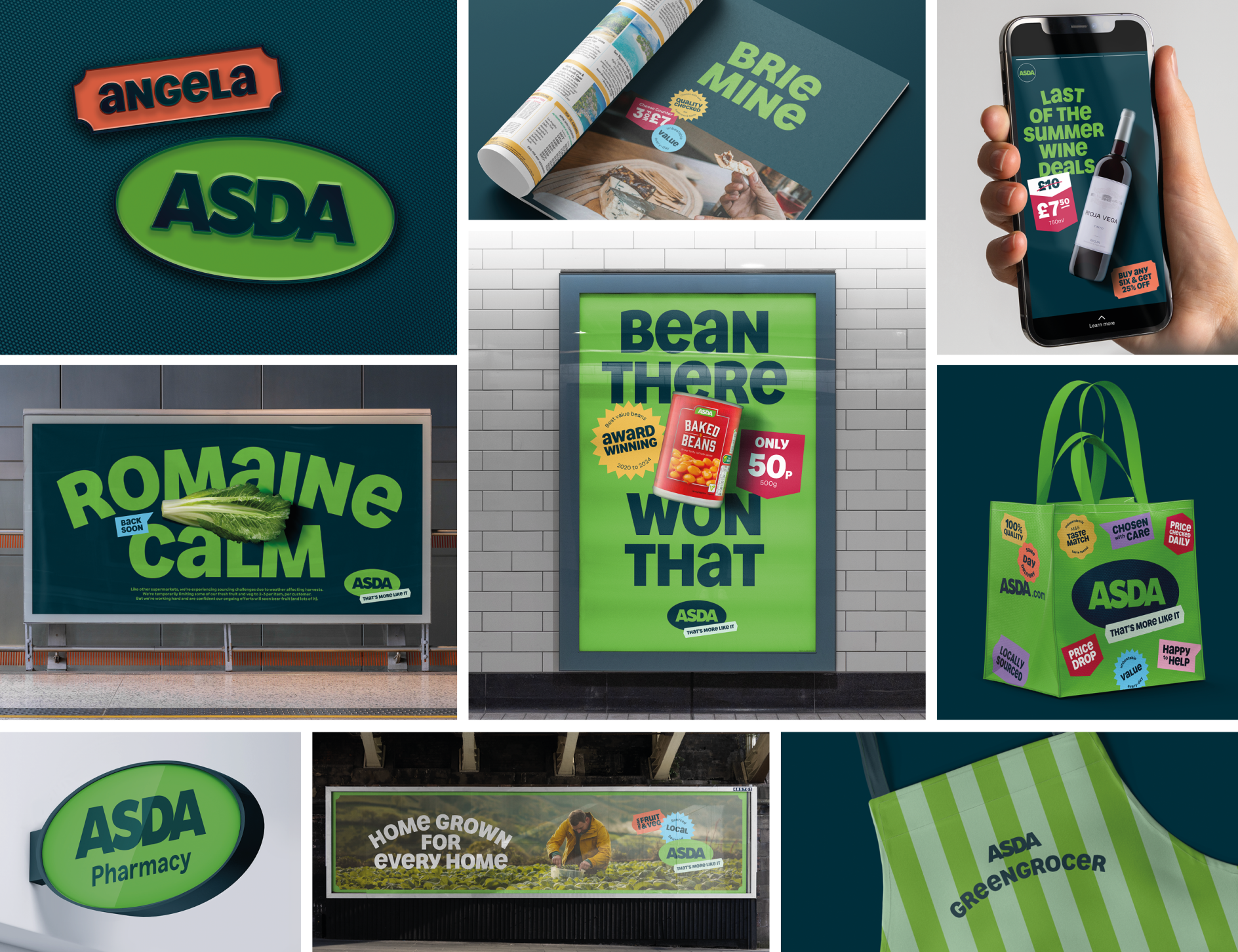
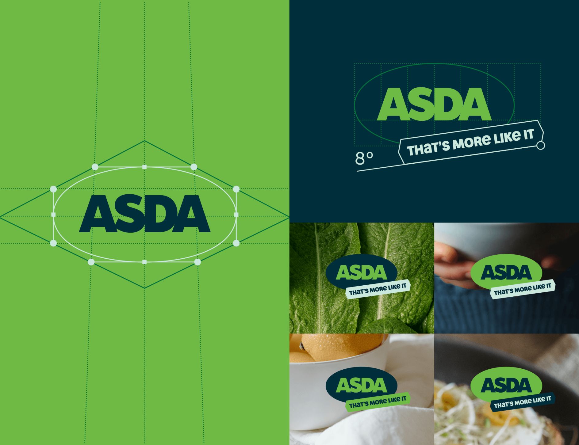
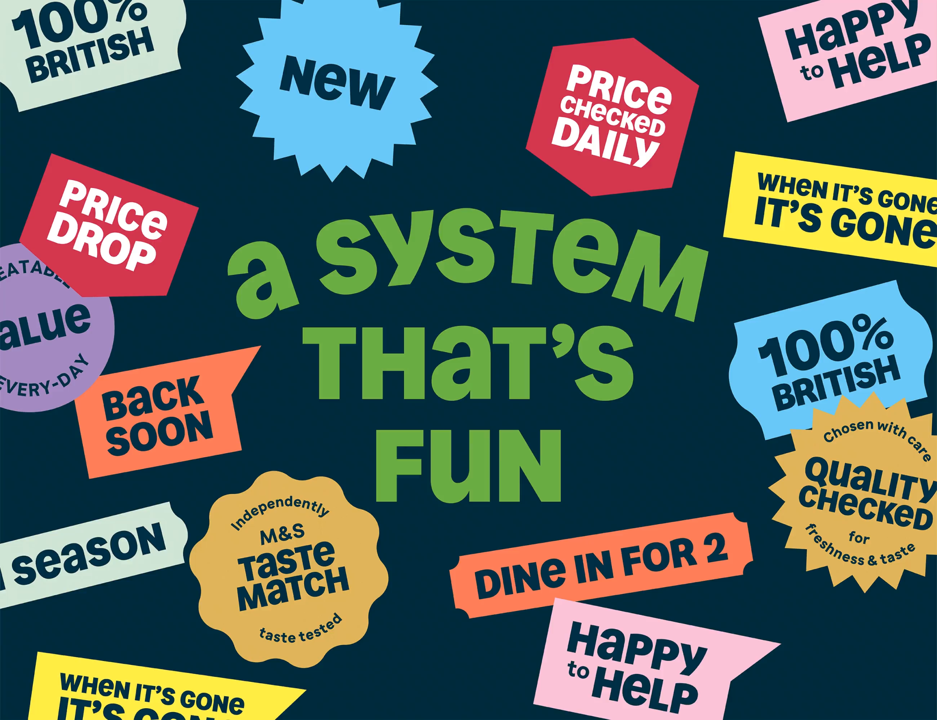
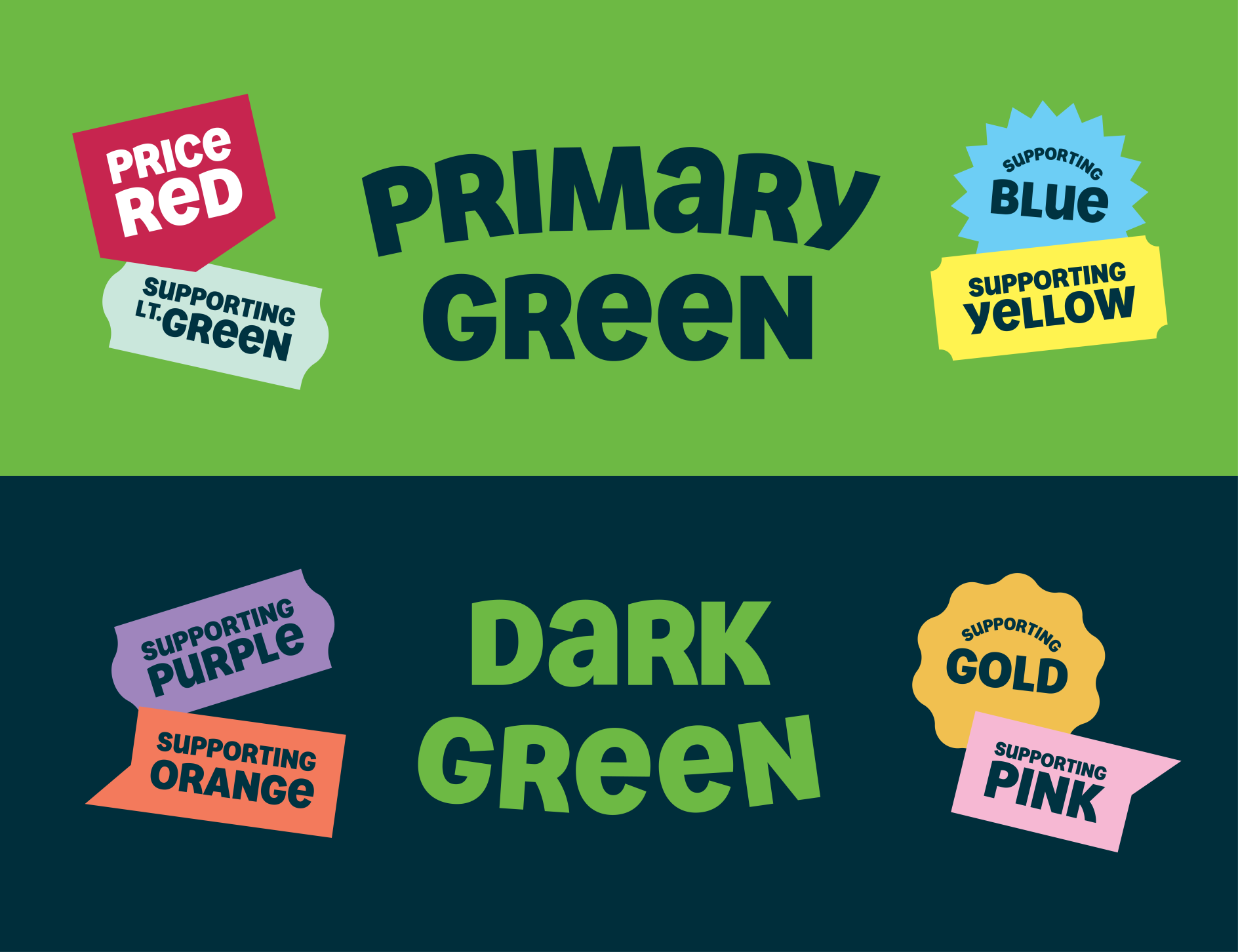
The updated visual identity for Asda retains its iconic wordmark and bright green brand color while introducing a deep green hue and a wider secondary color palette. Notably, the introduction of a new display typeface, developed in collaboration with type foundry Colophon, embodies an attention-grabbing all-caps treatment with unicase glyphs, infusing a conversational tone into the brand’s communication. This strategic design approach aims to reinforce Asda’s commitment to evolution while staying true to its roots, creating a cohesive and visually distinctive brand language that resonates with its diverse customer base.
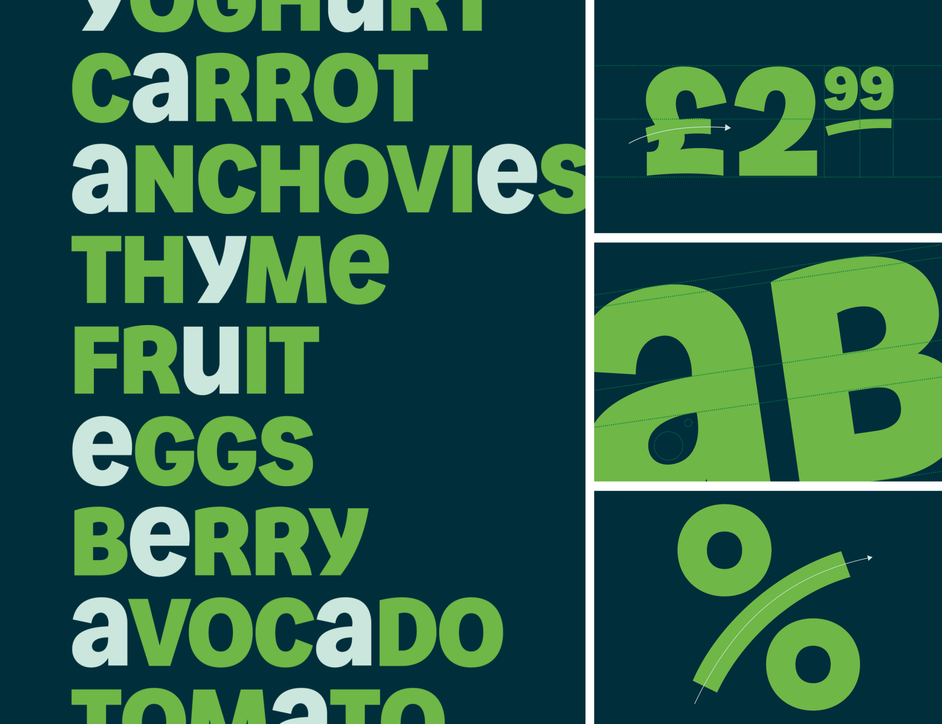
The Art of Typographic Storytelling
One of the most striking aspects of Asda’s rebrand is its unique typographic direction, developed in collaboration with Colophon. The lead display font, Asda Headline, is entirely unicase, blending the “beautiful cursive quality of lowercase into bold cap height prominence,” according to Lorenzo Fruzza, chief design officer at Havas. This typographic exploration also resulted in an open sans serif that incorporates the flares and swashes of traditional hand-painted grocer signage, paying homage to the brand’s roots while embracing a modern twist.
A Green Evolution
Asda’s iconic green hue has been a part of its DNA since the 1960s, and this rebrand ensures that this recognizable colour remains at the forefront. Havas addressed the challenges of hue and legibility by introducing a higher-contrasting single primary green and a dark green as a new secondary pairing. This evolution not only enhances brand recognition but also ensures better legibility across various channels.
Final Thoughts
As Asda embarks on its rebranding journey, the supermarket brand seeks to redefine the customer experience and position itself as a customer-centric, quality-driven, and value-oriented brand. The new identity, set to debut in the ‘Serious About Summer’ campaign, reflects Asda’s commitment to bringing its refreshed visual and verbal language to life. Through a strategic and creative partnership with Havas London, Asda aims to reinforce its market presence and resonate with customers in a rapidly evolving retail landscape. With a renewed focus on creating a more personable experience, Asda’s rebrand is a testament to the power of strategic design in connecting with modern consumers. By unifying its fragmented identity, embracing typographic storytelling, and evolving its iconic green hue, Asda has set the stage for a refreshing and engaging brand journey.
Also Read: Chatime Undergoes Brand Refresh, Boasts Updated Logo, Tagline and New Menu Choices