Kodak, established in 1888, is an imaging-based technology company. They have long been associated with manufacturing consumer cameras and films and waiting for a good number of days before the images could develop. Kodak also has a line of print systems and other enterprise solutions which serve at professional and business levels. Currently, Kodak provides packaging, functional printing, graphic communications, and professional services for businesses around the world. Its core segments are Print Systems, Enterprise Inkjet Systems, Micro 3D Printing and Packaging, Software and Solutions, and Consumer and Film.

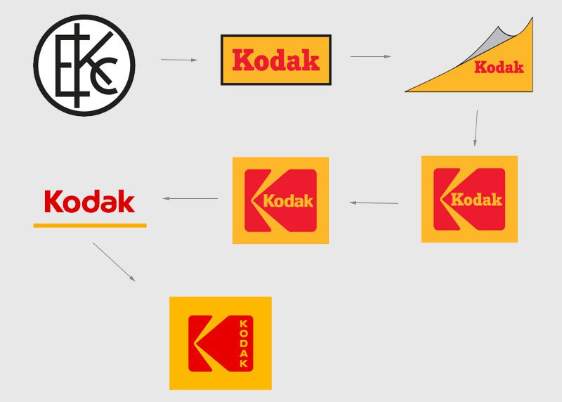
Recently, when Kodak decided on getting back to the consumer market, Kodak released Ektra, a photography-first smartphone, at the CES announced the return of Super 8 film and camera. And with this return, Kodak re-instated its past iconic ‘K’ logo with a typography and identity update, to come out as a more general consumer brand.
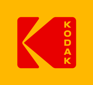
Kodak’s rebranding after a decade comes with a logo reminiscent of the red and yellow insignia, used originally by Kodak in 1970-80’s. The refreshed logo showcases the red K symbol against the warm yellow backdrop, just that, now the letters run down vertically than horizontally, as was done previously.

The same iconic K in warm yellow, red and black colors that are deeply rooted in the company let the space for the past rich brand identity to remain. This works very well for the company as the logo that people have recognized for so long stays and the bond between the people and the brand remains intact.
This logo comes out fresh, looks classic, and settles well with the past logos. Kodak takes this step very carefully (and successfully) to intensify on the logo that is resonant around the world.
Here, Kodak just set a perfect example of reviving the brand’s identity and vision through design.


