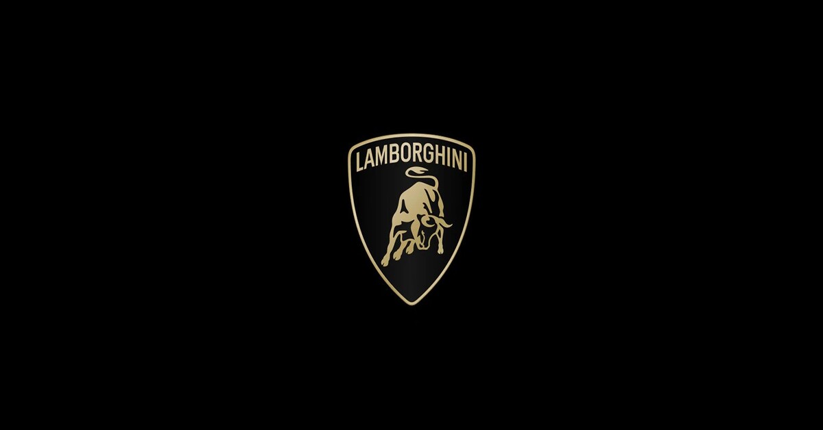
Italian luxury sports car brand Lamborghini has refreshed its logo after more than two decades since the last update. The brand’s visual expression better reflects the ‘brave’, ‘unexpected’, and ‘authentic’ values of its mission – Driving Humans Beyond.

This is part of the broad transformation process denoted Direzione Cor Tauri, the strategy that embodies Lamborghini’s new trajectory focused on sustainability and decarbonization. The brand wants to create a solid pact with future generations, serving as an inspiration and model for innovation and sustainable progress.
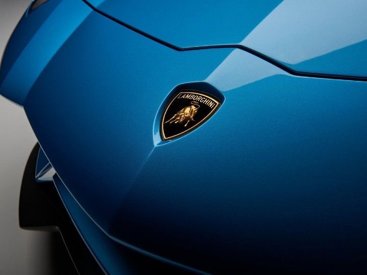
According to the official statement, Lamborghini’s new logo is redefined by a broader Lamborghini typeface than its predecessor and by colors that are minimal yet bold. The black and white are reconfirmed as the primary hues, symbolizing the clear identity of the brand, while yellow, and the introduction of the gold color are used as the accent color. The revamped version of the logo is an integral part of the company’s distinctive identity. It will also be applied to future cars.

The iconic bull in the center of the logo has undergone a major transformation and for the first time, it will exist individually on the company’s digital touchpoints, separated from the classic shield to lend it even greater prominence. The changes extend to all manifestations of the brand. Moreover, an official Automobili Lamborghini typeface has been created. It reflects the unmistakable lines and angularity of the cars, in line with the style and design of the Sant Agata Bolognese-based company.
The redesign also includes a new set of icons, which have been developed in collaboration with Lamborghini Centro Stile. It will be used and shared uniformly across all the digital touchpoints. Automobili Lamborghini looks to the future with a redesigned logo that embodies innovation and determination, marking a new phase in the company’s positioning.
Also Read: Walmart Targets Gen Z and Millennials with New Oral Care Brands Plus Ultra and Zimba


