The global skincare market is witnessing a surge in products specifically aimed at protecting the skin. Urban Kind, a Swedish skincare brand, has embraced this trend with a unique approach to shielding the skin from daily pollutants. Backed by a team of leading chemists and dermatologists, Urban Kind’s self-care products prioritize protection, authenticity, and natural aesthetics, setting the stage for a transformative skincare experience. Let’s delve into Urban Kind’s unique approach to shielding the skin from daily pollutants and how its brand identity reflects Nordic ancestry and democratic values.
The Battle Against Urban Skin Stressors
In today’s bustling urban environment, our skin faces constant challenges from various sources such as air pollution, changing levels of humidity, stress, screen radiation, and lifestyle factors like alcohol consumption. Conventional sunscreens may not provide sufficient protection against these daily aggressors. To tackle this, Urban Kind has developed a range of skincare products specifically tailored to address these modern-day challenges, providing an extra layer of defense that is currently lacking in our skincare routines.
A Fusion of Nature, Nordicity, and Democratic Values
To create a brand identity that resonates with urban dwellers worldwide, Urban Kind founder Peter Ternström enlisted the expertise of the Scandinavian studio Everland. The final design effortlessly incorporates elements inspired by the natural beauty of the Nordic region. It pays homage to the brand’s roots, embracing its heritage and embodying its core values of openness, integrity, and inclusivity.
A Shield for Every Skin
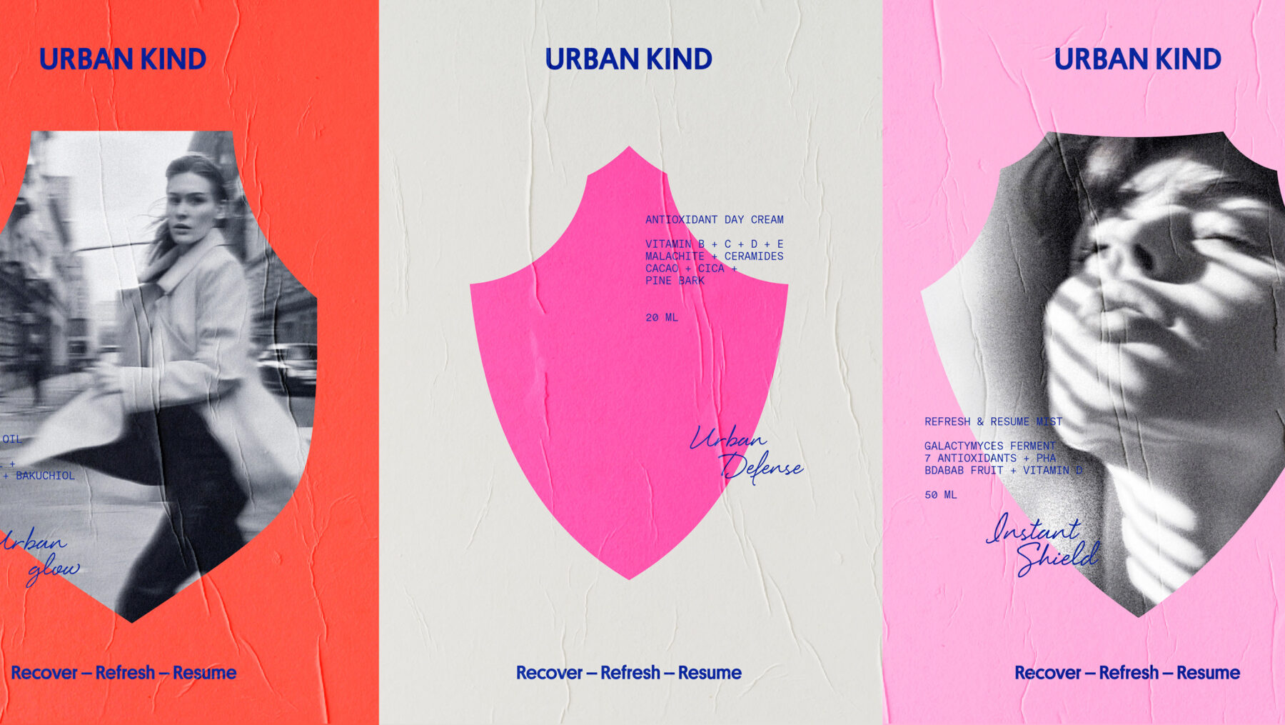
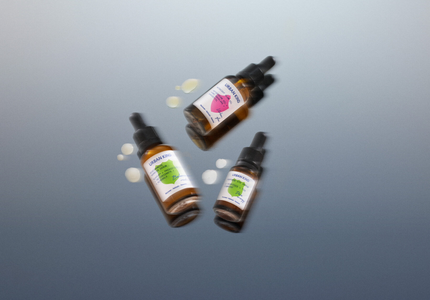
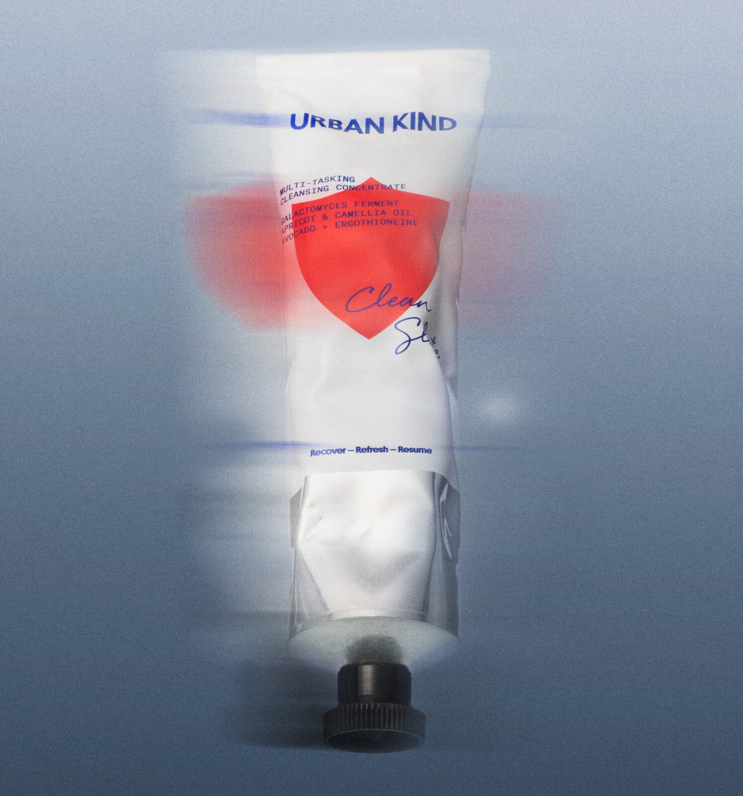
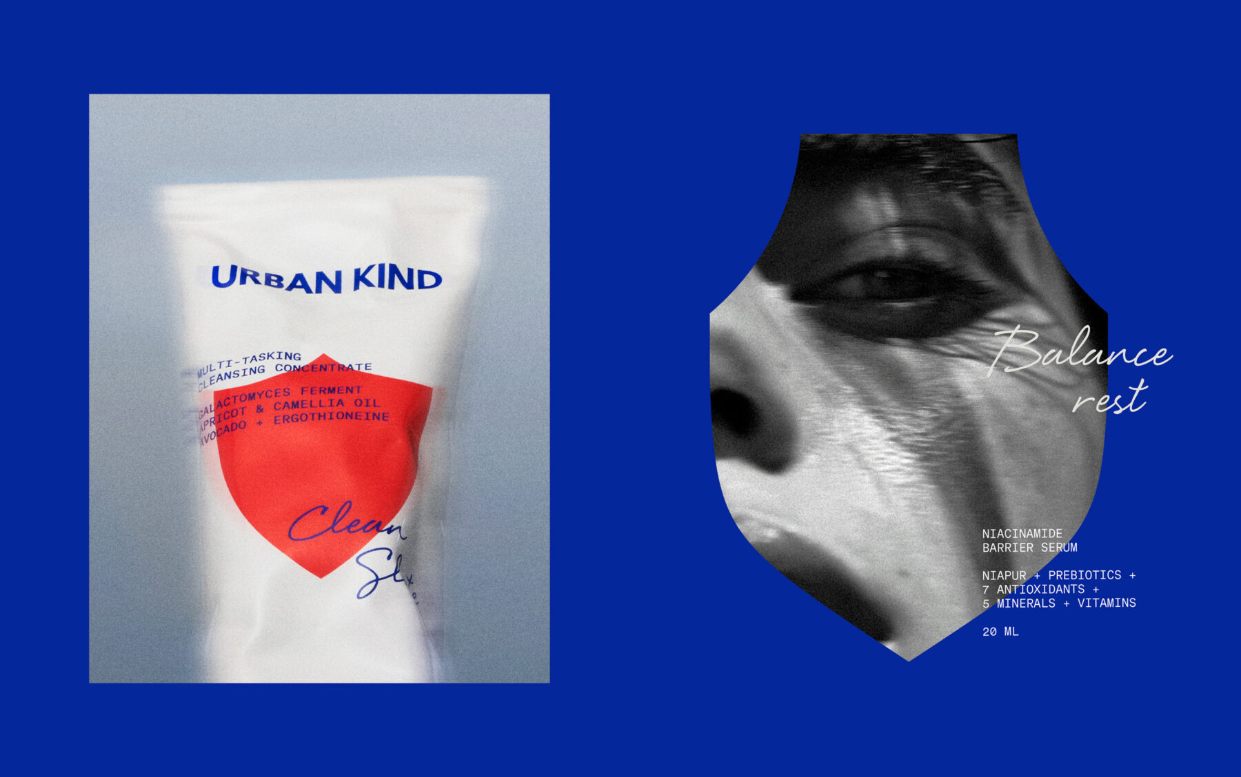
To visually convey Urban Kind’s protective qualities, the design team identified a shield as a universal icon that transcends cultures. This distinctive asset not only catches the eye on the shelf but also aids users in navigating the skincare range. Everland’s creative vision brought forth a universal symbol of protection—the shield—to represent Urban Kind’s commitment to safeguarding skin. Each product is distinguished by a unique shield shape and color, aligning with the notion that routines are essential for optimal skincare – from preparing the skin for the day to settling in for the night.
Elevating Urban Kind’s Shelf Presence
The packaging design adopts a simplistic approach, allowing the expressive and saturated color palette of the shields to stand out. This dramatic, expressive, and saturated color palette for the shields color choice by Everland not only bolsters the brand’s shelf presence but also creates a cohesive identity across all touchpoints, from social media to out-of-home advertising. The elegant and shiny nature of the brand reflects its ambition and vision, setting the stage for Urban Kind to expand its reach to cities worldwide.

Final Thoughts
Urban Kind’s transformative rebrand pioneers a holistic approach to skincare, offering a comprehensive vegan, cruelty-free lineup that serves as an impenetrable shield against urban pollutants. The brand’s visionary design seamlessly intertwines natural aesthetics, Nordic heritage, and democratic values, with the iconic shield emblem commanding attention on shelves. This audacious fusion of scientific rigor, ethical consciousness, and Scandinavian sophistication positions Urban Kind as a vanguard in sustainable beauty.
Also Read: Less Waste, More Wow: Kindred Black’s Sustainable Rebrand


