Protergia, the largest privately owned energy company in Greece has undergone a ‘sunny’ rebrand focusing on warmth and optimism. Protergia’s new brand identity aims to position itself as the ultimate ‘customer champion’. Let’s delve into the main elements of the rebrand, from the sun-inspired design to the introduction of the brand character and highlight the company’s commitment to delivering a positive and vibrant customer experience.

A Sun Inspired Rebrand
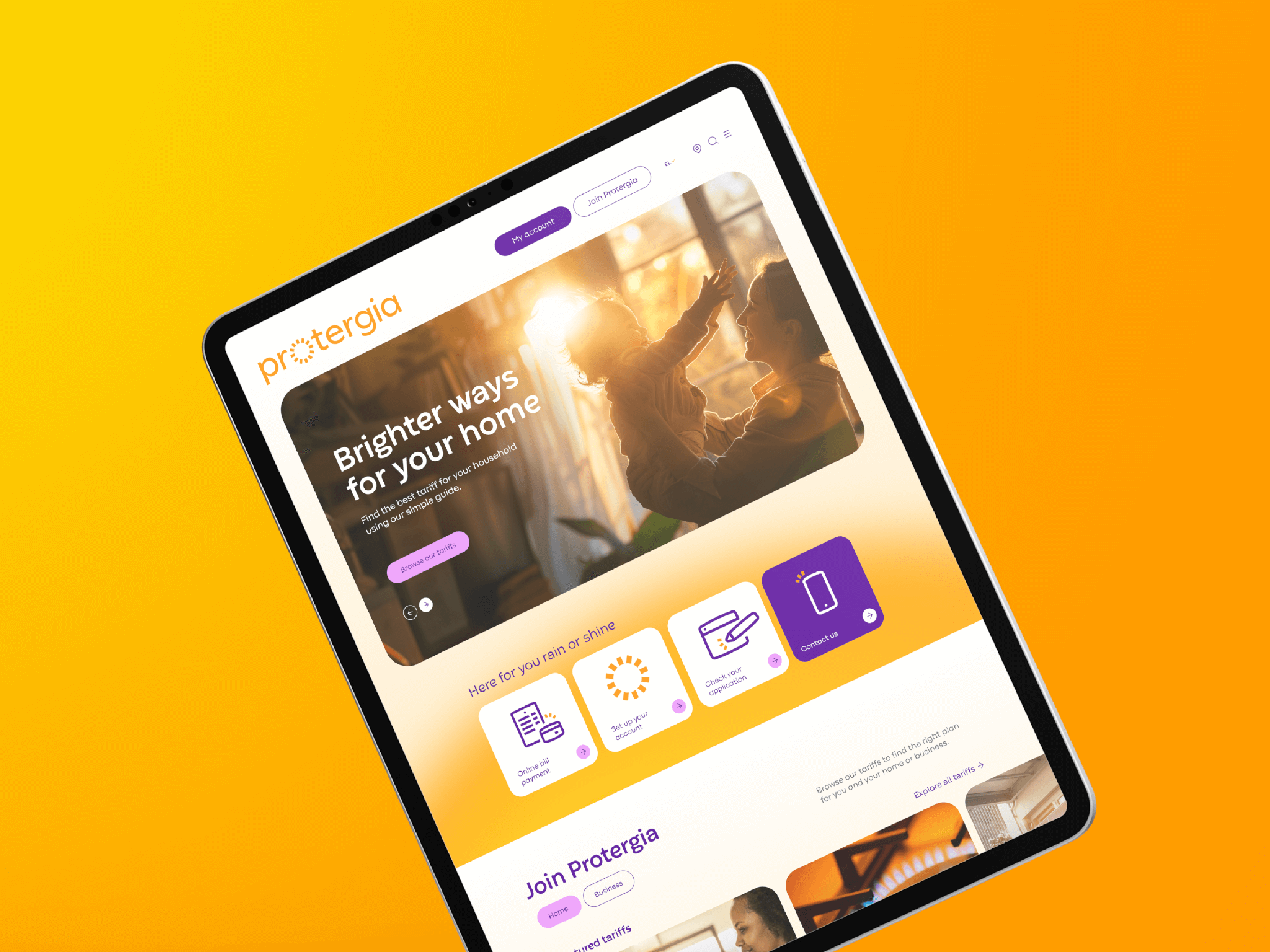
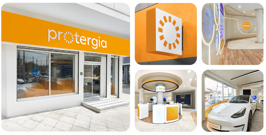
Protergia’s rebrand, created in collaboration with design agency SomeOne, draws inspiration from the sun, symbolizing vibrancy and brightness. Just like the sun generates energy, Protergia aims to power homes and businesses across Greece. The sun metaphor not only reflects the company’s optimism but also its ability to produce sustainable energy. This sun-inspired graphic device is incorporated into the revised logo, color palette, iconography, and photography, creating a cohesive visual identity that exudes positivity and sets Protergia apart from other energy companies.
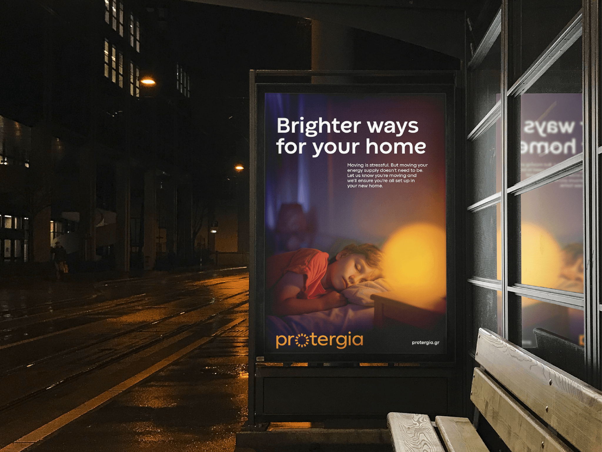
Protergia’s revised logo seamlessly incorporates the sun as a graphic interpretation. It’s warm orange hue boldly distinguishes it from the typical blue-centric energy companies. This vibrant logo encapsulates Protergia’s mission—to brighten lives and power progress.
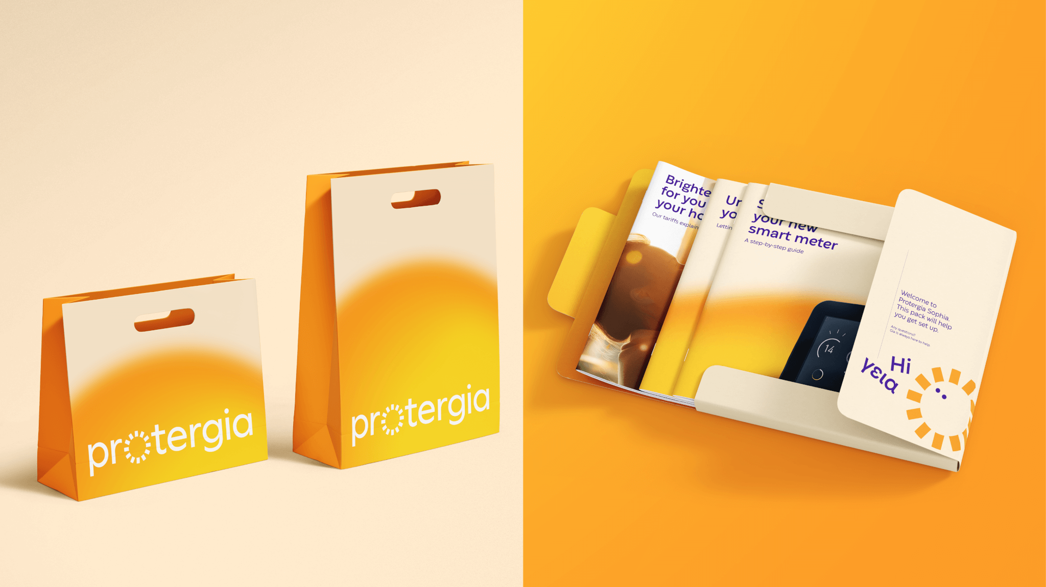
Orange dominates the new color palette, evoking feelings of energy, enthusiasm, and positivity. Say farewell to the mundane blues—Protergia’s brand colors now mirror the sun’s radiance, infusing warmth into their identity. The wordmark proudly features the ‘Codec Warm’ font. Its friendly and approachable style feels as though the letters themselves are basking in sunlight, reinforcing Protergia’s sunny disposition. Protergia’s photography aims to capture positivity. Whether it’s sun-kissed landscapes or smiling faces, each image aligns with the sun motif. Brightness and warmth permeate every shot.

Bringing Warmth to Customer Interactions
To enhance the customer experience and add a personal touch, SomeOne introduces brand character Gia. Phonetically pronounced like “hi” in Greek (γεια), Gia takes the shape of the sun and can be found in Protergia’s chatbots and app. By incorporating this friendly and personable character, Protergia aims to connect with customers on a deeper level, making their energy journey more engaging and enjoyable.
Fi Casey, design director at SomeOne, underscored the importance of embodying positivity and warmth in every element of the new identity. From the choice of a warm and personable typeface to the distinctive sun asset, each component was carefully considered to reflect Protergia’s strategic vision.
The reimagined brand was officially unveiled at the Protergia Brand Launch event held at the Port of Athens, marking a new chapter in the company’s journey to illuminate the Greek energy market with its customer-centric approach.
Final Thoughts
Protergia’s rebranding efforts, in collaboration with SomeOne, have successfully brought warmth and optimism to the forefront of the company’s identity. With the sun-inspired design elements, vibrant orange logo, and photography that captures positivity, Protergia aims to position itself as the ultimate ‘customer champion’. The introduction of brand character Gia adds a personal touch, enhancing the customer experience and fostering a deeper connection. By officially launching the rebrand at the Protergia Brand Launch, the company showcases its commitment to delivering a bright and energizing experience for its customers.
Also Read: Verizon Introduces Netflix-like Logo in Biggest Brand Refresh in More Than Two Decades


