Veeps, is a streaming service offering access to live and on-demand concerts and events from around the globe. With a respected roster and a high-quality product poised for growth, Veeps needed a brand that would position it as a leader in the entertainment industry. This resulted in them opting for a wholesome rebrand. Let’s explore the key elements of Veeps’ rebranding, including its bespoke wordmark, vibrant brand colors, and innovative typography choices.
A Punchy Logo Inspired by Music Editorial
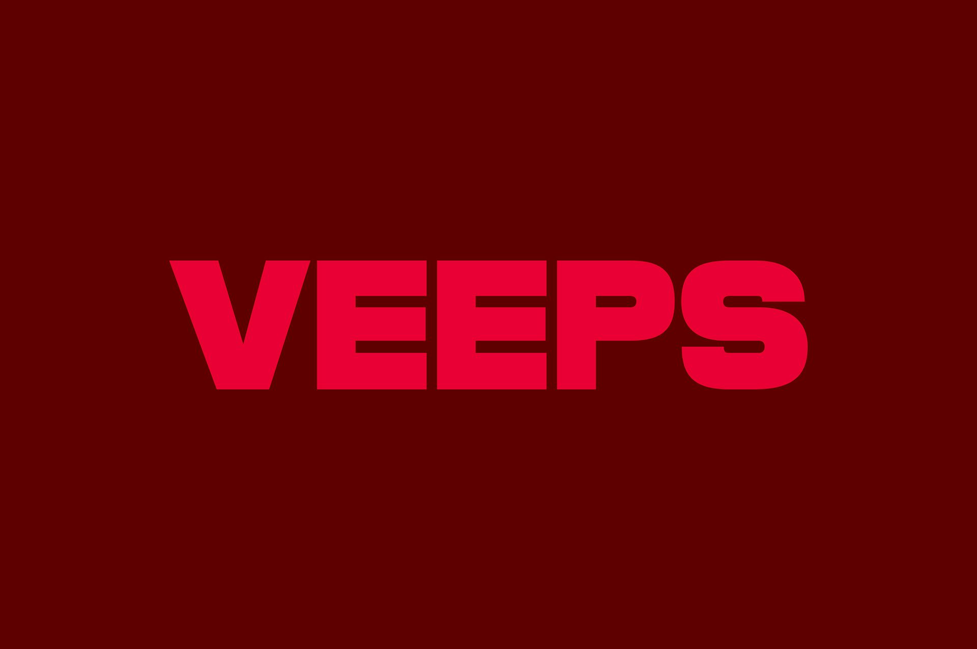
Partnering with renowned New York-based design agency Porto Rocha, Veeps, crafted a digitally native identity system that positions Veeps as an entertainment leader. Porto Rocha’s design team started out by creating a bespoke wordmark that echoes music editorial flair—a strong, punchy logo for Veeps, one that leaves an indelible mark, leaving a lasting impression on viewers in both its full form and its simplified ‘V’ version, used for memorable signoffs.
Energizing Brand Colors
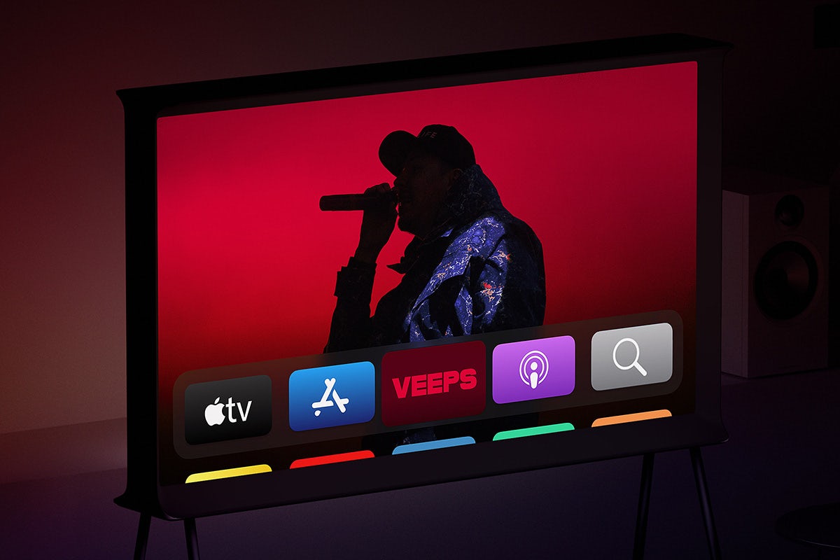
To inject energy into Veeps’ previously black-and-white brand, Porto Rocha selected bright scarlet and deep crimson as the signature hues. These vibrant colors not only bring life to the brand but also pay homage to the red live indicator. By departing from the previous neutral approach, Veeps transforms its online presence into a visually captivating platform that aligns with its world-class product offerings.
Innovative Typography Choices for a Bold Aesthetic
With rapid growth and future expansion in mind, Veeps recognized the need to rethink its brand’s look and feel. The previous neutral identity, common among tech brands, no longer served its purpose. To ensure a bold path forward, Porto Rocha focused on typography as a key touchpoint. They designed a custom display typeface called Veeps Ruder Plakat, which serves as the centerpiece of the brand. This adaptable font strikes a balance between personality and neutrality, making it suitable for a wide range of music genres and artists. It allows the individual expressions of artists to shine through without detracting from the overall aesthetic. Saans by Displaay Type Foundry also comes into play as a supporting typeface, with its precise and utilitarian forms complementing Veeps’ overall visual language.
Final Thoughts
Veeps’ collaboration with Porto Rocha has resulted in a bold and captivating brand identity that positions the streaming service as a leader in the livestream entertainment industry. The bespoke wordmark, vibrant brand colors, and innovative typography choices reflect Veeps’ commitment to delivering high-quality livestream and on-demand experiences to music enthusiasts worldwide. As Veeps continues to grow, its reimagined brand identity will serve as a powerful foundation for its future endeavors.
Also Read: Mother Design Does Guerilla-style Sticker Campaign for Netflix Comedy Festival 2024