Pienso is an innovative AI company dedicated to democratizing artificial intelligence and making it accessible to a wider audience. Recently, Pienso unveiled a striking rebrand, drawing inspiration from the Bauhaus movement. Let’s explore the key elements of Pienso’s new identity, including its vibrant design and user-centric approach, and discover what the rebrand signifies and what we can expect from this transformation.
A Design Revolution
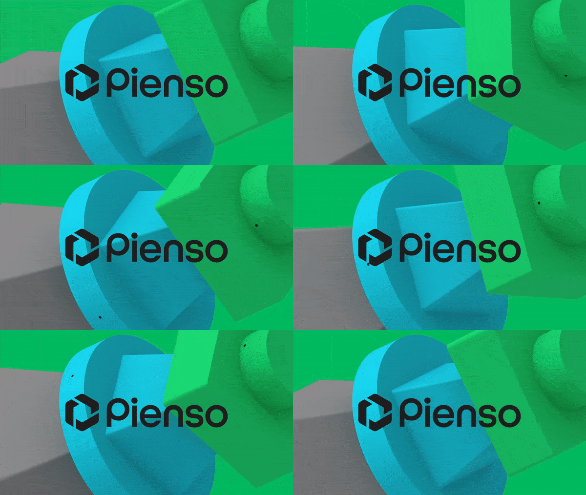
Pienso, in collaboration with award-winning design firm Pentagram, has drawn inspiration from the Bauhaus movement, renowned for its emphasis on simplicity and functionality. The new visual identity employs vibrant geometric shapes that not only evoke nostalgia but also serve a practical purpose. Each element symbolizes a feature of Pienso’s software, effectively demystifying the complexities of AI and presenting it in a user-friendly manner. This innovative approach transforms the intricate and often intimidating realm of artificial intelligence into an engaging and accessible experience, akin to assembling a sophisticated puzzle rather than grappling with a black box of technology.

A New Persona for AI
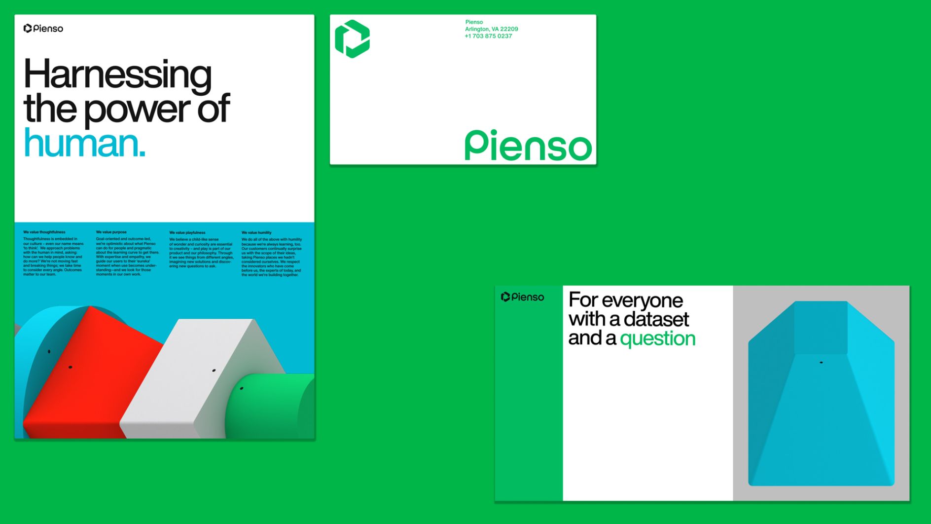
In this rebranding initiative, Pienso introduces the ‘Optimistic Navigator’, a persona designed to resonate with users on a personal level. This character embodies a supportive guide in the often overwhelming landscape of AI, emphasizing empowerment rather than replacement. Pienso aims to demystify AI, making it accessible to individuals without advanced technical backgrounds. By adopting this optimistic narrative, Pienso positions itself as a refreshing alternative in an industry often characterized by complexity and fear. This approach is not only engaging but also fosters a sense of excitement around the potential of AI technology.
A Typography That Communicates
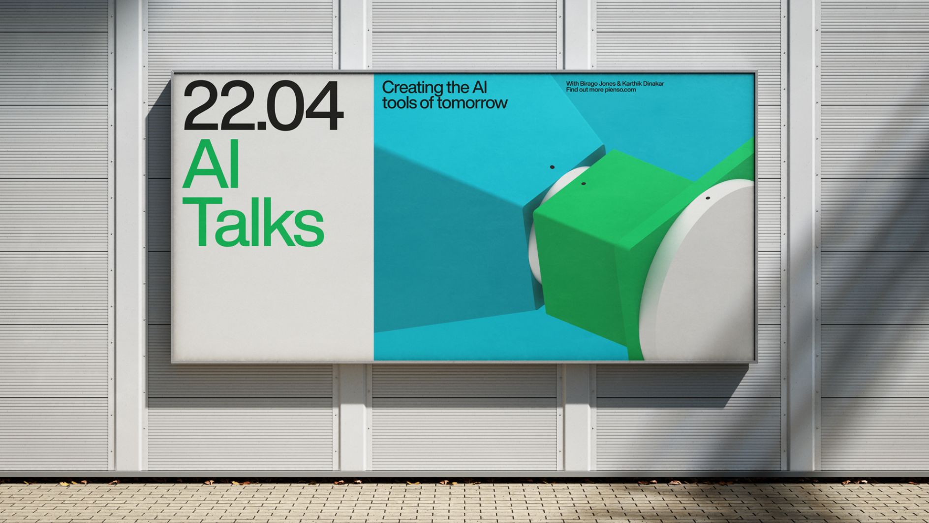
The choice of typography in Pienso’s rebrand is equally noteworthy. Featuring Helvetica Now, a modern evolution of the classic Helvetica typeface, the design exudes clarity and sophistication. This selection aligns with Pienso’s commitment to blending functionality with aesthetic appeal, thereby enhancing the overall user experience.The typography serves not merely as a decorative element but as an integral part of Pienso’s identity, reflecting the modernist principles that inspired the founders during their academic pursuits at MIT.

Redefining Tech Aesthetics
Pienso’s rebranding also embraces a vibrant color palette that departs from the traditional sterile blue and gray tones often associated with technology. Inspired by the bold works of design pioneers Muriel Cooper and Jacqueline Casey, this lively color scheme invites users to engage with Pienso’s offerings. The strategic use of black and white creates a visually striking backdrop, allowing the colors to stand out and ensuring that Pienso’s message of accessibility and innovation resonates clearly within a competitive digital landscape.

AI for Everyone
Pienso’s rebranding effort goes beyond aesthetics, representing a commitment to making AI technology accessible to all. The company presents advanced tools in an inviting and intuitive way, empowering individuals from diverse backgrounds to tap into AI’s potential. In a world where technology often feels exclusive, Pienso’s approach shines as a beacon of hope. They’re not just revolutionizing the game – they’re opening it up to everyone. This rebrand, inspired by Bauhaus principles, showcases design’s critical role in making technology both accessible and appealing. It sets a new benchmark for AI branding’s future.
Also Read: Brand Spotlight: How Rabbit R1 is Setting New Standards in AI Technology?
