Crusha, a popular milkshake brand which has a 70-decade legacy, has adopted a retro new brand identity, mixing the 50s Americana with a modern touch. It celebrates the past and present, which gives the brand a distinct stylish flavor.
Crusha partnered with Outlaw, a Bristol-based design agency, for the new look. The playful illustration, fresh typography and revamped mascot also give nostalgic vibes. Alex Rexworthy, Design Director at Outlaw, said the rebrand took inspiration from its roots which date back to the 1950s. It embodies a classic retro diner aesthetic that points to its origins. “The new look and feel boldly leverages visual codes such as milkshake silhouettes, stripy straws, and red cheeks,” he explained. “By imagining the supermarket shelf as a bar at the dinner we are able to create fun brand blocking that disrupts a somewhat quiet aisle.”
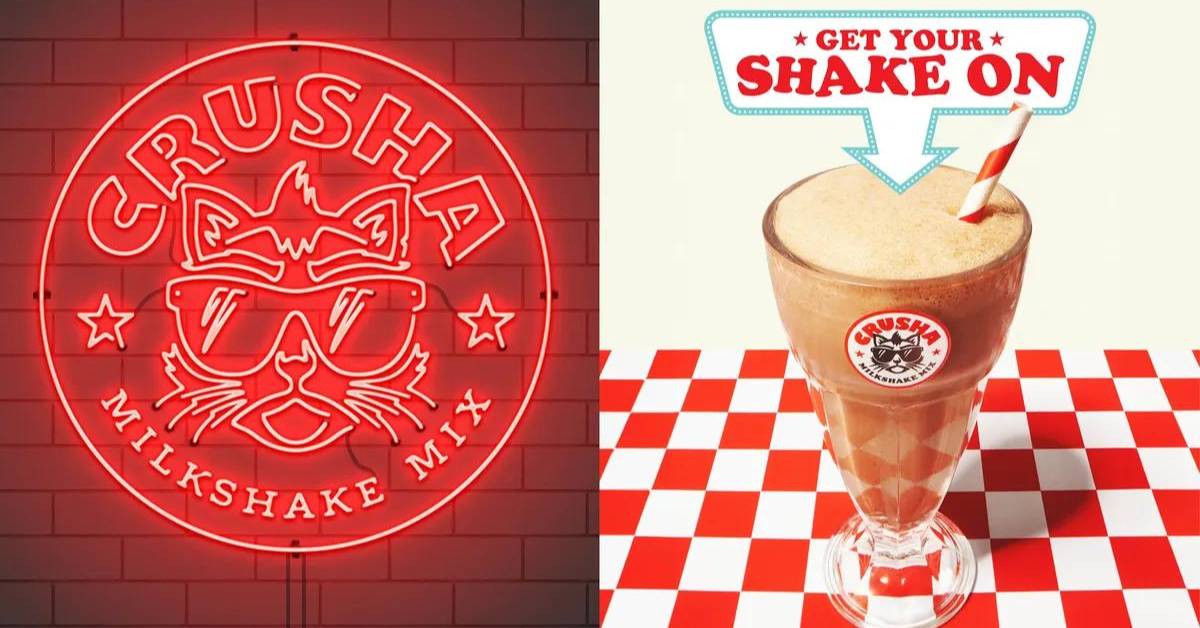
Rexworthy highlighted the brand’s reimaginged visual motifs of Errol – Crusha’s feline mascot. He said Errol had become too soft, infantile and playful in recent years. It transformed into a new, punchier design. “To achieve Errol’s irreverent personality we were inspired by simple bold tattoo design. Small details in the illustration, such as the nick out of the ear, the shape of the eyebrows, and the Mohawk all add up to a mascot that demands authority on the shelf.”
Moreover, the new identity is neutralized by the playful touch points, giving an extra layer of personality to the brand. The Outlaw executive believes the varsity jacket is a great touch point for Crusha. “It’s a timeless piece of fashion that cues classic Americana. Combined with the Crusha roller skates you can start to see the versatility of the brand world.”

Rexworthy shared that creating taste cues on the pack was the most challenging part of the design. He said it can be tricky to represent the flavor profiles in an original way that aligns with the brand. Outlaw explored photography fruit, chocolate and milk. But Rexworthy said the end result didn’t feel as progressive as the brand identity. “We landed on a tasty illustration style for the glass, showcasing bubbles and thick wispy colorful lines in an abstract way showing the product mixing with the milk.”
Also Read: Lotus Biscoff Takes Up New Distinct Brand Identity
