Honda flipped its logo for Acura, a luxury car brand, to target sophisticated and international consumers. The Acura was launched in 1986 by Honda to sell premium range cars in the U.S. Its logo, which looks like a stylized letter ‘A’, can also be seen as a stylized ‘H’ character that refers to Honda. The emblem focuses attention on the streamlined shape and high ground clearance.

The brand says its logo is derived from the caliper a precise design tool representing the meticulous attention to detail that goes into every Acura. The Japanese carmaker described it as the perfect symbol to communicate Precision Crafted Performance, and the company’s promise to aspire to a level of precision that’s never been achieved in the industry, or anywhere else.

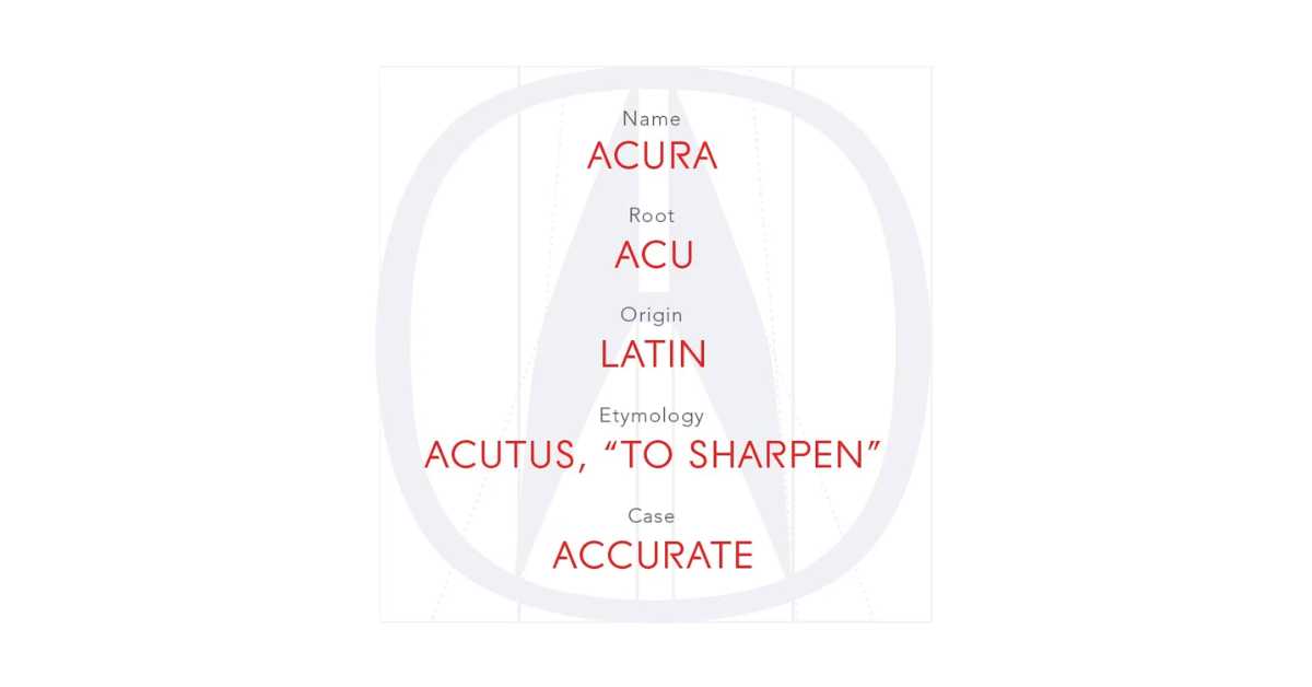
According to Logos-World, ‘Acu’ in Acura means accurate and the second part ‘ra’ doesn’t make much sense but seems to simply the pronunciation. Acura, as a brand, stands out for its precise and accurate approach to production.
Moreover, it’s a clever marketing trick to attract customers. Experts say the logo pushes the limits of imagination and creativity, and engages the onlooker, making the emblem evocative imagery.


