Lyle’s Golden Syrup, a beloved fixture in British households for over a century, has bid farewell to its iconic logo—a lion’s carcass swarmed by bees—and welcomed a brighter, more animated version of the regal beast. This significant rebranding marks the first major overhaul for the company since 1883, signaling a departure from tradition while striving to meet the evolving needs of consumers in the modern age.
Revitalizing Tradition for a Modern Audience
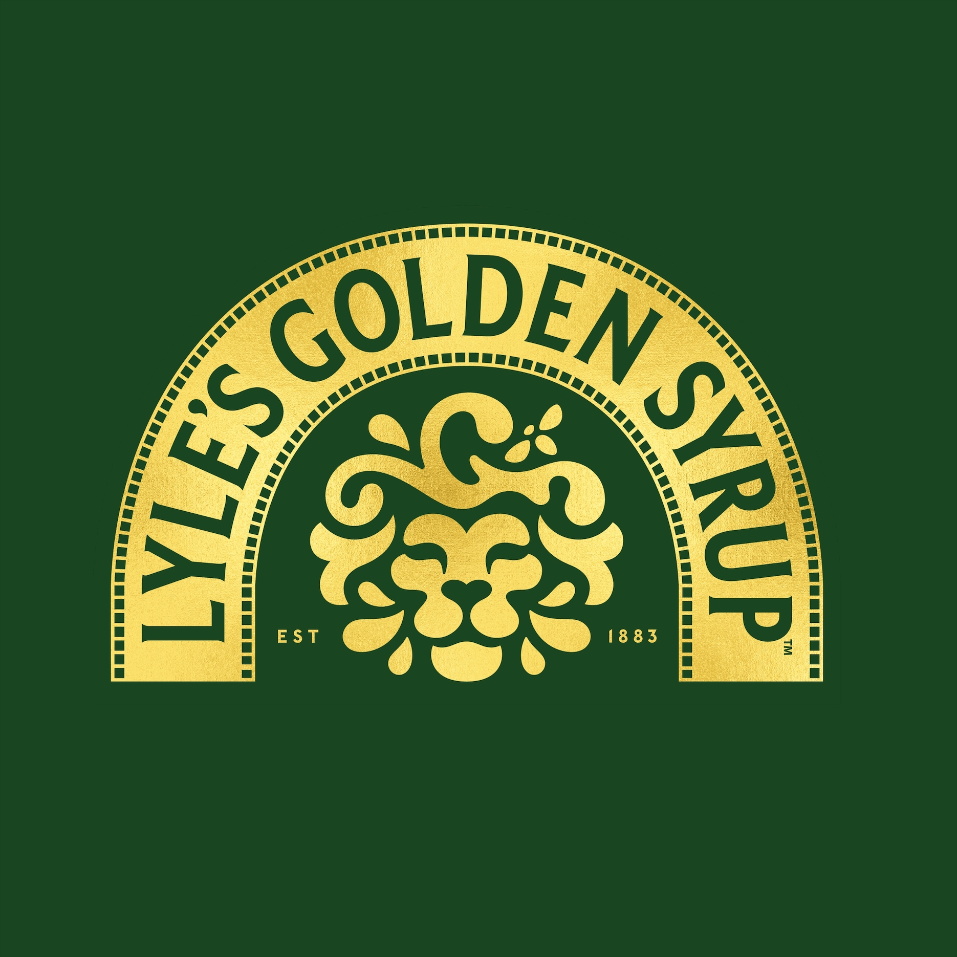
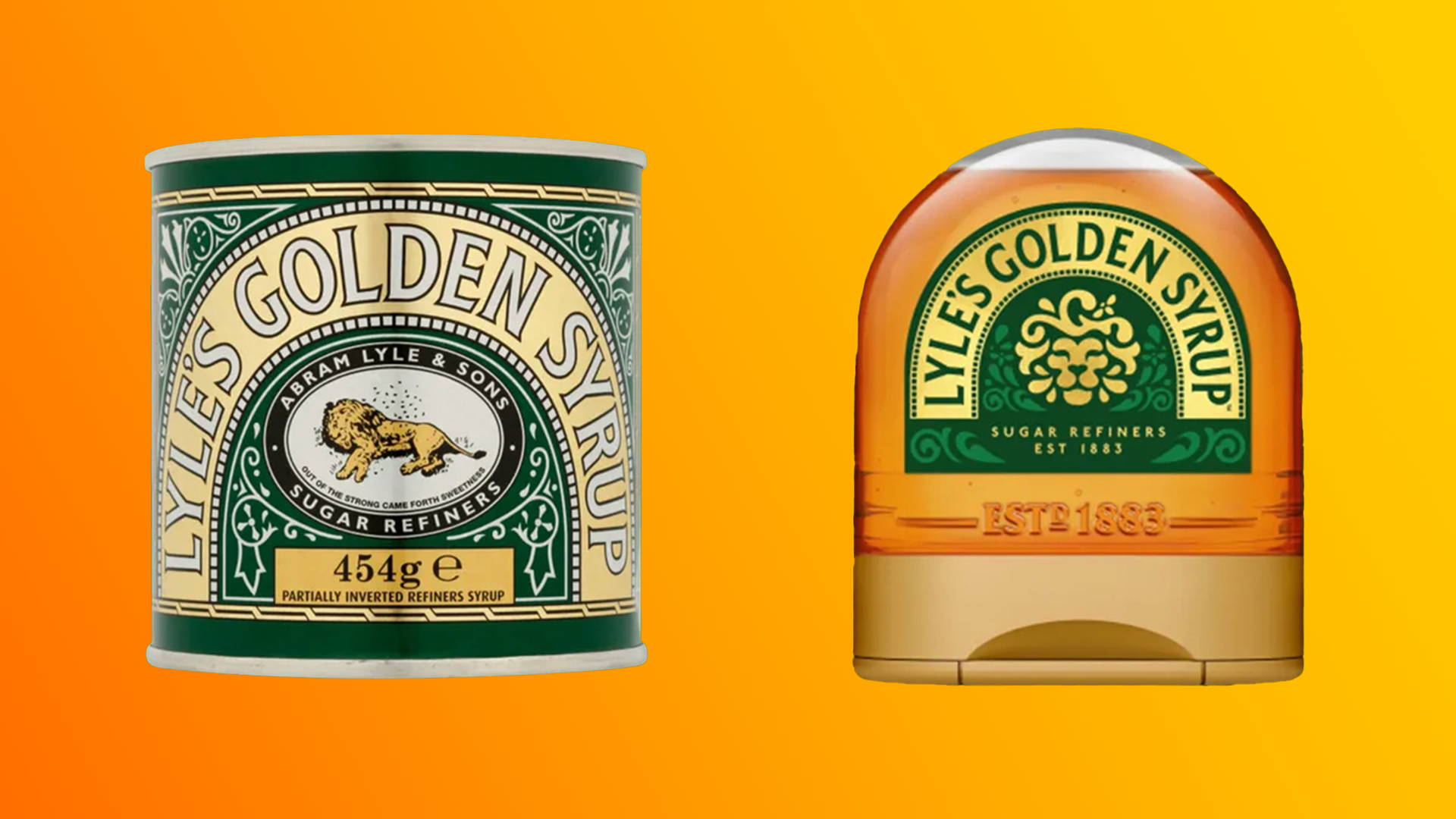
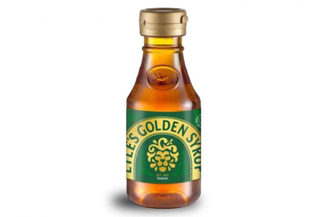
For more than 140 years, Lyle’s Golden Syrup has proudly showcased its distinctive logo featuring a deceased lion encircled by bees—a symbol deeply ingrained in British culture and history. Holding the Guinness World Record for the oldest unchanged brand packaging, this iconic imagery has stood the test of time, enduring even through wartime material shortages. However, as consumer preferences and cultural landscapes evolve, so too must brands adapt to stay relevant. That is why to appeal to the evolving tastes of the 21st-century consumer, Lyle’s Golden Syrup has undergone a revitalization of its brand identity. The new logo, featuring a happier animal and a single bee, reflects the brand’s commitment to freshness and innovation while retaining its nostalgic charm. This modern redesign aims to resonate with contemporary British households, offering a perfect blend of tradition and modernity.
Balancing Tradition with Modernity
James Whiteley, brand director for Lyle’s Golden Syrup, expresses enthusiasm for the brand’s fresh redesign, emphasizing a commitment to honoring tradition while embracing progress. While the classic lion-and-bees logo will still grace the traditional golden syrup tin, new packaging for bottles and dessert toppings features a more jovial rendition of the lion alongside a single bee, symbolizing positivity and forward momentum. Whiteley assures consumers that while the brand evolves, its essence remains rooted in authenticity and nostalgia, resonating with the everyday British household.
The Story Behind the Old Logo Symbolism
The iconic old logo of Lyle’s Golden Syrup was based on a Christian analogy from the Old Testament. It features a version of the riddle Samson presented at his wedding, “Out of the strong came forth sweetness.” The founder of the syrup, Scottish businessman Abraham Lyle, chose this riddle as it aligned with his Christian beliefs. In view of this, ditching this classic logo for the rebrand has sparked debate, particularly among religious circles, Lyle’s Golden Syrup stands firm in its decision to embrace change. Critics from the Church of England have voiced concerns over the perceived disregard for tradition and Christian messaging. However, the brand clarifies that the decision to update the logo was driven solely by a desire to resonate with modern consumers, and religion played no role in the move.
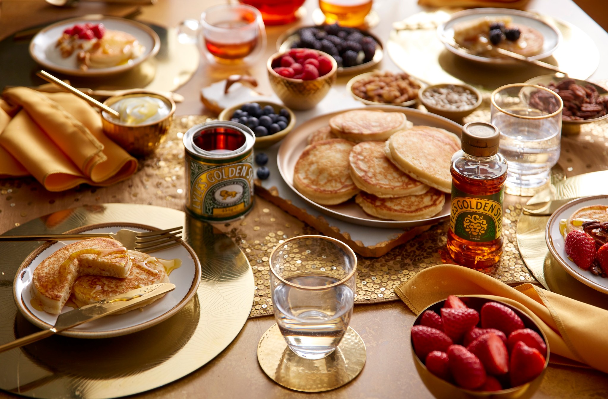
The updated packaging will be rolled out later this month and continue throughout the year.
The Big Picture
Lyle’s Golden Syrup’s historic rebrand introduces a fresh and contemporary design while preserving the essence of its longstanding legacy. The new logo, featuring a cheerful lion and a single bee, reflects the company’s commitment to meeting the evolving needs of consumers while maintaining a sense of nostalgia. While the change has received criticism, Lyle’s Golden Syrup remains dedicated to striking a balance between tradition and progress.