Atlassian Corporation Plc is an enterprise software company that develops products for software developers, project managers, and content management. It is best known for its issue tracking application, Jira, and its team collaboration and wiki product, Confluence. Atlassian serves over 60,000 customers. Mike Cannon-Brookes and Scott Farquhar founded Atlassian in 2002. The pair met while studying at the University of New South Wales in Sydney. They bootstrapped the company for several years, financing the startup with a $10,000 credit card debt. (Source)
Atlassian’s latest rebrand comes in the light of an open work culture: unleashing the full potential of teams to think, work and behave openly. This enables diverse viewpoints and stronger outcomes, going beyond the barriers of silos and confinement.
The Logo
Before: The name derives from the Titan Atlas; from Greek mythology who had been punished to hold up the Heavens after the Greek gods had overthrown the Titans. The logo reflects this through the blue X-shaped figure holding up what is shown to be the bottom of the sky.
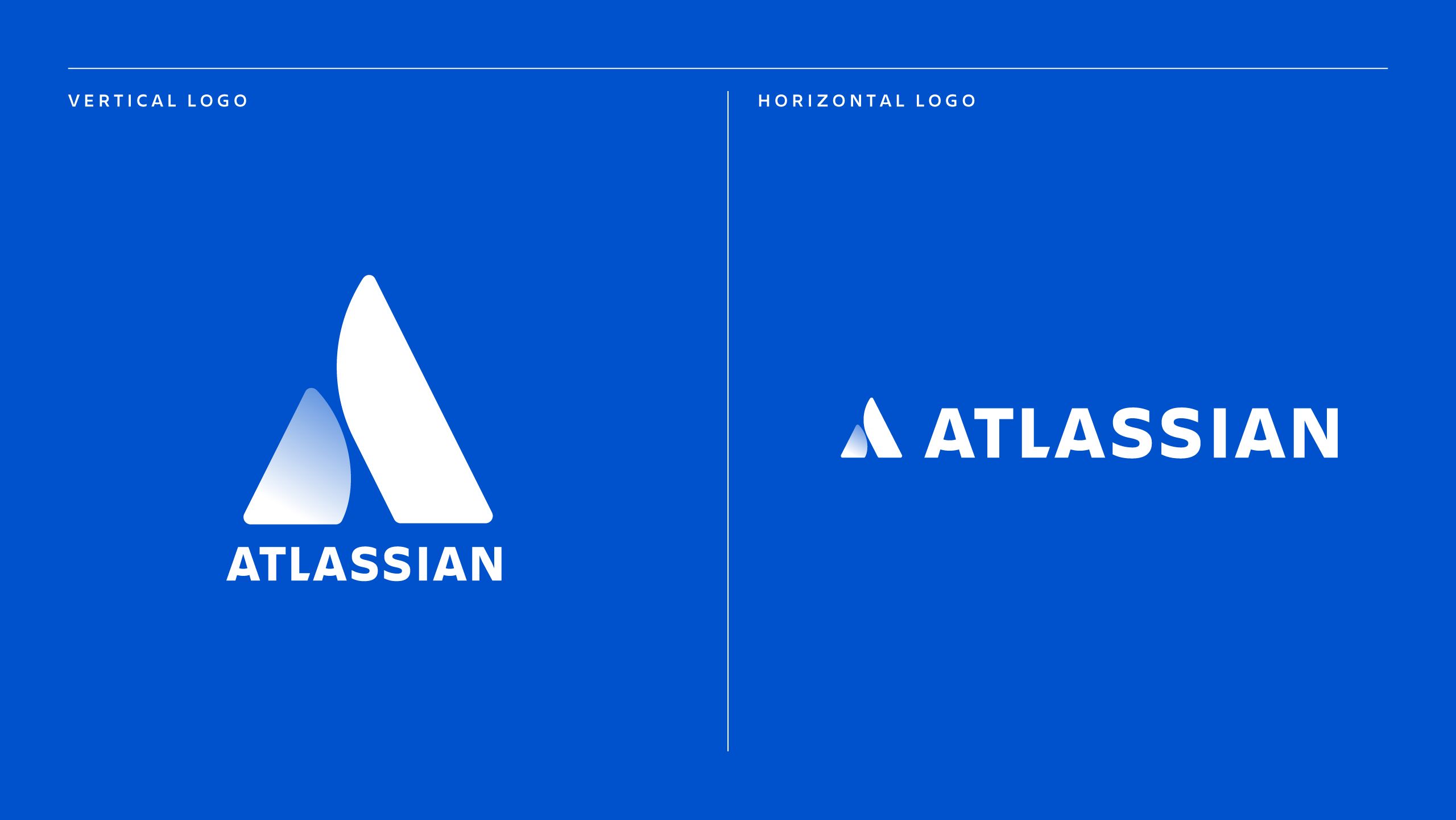
Now:
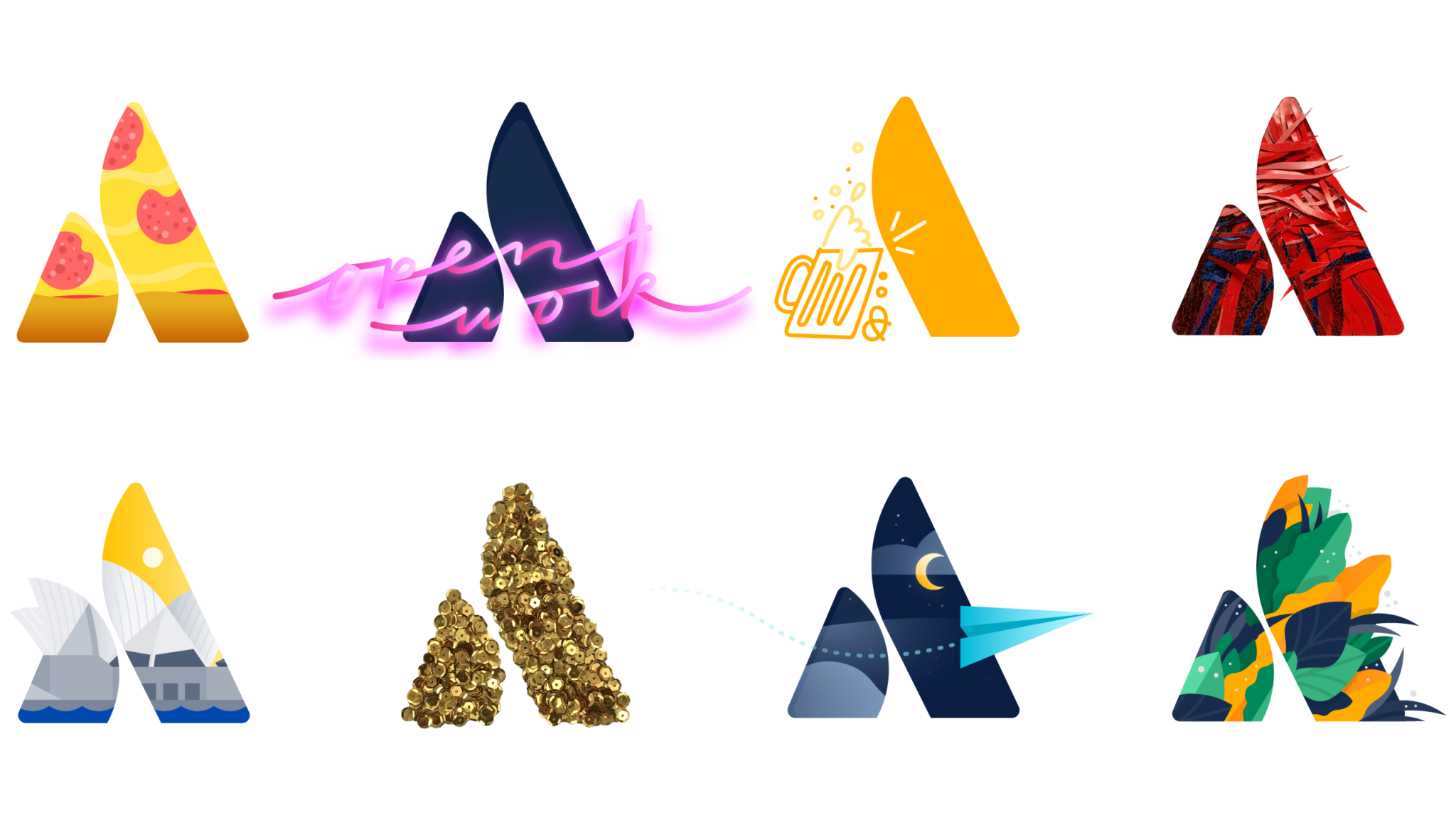
The new logo has been build focusing on teamwork, and on the specific benefits the customers can feel when teamwork is at its best. The end result symbolizes teams in the new Atlassian logo – two people high-fiving, a mountain ready for teams to scale, or even the letter A formed from two pillars reinforcing each other.
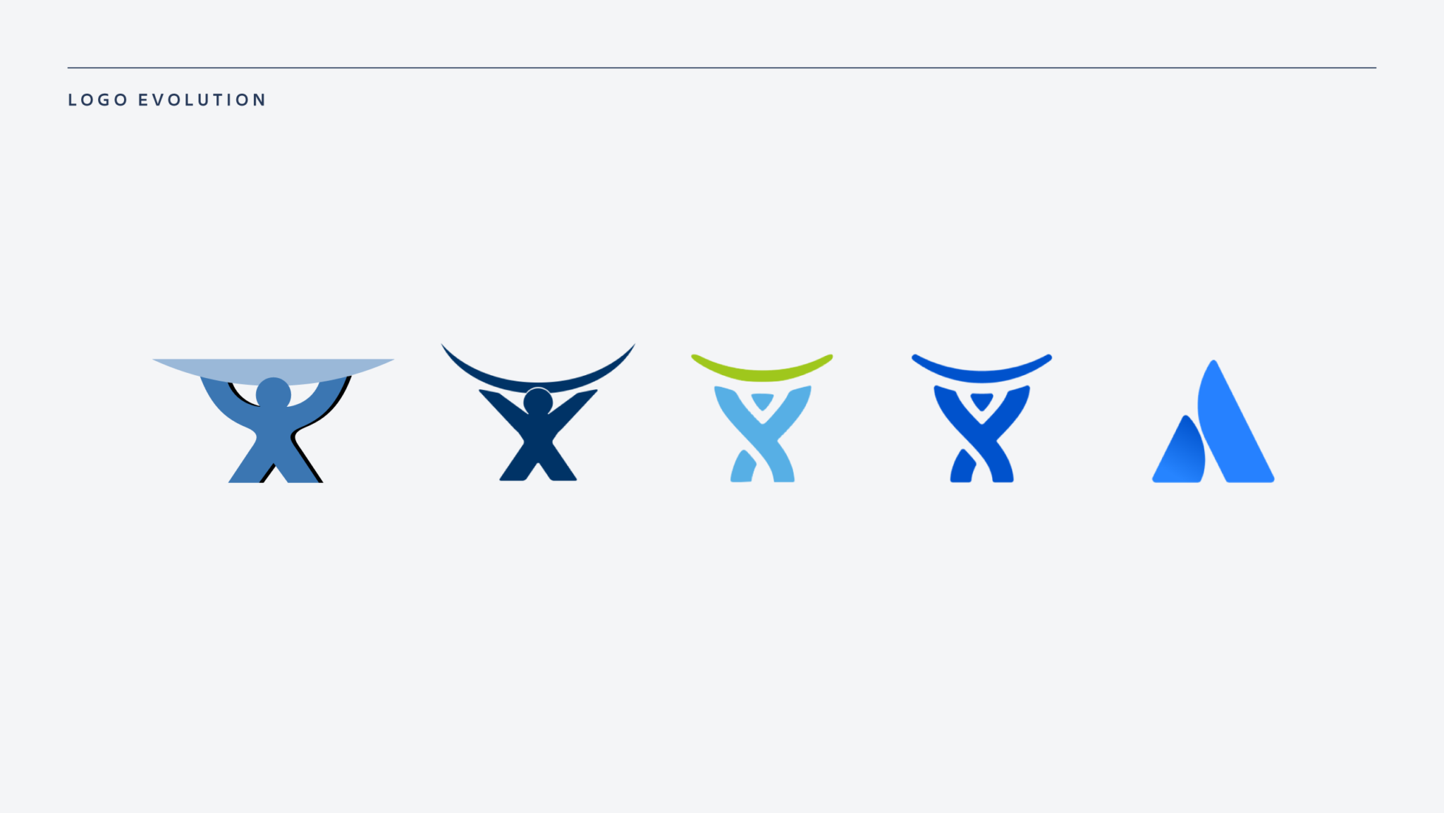
“I’m excited about our new logo for the same reason I appreciate our old one: it’s friendly, human, and reflects our genuine personality.”
The Typeface
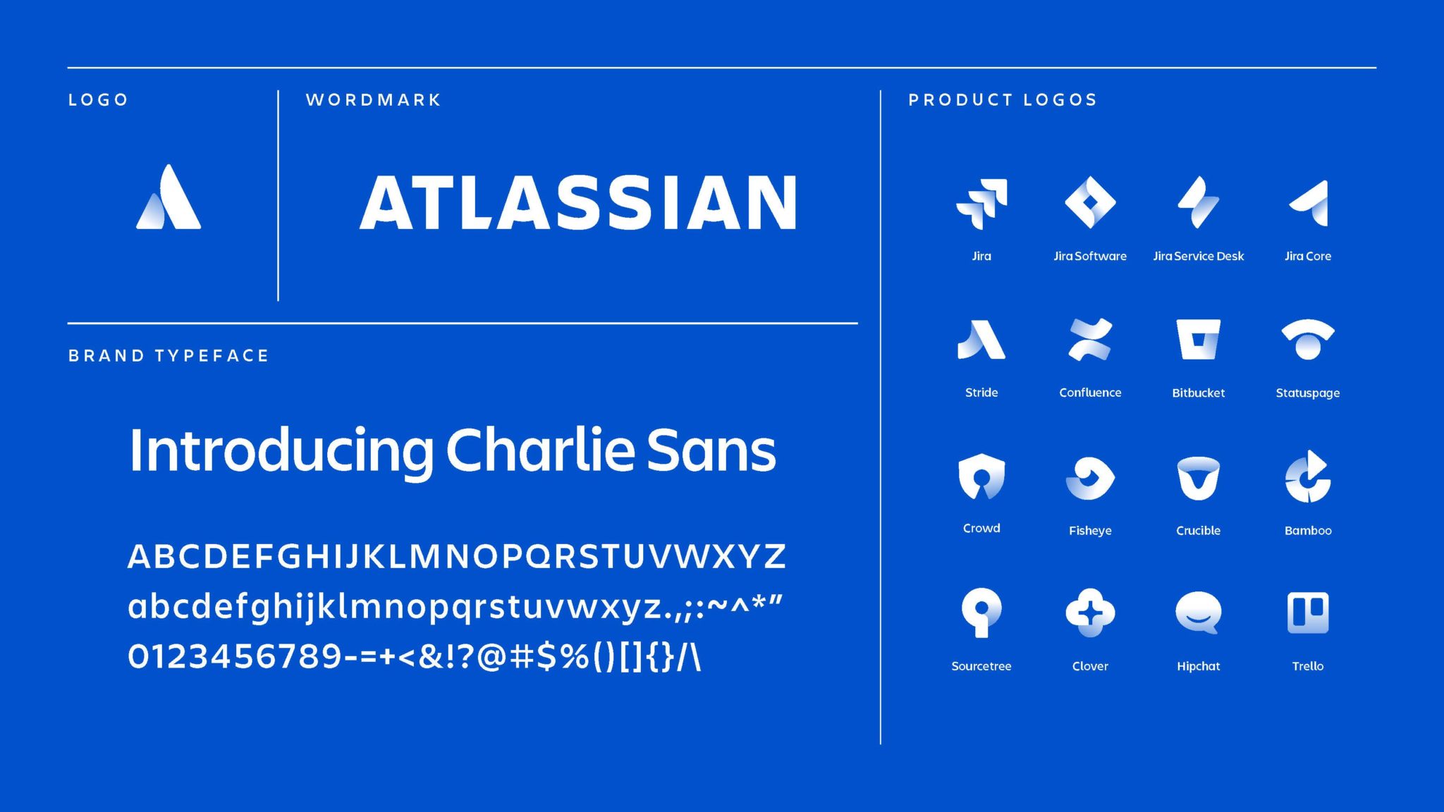
Atlassian flaunts it’s new typeface: Charlie Sans. Designed to balance legibility with personality, Charlie Sans has tremendous flexibility, which allows us to create the hierarchy between Atlassian, our products, and other offerings in our ecosystem.
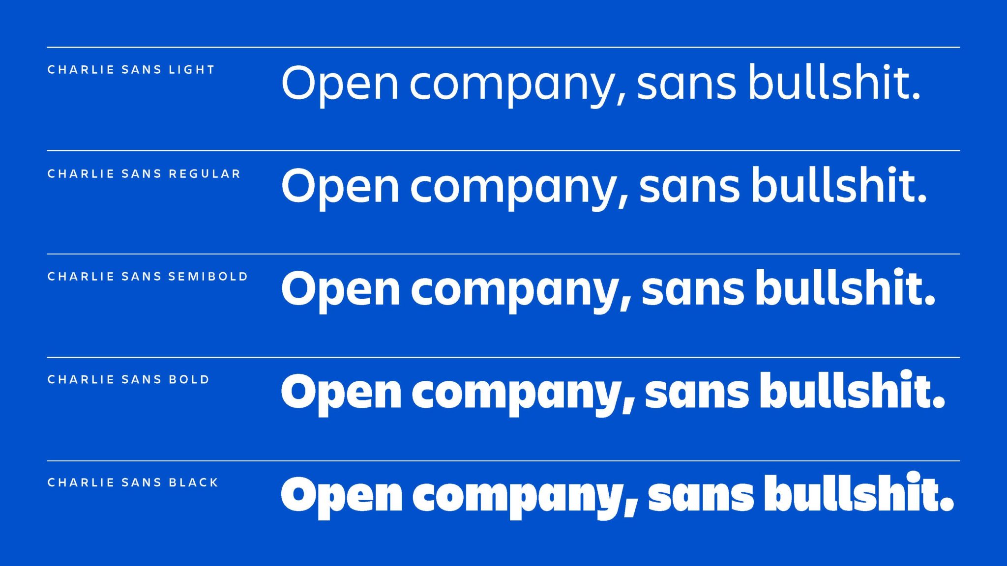
Fun fact: we paid special tribute to our original logo, Charlie, in this name, as well as in the letter “A” in our wordmark. (Source)

