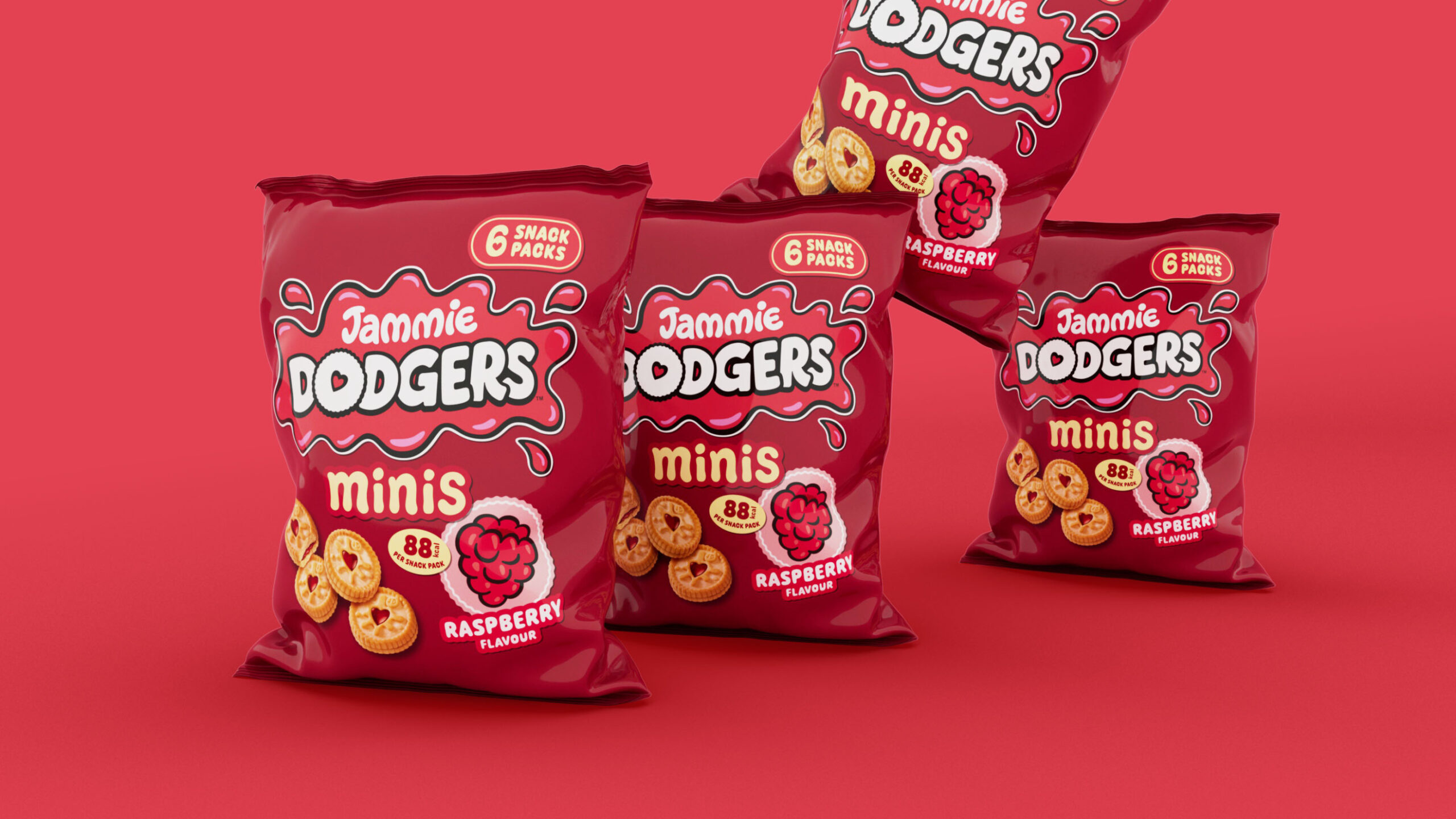
In the world of biscuits, few names evoke as much nostalgia and joy as Jammie Dodgers. This beloved British treat has recently undergone a packaging makeover. This strategic move aims to bring consistency to the biscuit’s portfolio while evolving some of its key assets. Let’s dive into the details of this delightful redesign.

The Challenge of Brand Cohesion
Jammie Dodgers faced challenges in maintaining brand cohesiveness across multiple variant and flavor launches. Improving consistency while differentiating between flavors and format extensions became crucial to support future growth. As a solution, the brand collaborated with the design studio Coley Porter Bell to enhance Jammie Dodgers’ variant awareness and support product innovations. With a strategic approach, the studio aimed to create a packaging design that would captivate consumers and showcase the uniqueness of each Jammie Dodgers offering.

Balancing Nostalgia with Excitement
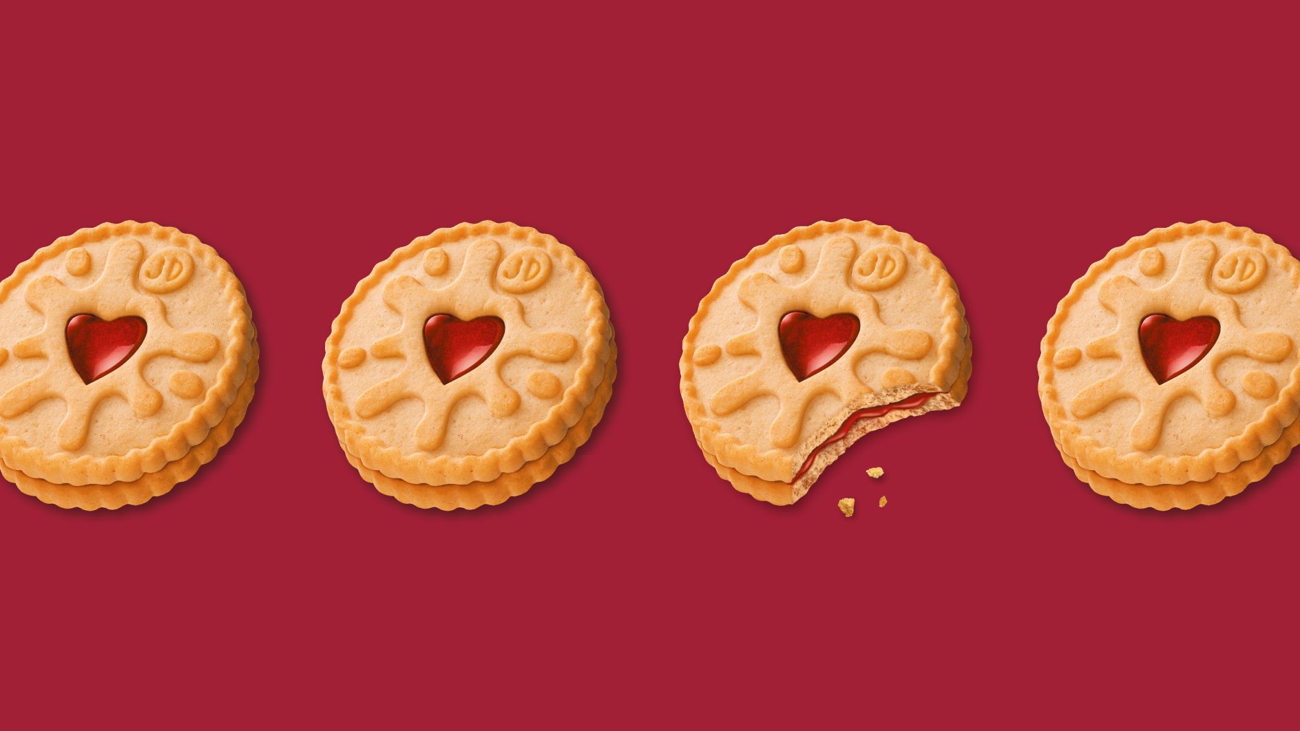
At the core of the redesign strategy lies the concept of ‘Cheeky at Heart’. This unordinary idea was to capture the brand’s playful and mischievous personality, endearing it to generations of biscuit lovers. The concept of ‘Cheeky at Heart’ was born, encapsulating the qualities that make Jammie Dodgers truly special. This idea balances a good-natured, yet mischievous brand attitude combined with the iconic love heart shape of the biscuit.

Embodying Fun and Playfulness
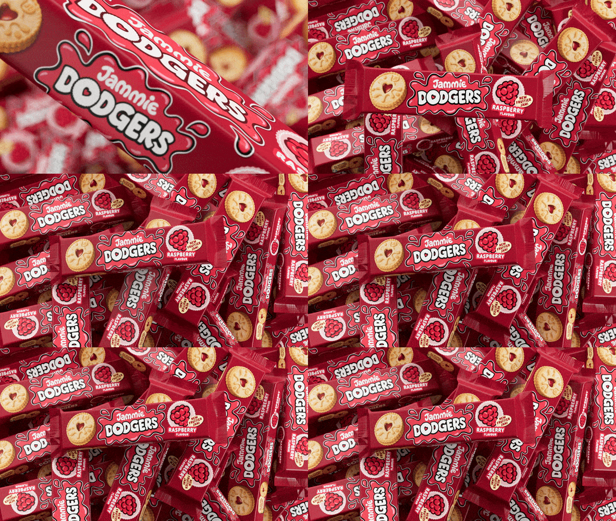
Drawing inspiration from the Jammie Dodgers logo, which resembles a splodge of sticky jam, Coley Porter Bell created a suite of graphic assets in the form of stickers. These stickers embody the brand’s fun, playful, and mischievous attitude, appearing unexpectedly in various places to surprise and delight consumers. By using stickers, the brand gains increased visibility and can be seen in new and unexpected locations, reinforcing its presence in consumers’ minds.

Enhancing Recognition and Navigation
As Jammie Dodgers steps into this new era with its refreshed look, it stands as a testament to the power of thoughtful brand evolution. Here are some of the key elements that were refreshed to enhance the brand’s image by Jammie Dodgers in their packaging design:
1. Sticker-Style Graphics: A set of sticker-like assets was developed, drawing inspiration from the jam splodge logo to capture the brand’s lively essence.
2. Refined Typography: The collaboration with hand lettering artist Alison Carmichael led to the creation of a more legible yet whimsical cartoon-style typography.
3. Optimized Jam Splodge: The iconic jam splodge was invigorated with a livelier appearance while preserving its distinct identity.
4. Tweaked Color Palette: Subtle modifications were implemented to maintain brand recognition while infusing a more contemporary vibe.
5. Updated Packaging Layout: The new design establishes a clear layout with the biscuit on the left, the logo in the center, and flavor descriptors on the right.
These design elements are worth skillfully transforming positive nostalgia into excitement, creating a brand identity that’s both familiar and fresh for Jammie Dodgers.


