

NBC News is getting ready to give its midterm election coverage a new look. The name stays: Decision has been the network’s election banner for years, and the new mark reads Decision ’26. The symbol changes. According to NewscastStudio, which reported the update on 2 October, the star-centred motif NBC News has used for close to a decade is gone, replaced by a single feather taken from the NBC peacock. The new logo is already turning up in promotional elements on NBCNews.com. NBC News did not respond to NewscastStudio’s request for comment on the design. For anyone who builds identity for events, campaigns or sub-brands, it is a tidy example of refreshing a mark without throwing away what the audience already knows.
One feather instead of a star
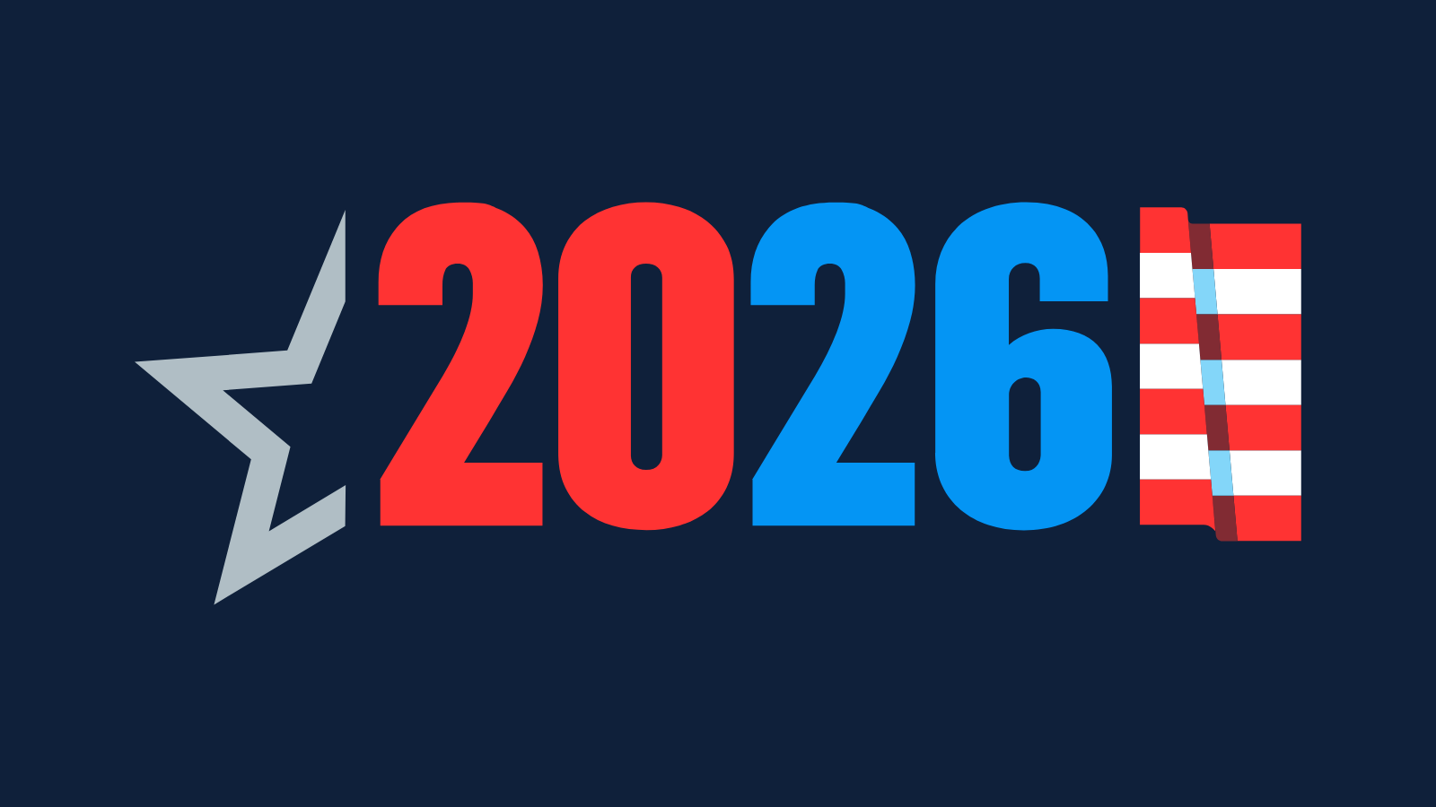
The old election look leaned on stars, the shorthand every network reaches for in a political season. The trouble with stars is that everyone uses them. They say “American politics” but not “NBC”. The new logo reverses that. NewscastStudio describes it as built on the fourth feather of the peacock, the one that lets the bird’s forward-facing head show fairly prominently. Three red stripes run off the right side of the feather, each a different shape, and together they create two white stripes in the negative space. The shapes and gaps echo the geometry of the feathers themselves. Read whole, the blue feather can also look like a flagpole, or like the blue field of stars on the US flag. That double reading lets the design say “election” without using a star at all, which is a smarter trick than it first looks.
Why borrowing from the parent mark works
Event branding sits between two risks. Look too much like the parent and the event goes unmarked. Look too unlike it and the event feels like another company’s product. NBC’s answer is to take one element from its own mark and rework it, rather than introduce a new symbol. That matters for a news brand, because election coverage runs on trust and viewers choose a network quickly on the night. Recognition does much of that work. A feather ties the election look straight to the peacock they already know, where a generic star could belong to any channel. It also fits what NBC has been doing across its wider identity. The network confirmed a redrawn peacock logo and updated type in December 2022, and in January 2026 NewscastStudio reported an update to promos and on-screen graphics, with a new take on the feather shape and a little less colour. The election mark continues that thread. It is a system move, not a one-off graphic.
The case for simplicity
There is a practical argument too. A logo for a news event has to work on a phone screen, in the corner of a live broadcast, on a social tile and in print. A cluster of stars blurs at small sizes. A single feather with three stripes holds up. Tournament and sports branding has wrestled with the same problem. The FIFA World Cup 2026 identity chose flexibility over a single fixed mark, and the earlier fan reaction to the World Cup logo showed how fast an event mark gets judged in public. Event logos that last tend to stay legible and keep a clear line back to the brand behind them.

What it means for brand teams
Three points travel beyond television. First, a sub-brand does not need its own symbol, it needs its own signal. Here the signal is a colour and a gesture, red stripes on a blue feather, drawn from the master brand. Second, retiring a long-running device is a decision about what it stood for. The star had become generic. Dropping it frees the identity to say something only NBC can say. Third, negative space is cheap storytelling. The white stripes carry as much meaning as the red ones, and designers on tight identity budgets can borrow the technique.
Also readGoogle’s gradients are not a redesign. They’re a declaration
One caution: the design has only had its first public outing. How it behaves in motion, in lower thirds and on air will decide whether it works as a system or just as a static mark.
What to Watch
Watch the on-air version in the weeks before the midterms: if the feather and stripes hold up in motion and at small sizes, event teams in any sector have a model for refreshing a sub-brand by borrowing one element from the parent mark.