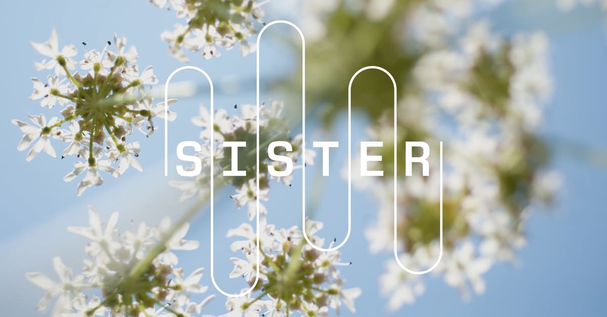
Sister is Manchester’s new science and innovation district, a groundbreaking project developed by Pentagram’s Harry Pearce in collaboration with the University of Manchester and Bruntwood SciTech. Spanning an impressive four million square feet, Sister is strategically located between the university and the city’s main train station, aiming to create a vibrant community that integrates science, technology, and culture.
The Inspiration Behind the Name
The name ‘Sister’ was crafted by The Draft, a creative agency that drew inspiration from the historic Robbins Report of 1963, which laid the foundation for the UK’s higher education system. While the report’s recommendations were implemented, the idea of creating three Special Institutions for Scientific and Technological Education and Research (SISTERs) was ultimately shelved, with Manchester being one of the intended locations. The irony of reviving this concept through the naming of a new district resonates with the rebellious spirit of Manchester, making it a fitting tribute to the city’s innovative legacy. Pearce describes the name as ‘brilliant’, emphasizing its historical significance and its role in shaping the district’s identity.
A Visual Identity Rooted in Research
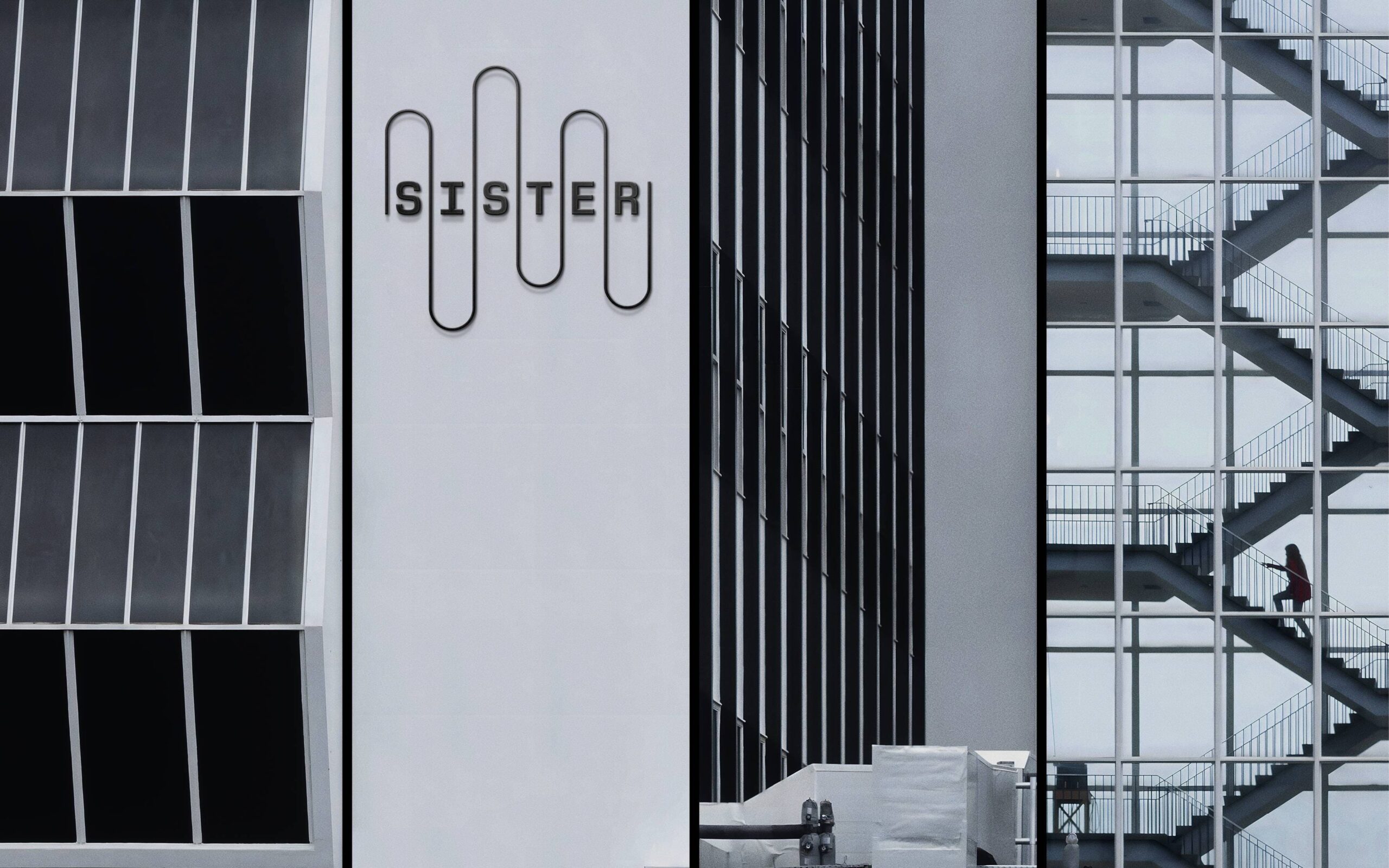
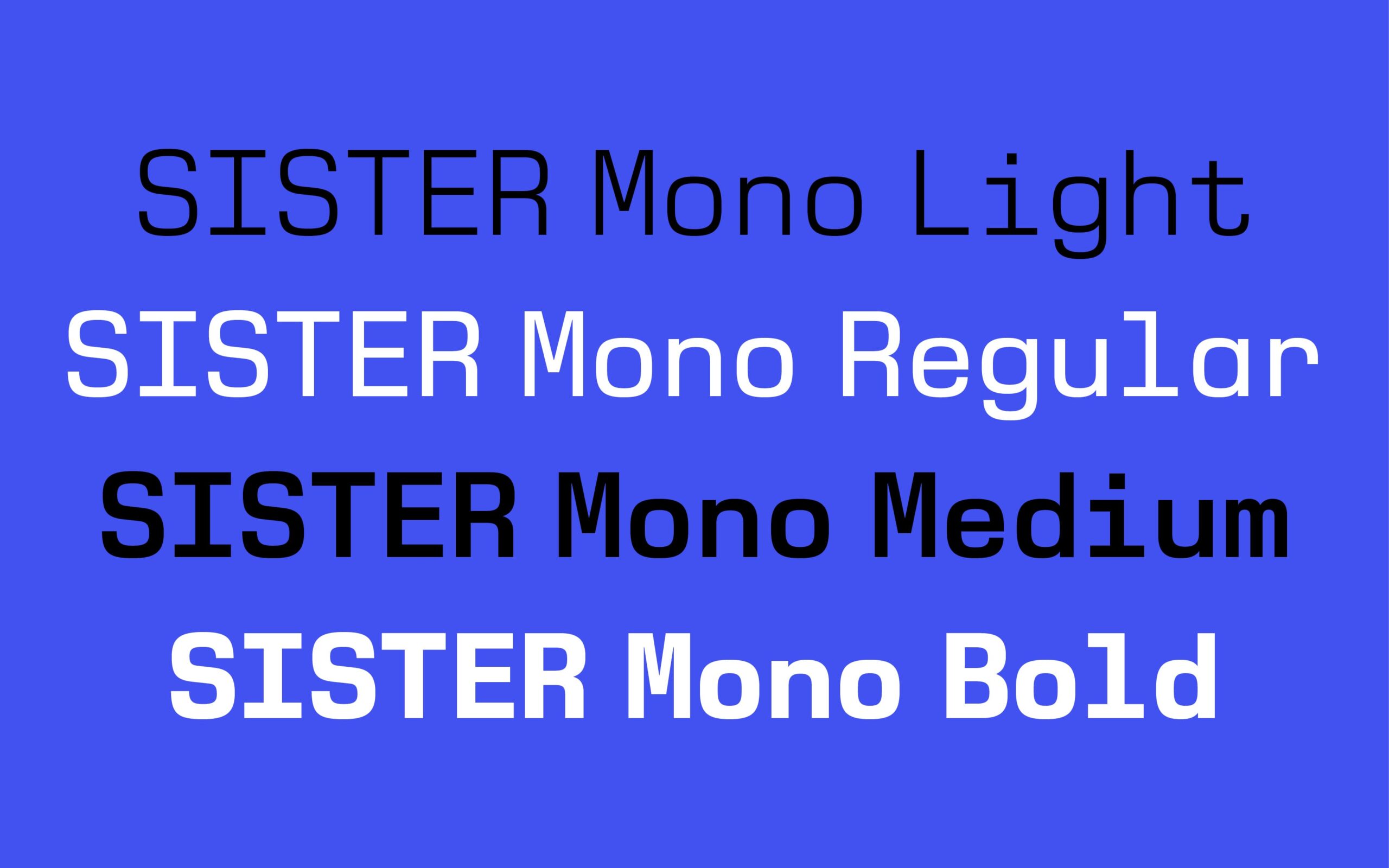
Alongside the new name, Pearce and his team developed a comprehensive visual identity that includes a bespoke typeface, logotype, icons, and signage. Pearce approached the project with a focus on research and listening, engaging deeply with the history and context of the area. This process involved examining archival documents, conducting interviews, and exploring architectural visions for the future, ensuring that the design honors the people and institutions that comprise the district. One notable feature of the visual identity is the new typeface, Sister Mono, inspired by Alan Turing, the father of modern computing. Turing’s long-standing association with the University of Manchester informs the design, which draws from the letterforms of code-breaking machines and early computers. Pearce explains that the typeface blends stylistic elements from various sources, resulting in a unique representation of the district’s scientific heritage.
The Fluidity of Sister’s Design
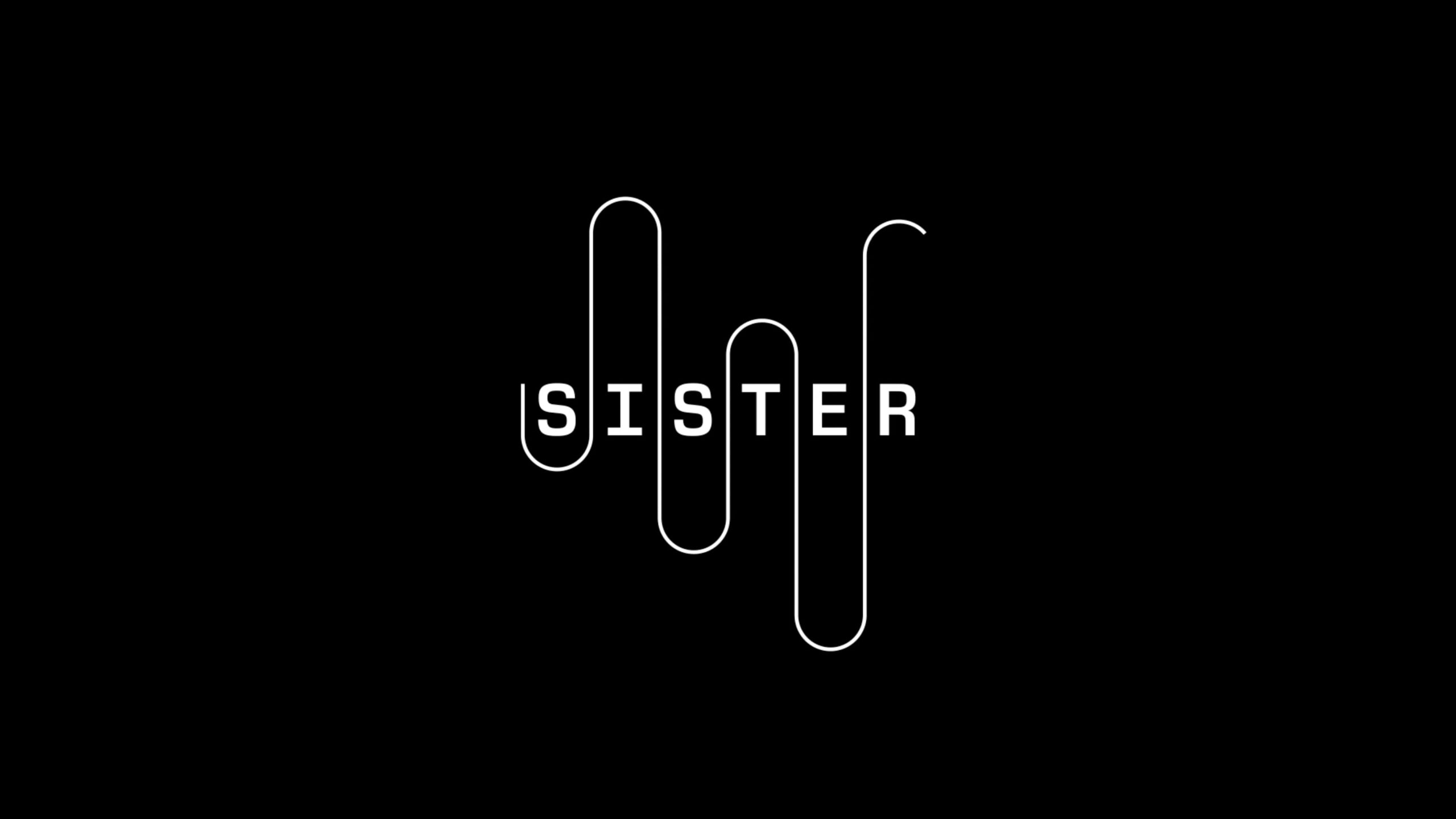
The logotype’s undulating line symbolizes the porous boundaries of the Sister district, reflecting its commitment to blending into the urban landscape and promoting the exchange of people, ideas, and events. This design choice was influenced by the River Medlock, which flows through the site, as well as a diagram from the 1940s Manchester Code computer system. The dynamic line not only visually connects different elements of the identity but also represents the fluidity and innovation that Sister embodies. Pearce’s visionary approach ensures that Sister’s identity is cohesive and engaging, resonating with both the local community and visitors. The linear version of the logotype serves as a shorthand expression of the overall visual identity, further enhancing the district’s brand recognition.
A New Era for Manchester
With the launch of Sister, Manchester is poised to become a hub for science and innovation, bridging the gap between academia and the community. The thoughtful design and historical connections embedded in the visual identity reflect the city’s commitment to fostering creativity and collaboration. As Sister takes shape, it promises to be a landmark destination that inspires future generations of thinkers, creators, and innovators.
Also Read: Microsoft Outage: A Test of Resilience and Market Influence


