In a world where capturing audience attention is paramount, historical institutions must adapt and refresh their visual presence. This was the challenge faced by Vitenskapsmuseet (VIMU), one of Norway’s oldest museums and home to a vast collection of artifacts documenting the country’s environmental and cultural history. Despite its celebrated research and extensive archives, the museum recognized the need to clarify its positioning and unlock its untapped potential for public outreach. Let’s explore how the museum revitalized its brand identity.
‘Opening Up’ Through Design
To revitalize its identity, VIMU turned to Try Design, Norway’s largest communications agency. With VIMU’s mission ‘to open up our incredible world through engaging storytelling, activities and experiences’ – as the guiding light, Try Design embarked on a journey to create a dynamic visual identity that would captivate audiences and showcase the museum’s treasures.
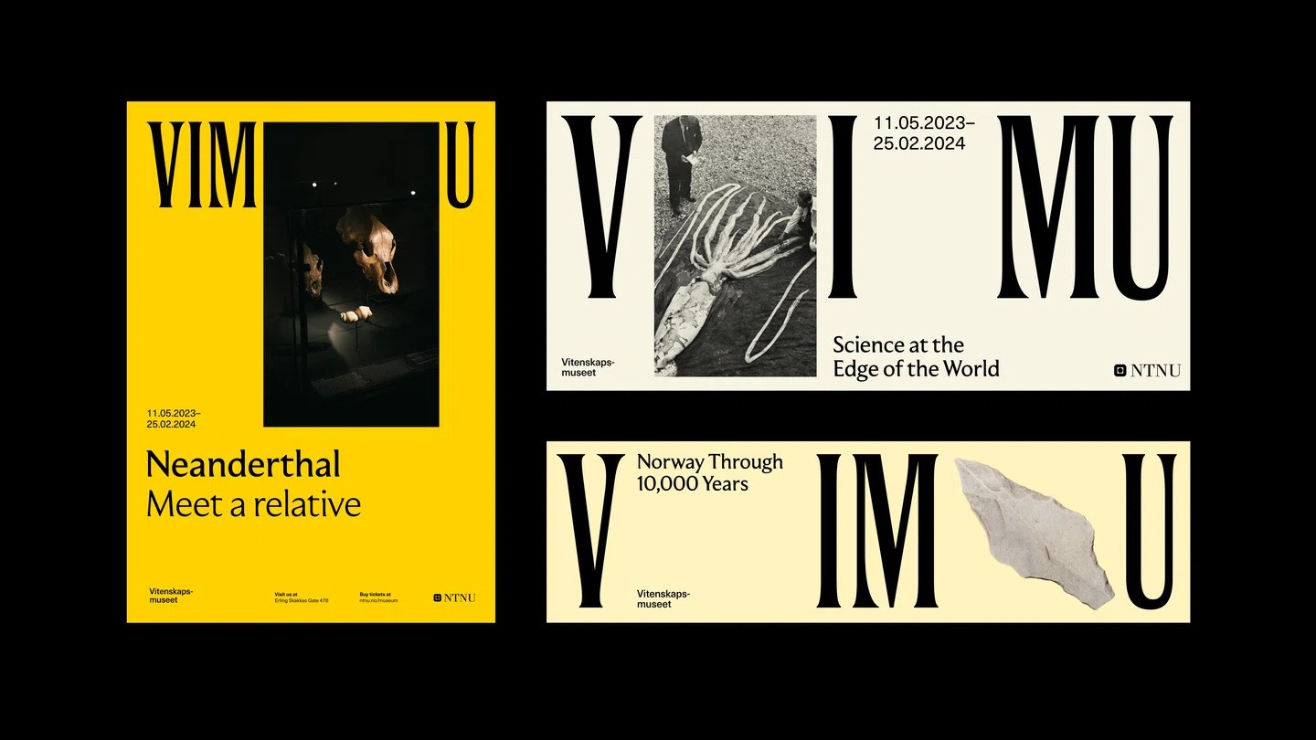
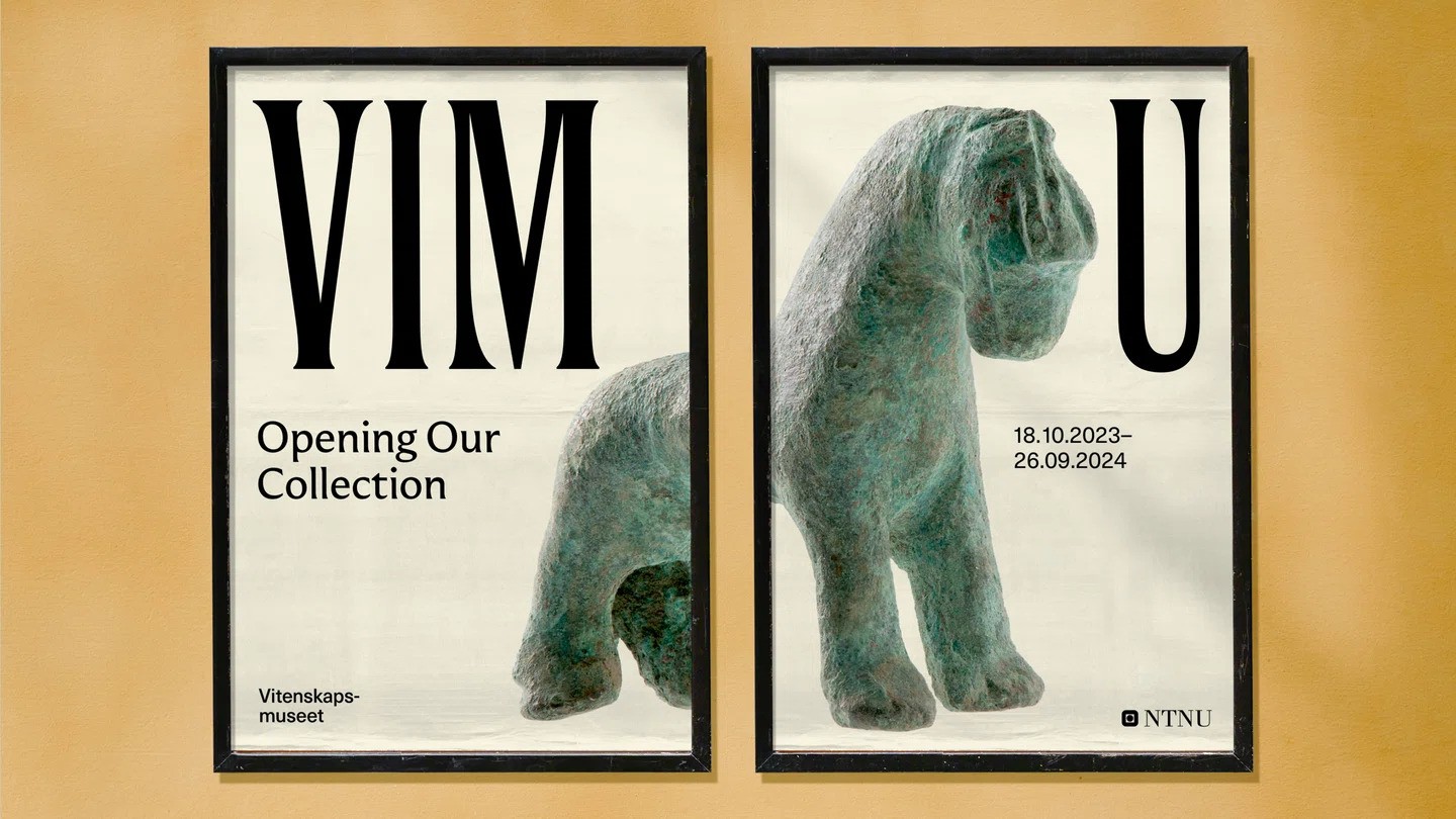
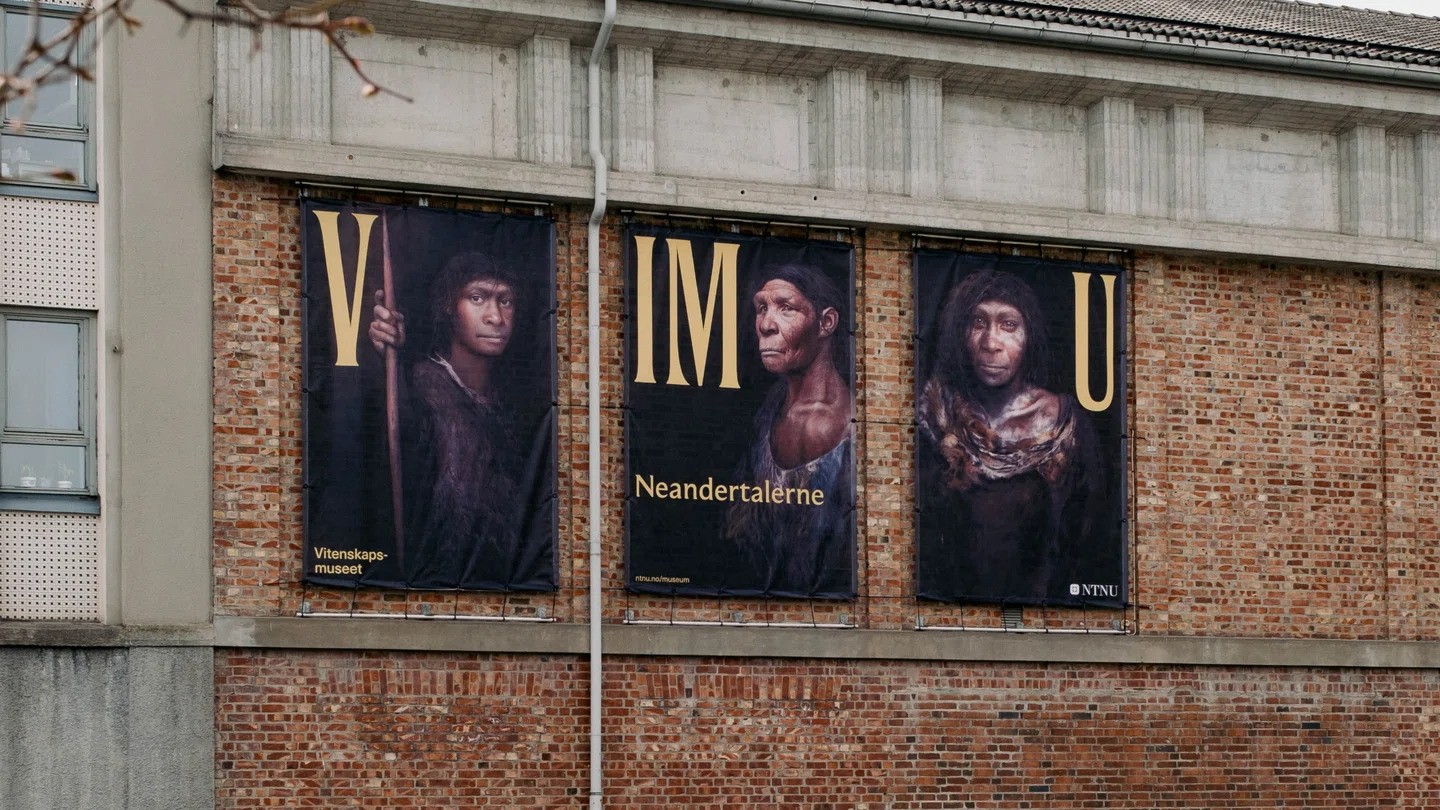
At the heart of this identity lies a distinctive typographic system, featuring a custom wordmark and the supporting Moulin typeface from Commercial Type. The wordmark’s elegant, elongated letterforms and subtle serifs pay homage to the museum’s historical roots.
But the true magic lies in the motion elements that bring the typography to life, revealing artifacts and stories hidden within. This innovative approach ensures that while the museum’s identity is refreshed, the artifacts remain the stars of the show. The new design invites onlookers to delve deeper, to explore the narratives etched in each exhibit.
“While the new identity was intended to appear modern and engage the audience, it was also crucial to preserve the proud history that traces its roots back to 1760,” explains Bendik Høibraaten, Try Design’s lead brand designer.
Artifacts Take Center Stage
Conscious of the museum’s rich heritage, Try Design ensured that the artifacts themselves remained the focal point of the visual identity. Across various assets, including posters, banners, and the website, these artifacts populate the design, creating a sense of curiosity and inviting further exploration. “It was also important to create an identity that did not divert attention away from individual exhibitions, allowing the exhibits and objects to take center stage,” Bendik notes.
“We’re proud of having created such a simple graphic system that can be utilized in endless ways,” Bendik concludes. “The idea of ‘opening up’ facilitates numerous expressions, allowing the museum to showcase everything it encompasses.”
A Timeless Expression of Engagement
Through its simplicity and assuredness of expression, Vitenskapsmuseet’s revitalized identity promises to captivate audiences and rekindle their interest in the museum’s offerings. By seamlessly integrating historical references with modern design elements, Try Design has crafted a visual language that celebrates VIMU’s rich past while propelling it into a future of engaging storytelling and audience connection.
Bottomline
VIMU’s refreshed visual identity, crafted with precision and simplicity by Try Design, has brought new energy and relevance to the museum. The concept of ‘opening up’ is beautifully translated through sliding typography and the inclusion of artefacts, allowing VIMU to showcase the depth of its collection while engaging and captivating a modern audience. Overall, this brand refresh positions VIMU for continued success, ensuring its vast collections and vital mission remain accessible and engaging for generations to come.