Minimalism has become a buzzword in branding and design. This timeless aesthetic philosophy emphasizes stripping away the unnecessary to highlight what really matters. When applied thoughtfully, minimalism creates brands with instant visual impact and staying power. Let’s delve into the essence of minimalism in branding, exploring how it creates a cohesive and impactful brand experience.
Understanding Minimalism in Design
Minimalism simply refers to the embodiment of simplicity in design. It’s like decluttering a room, removing all the excess elements – be it colors, shapes, or textures – and leaving only what truly matters. It is typically used to create a clean, uncluttered space that lets the content or product take center stage allowing the brand to truly shine.
Minimalism isn’t a new trend. It has deep roots, drawing inspiration from the elegance and simplicity of traditional Japanese design and architecture. But it was in the 1960s, amidst the hustle and bustle of American life, that minimalism really came into its own. As a reaction against excess, it offered a breath of fresh air, a moment of calm in a chaotic world. And that’s the beauty of minimalism – it’s more than just a design style, it’s a philosophy, a way of seeing the world.
Minimalism in Branding: Why it’s important?
Establishing a strong brand is essential for achieving business success. However, elaborate branding can often do more harm than good, distracting rather than attracting potential customers. That’s where minimalist branding comes in. By emphasizing simplicity and stripping away excess, minimalist branding allows you to captivate your audience and convey your message with clarity and precision. And as more and more people are drawn to its “less is more” philosophy, minimalism will continue to be a powerful tool for cutting through the noise and conveying the essence of a brand. When used intentionally and strategically, minimalist branding can help you connect with your audience on a deeper level and achieve lasting success.
The Core Elements of Minimalism
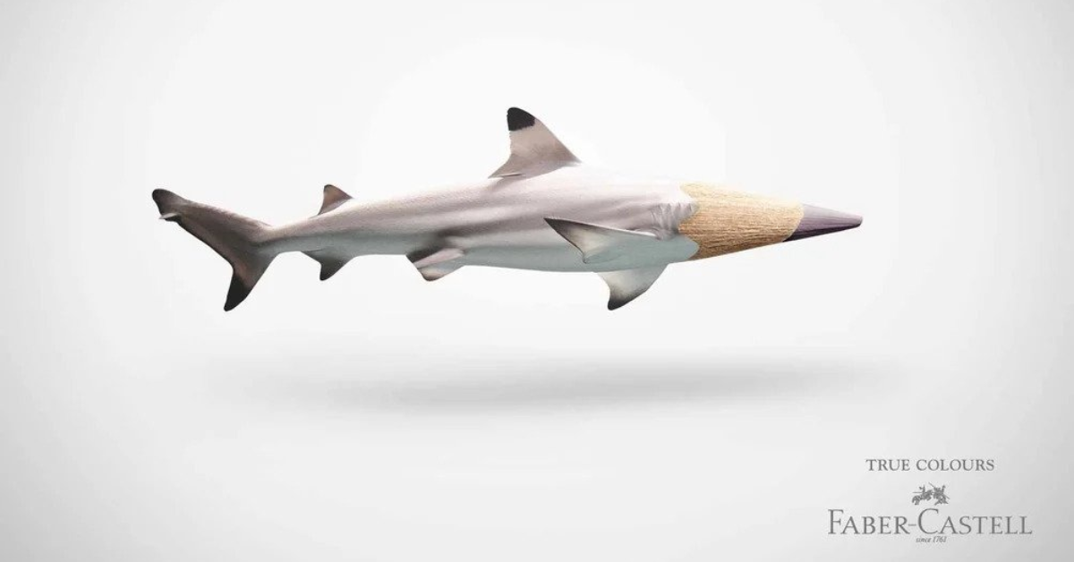
Minimalism is a design concept that encompasses four essential components, each of which contributes to its enduring and classic aesthetic.
- Less is More: The core of minimalism is the idea that less is more. Removing extra elements focuses attention on the essential. Minimalism is not about emptiness but about intentionality – keeping only what the design truly needs. White space, clean lines, and basic color palettes all help the central elements stand out.
- Managing Negative Space: Negative or white space is vital in minimalism. Generous negative space directs the viewer’s gaze toward key items by isolating them visually. Clever use of asymmetry and contrast also highlights subject matter against uncluttered backgrounds.
- Achieving Visual Harmony: Minimalist designs utilize visual harmony through balanced compositions. Grid systems, symmetry, and thoughtful positioning create cohesive layouts from limited elements. Centered, radial or asymmetric arrangements promote harmonious minimalist aesthetics.
- Colors, Textures and Contrast: While minimalist color palettes are muted, smart contrast adds accent and focus. Crisp textures and subtle gradients also provide interest while retaining simplicity. Vivid hues can be used sparingly as bold focal points against neutral backgrounds.

The Power and Pitfalls of Minimalist Branding
Minimalism has become a major trend in branding and design. The appeal is clear – minimalism exudes sophistication, focuses attention, and cuts through visual clutter. Let’s explore the pros and cons of Minimalist branding.
Advantages of Minimalist Branding
Minimalist branding provides several benefits that explain its popularity. Here are a few advantages of Minimalist Branding:
- Timeless and Memorable: By stripping away extraneous elements, minimalism creates branding that stands the test of time. The most iconic logos like Nike and Apple are testaments to this simplicity and memorability.
- Showcases the Product and Brand: Minimalism removes distractions so the product and brand identity take center stage. A minimalist website draws attention to the most important elements and creates an elegant user experience.
- Perception of Quality: Consumers often associate minimalism with high-end luxury and quality. The sparseness and clean visuals convey sophistication and attention to detail.
Potential Drawbacks to Consider
Brands must carefully evaluate if a minimalist approach aligns with their identity and goals. Companies should examine possible downsides before pursuing this route.
- Risk of Oversimplification: Simplifying too much could water down a brand’s complex identity and result in generic branding. Achieving the right balance is key.
- Standing Out: In a sea of minimalist brands, companies risk blending into the background. Distinctiveness may be lost if not handled creatively.
- Misaligned Brand Personality: Fun, playful brands could lose their energy if a minimalist design clashes with their identity and audience expectations.
Gap’s attempt at minimalist rebranding in 2010 serves as a cautionary tale. The company redesigned its logo, but customers reacted negatively, feeling disconnected from the new design. The rebranding lacked the essence and meaning associated with Gap, leading to a swift reversal of the changes.

Tips to Mastering Minimalist Branding
Executing minimalism successfully requires understanding its nuances as a versatile design philosophy. Brands must look beyond surface-level trendiness to leverage minimalism strategically. Here are few pointers that can help while crafting a minimalist brand.
- Keeping it Simple: The key to minimalist branding is simplicity. Focus on clean, uncluttered design that is easy to grasp. Limit your color palette and use basic typography to create an elegant look. Too many elements can dilute your core message. With minimalism, less is more.
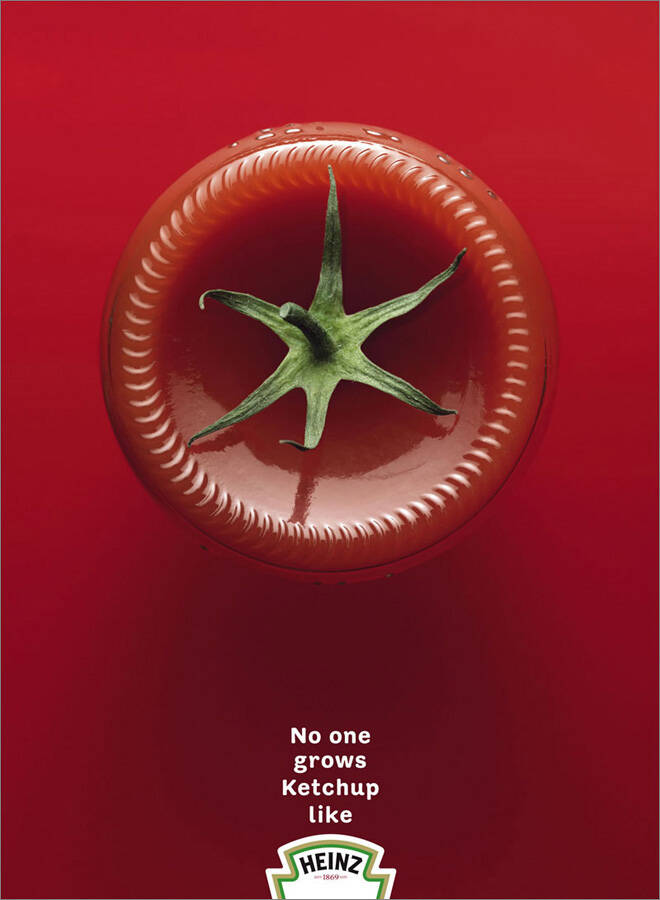
- Align with Brand Values and Audience: Minimalism must stem from a brand’s ethos and resonate with its audience. For companies like Apple, minimalism is an expression of their vision, not just an arbitrary aesthetic choice.
- Spotlight Your Unique Selling Proposition: Minimalist branding spotlights what makes you special. Identify your unique value and make it the centerpiece of your brand identity. Avoid generic elements and highlight your competitive edge. Emphasize the key reasons customers should choose you.
- Clarity in Design: Minimalism focuses on clear communication. Use straightforward language that directly connects with your audience. Avoid convoluted messaging that could distract from your core ideas.
- Complete Commitment: Half-hearted minimalism fails. Brands need full commitment at all touchpoints, from logo and packaging to messaging and customer service.
- Balance Elements Carefully: Walking the line between elegant simplicity and sparseness is key. Meticulous positioning of limited elements creates minimalism, not merely empty space. Minimalism does not mean boring. A distinct minimalist identity can captivate your audience while keeping branding simple. Leverage bold fonts, color and smart design choices to build a memorable brand.
- Embrace White Space: Generous white space improves minimalist branding by creating a clean, uncluttered look. White space also draws attention to important elements. Don’t be afraid of empty areas – white space can sharpen your message.
- Review and Refresh: Revisiting minimalist designs with fresh eyes helps identify opportunities to improve focus and impact. Small tweaks can enhance minimalism over time.
Future Trends in Minimalism
Minimalism has evolved from a mere design style into a lifestyle philosophy centered around the elegance of simplicity. Minimalist branding today is undergoing an exciting transformation that redefines its core principles. The minimalism of tomorrow seamlessly blends innovative concepts, cutting-edge technology, and sustainability while staying true to simplicity. Let’s explore the top 10 trends shaping the future of minimalism in design:
1. Seamless Integration of Technology: Smart home technology is now an integral part of minimalist interior design. Motion-activated lighting, automated climate control, and disappearing TVs allow for clutter-free, futuristic aesthetics. Technology integration enables efficiency and sophistication.
2. Digital Minimalism: Beyond physical spaces, minimalism now dominates digital interfaces. Digital minimalism focuses on clean, simplified interfaces and apps that provide an uncluttered user experience. Reducing visual noise and distraction creates a sense of order.
3. Zero-Waste Design: Sustainable practices are central to minimalism. Zero-waste design emphasizes using eco-friendly materials and techniques that generate little to no waste over a product’s lifecycle. Upcycling and repurposing materials creates sustainability.
4. Maximalist Minimalism: While minimalism celebrates simplicity, maximalist minimalism incorporates bold colors, patterns, and furnishings within a minimalist framework. Unexpected elements create striking visual impact.
5. Multi-Sensory Design: Minimalism engages multiple senses using textures, sounds, scents, and lighting. Ambient lighting and tactile materials craft immersive, multi-sensory environments.
6. Mindful Spaces: Mindfulness and intentionality are inspiring the design of relaxing environments that promote mental clarity and wellbeing. Serene simplicity enables tranquility.
7. Adaptive Design: Adaptive minimalism revolves around versatile, modular spaces that effortlessly transform to serve different functions. Flexibility accommodates evolving needs.
8. Ethereal Aesthetics: The interplay of light, sheer fabrics, and reflective surfaces creates dreamlike, surreal environments. Light enhances spatial experience.
9. Cultural Fusion: Minimalism now seamlessly encompasses diverse cultural motifs, blending modern and traditional. Global influences add depth.
10. Emotional Connections: Emotional minimalism uses thoughtful elements to forge profound connections between people and the spaces they inhabit. Design choices evoke feeling.
To conclude, the future of minimalism promises ever-evolving innovation in pursuit of elegance through simplicity. As designers embrace these 10 trends, they usher in a new era of functional artistry.

Brand Examples For Minimalist Branding
Minimalist branding examples are not so hard to find as the two main tech giants in the world, Apple and Google, itself exemplify the success of minimalist brand design. Let’s see why their minimalistic design so sensational
Apple
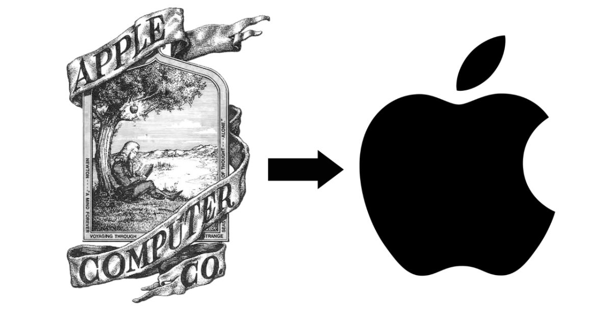
Apple’s minimalist branding approach has made them stand out in a crowded marketplace, positioning them as a brand synonymous with luxury, quality, and innovation. The influence of founder Steve Jobs is evident in every aspect of their product design and marketing strategy, defining their iconic products worldwide. Its iconic logo, product design, and user interfaces embody the essence of minimalism, with clean lines, simple shapes, and a restrained color palette defining its iconic products.
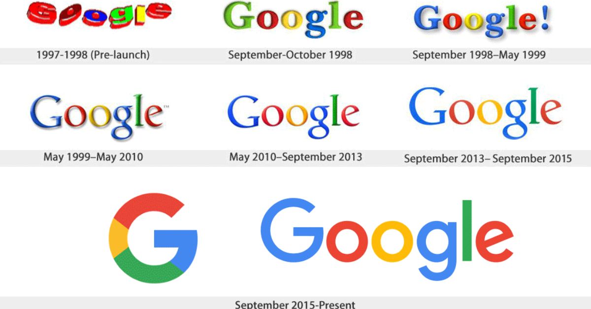
Google’s success story is a testament to the power of minimalist design. Its uncluttered homepage and intuitive user interface are a breath of fresh air in the often chaotic digital world. Google’s commitment to simplicity not only sets it apart but also enhances the user experience, making it a go-to choice for millions around the globe.
Treading Carefully on the Minimalist Journey
The success of minimalist branding ultimately relies on a deep understanding of a brand’s ethos. Brands must ensure this design approach complements, not contradicts their image. When aligned with core values and audiences, minimalism can become a highly impactful branding tool. Without a proper strategy, however, the quest for simplicity could dilute a brand beyond recognition. The minimalist path requires vision, nuance and creative flair to traverse successfully.
The Takeaway
When it comes to brand design, minimalism can be a game-changer. It’s all about keeping things simple and consistent, which can really help a brand stand out from the crowd. But before you jump on the minimalist bandwagon, it’s important to take a step back and think about whether this style truly fits with your brand and what your customers are looking for. Take Apple and Google, for example. They’ve woven minimalism into the very fabric of their brands, and it’s played a big part in their ongoing success. But remember, deciding to adopt a minimalist approach should come from a place of understanding – understanding your brand and its specific needs. So, take the time to really get to know your brand before making the leap to minimalism.
Also Read: Why Brands Cannot Afford to Lose Focus?


