Kikin, a finance startup focused on sustainability, provides non-dilutive funding – financing that doesn’t require giving up ownership or equity – to businesses with an environmental mission. This sets Kikin apart from traditional investment firms by allowing values-driven companies to access capital while retaining control. Let’s delve into the details behind this innovative branding.
Playful Outdoorsy Visuals Align with Sustainable Values
To reflect its unique position in the finance world, Kikin partnered with design firm Koto to develop an approachable new brand identity that nods to its sustainability emphasis. Kikin’s branding features a suite of charming woodcut-style illustrations depicting outdoor scenes like forests, mountains, and wildlife. Resembling badges stitched on scout uniforms, has images that reinforce the startup’s connection to nature and sustainability. Friendly iconography also references the UN’s sustainable development goals, highlighting Kikin’s commitment to that mission.
Bespoke Wordmark and Logo Communicate Accessible Personality
Kikin’s color palette draws from nature to match the brand’s goals. Shades of green, brown, blue, and orange aim to evoke feelings of the outdoors and humanity’s connection with the natural world. Within Kikin’s digital platforms, illustrations add warmth to the user experience with a design system that feels friendly and approachable.
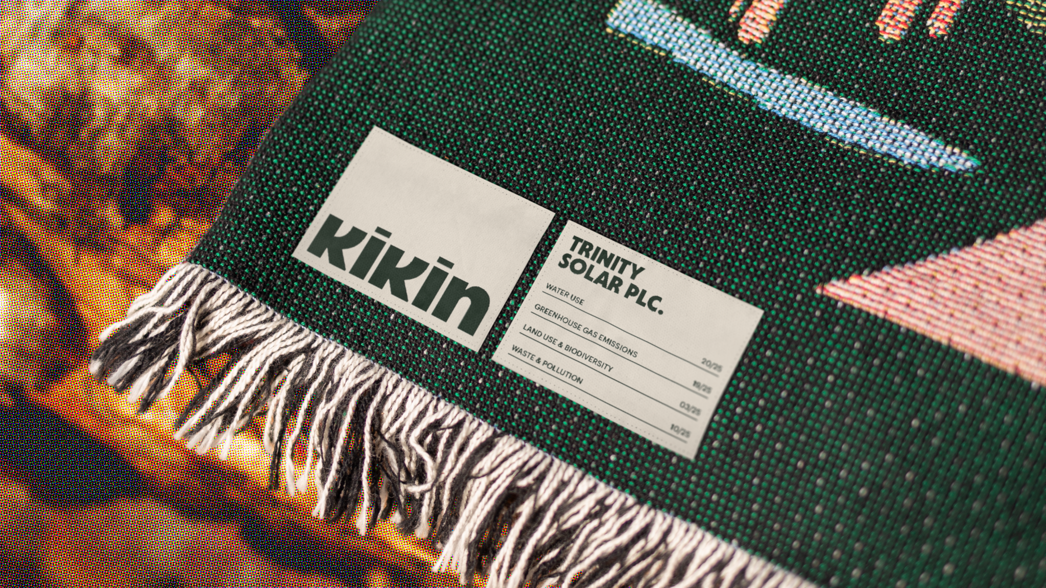
In addition to the whimsical outdoors imagery, Kikin worked with Koto to craft a unique wordmark and logo that set it apart from sterile financial firms. The rounded lowercase wordmark uses soft curves for an approachable, friendly impression. The playful logo extracts the ‘k’ and ‘i’ to form a figure evoking a hiker, further emphasizing Kikin’s sustainability focus.
Amplifying the Message – Digital and Physical Touchpoints
Kikin makes use of a combination of online and offline channels to expand its reach and appeal to a wider audience. The illustrations are used as engaging hero images across Kikin’s website and marketing materials, bringing visual interest to financial data. The website acts as a central point of information, highlighting the brand’s values, mission and impact. The website is also a place for businesses to find out more about how they can use Kikin’s services and get involved.
Social media plays an essential role in expanding the reach of Kikin and engaging the community. By creating engaging content and engaging campaign content, Kikin creates an online presence that speaks to its audience and inspires them to become sustainable growth ambassadors.
Kikin also uses physical touchpoints in addition to its digital channels. Events, workshops and merchandise are just a few examples of these touchpoints. These give Kikin the opportunity to reach potential partners, inform businesses about the advantages of sustainability and provide tangible reminders of its mission.
A Branding Signaling New Era in Conscious Finance
As Koto’s creative director Sam Howard summarized, “We worked hard to create a sense of humanity at every level and interaction, signaling a change to a more sustainable financial model.” With its new visual identity, Kikin demonstrates that finance startups can move beyond detached sterility to communicate personality, passion, and purpose. For eco-conscious companies seeking capital without compromise, Kikin’s branding provides a compelling vision of values-driven investment.