Aicocken, a kids’ clothing company, has recently undergone a charming and visually stunning brand refresh by Onnff, a creative studio specializing in branding. Onnff’s rebranding of Aicocken puts children’s interests at the forefront, showcasing a cute illustrated character that doubles up as a logo and slide, as well as playful and uniquely shaped packaging. The fresh orange and blue color combination adds to the fun and playful vibe of the brand.
Putting Children’s Interests First
To achieve the look and feel of the brand refresh, Onnff’s founding director Zhengrui Hu put himself “in the shoes of children.” The branding is visually simple, aiming to impress adults too. When Zhengrui was approached by the brand, he was drawn to the interesting and lovely product content. However, the previous branding was causing “visual confusion” with too many characters and haphazard colors. The logo was also weak and failed to make an impression. Zhengrui’s challenge was to unify all visions, dig deep into interesting meanings, and connect product packaging with applications in everyday life.
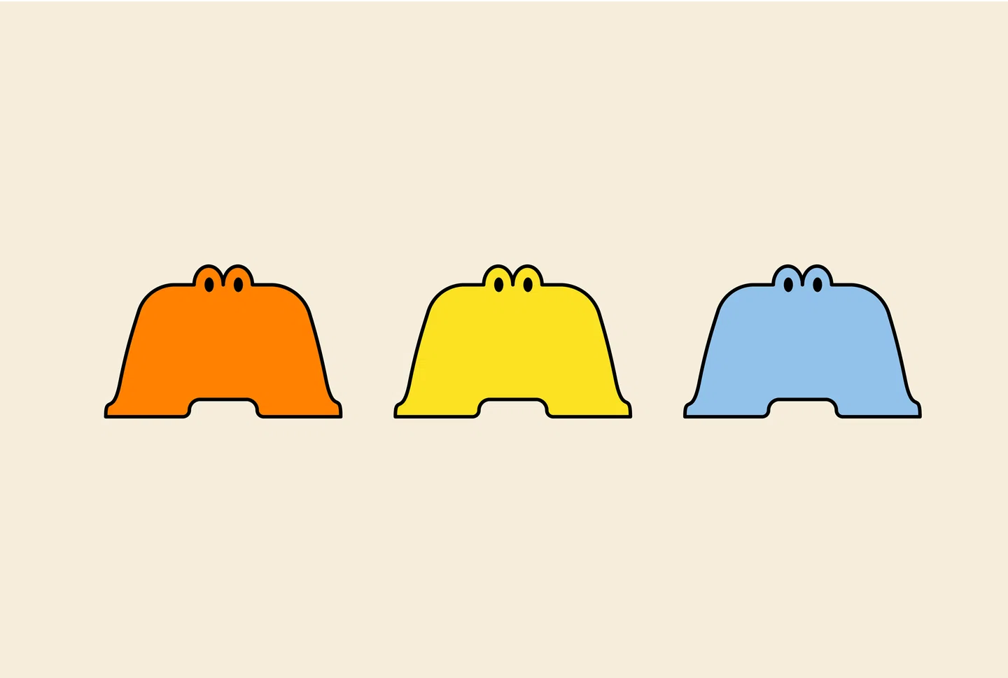
Creating a Fun and Curious Logo
Zhengrui started the rebranding process by designing a new logo for the brand. The logo features the open license font Erica One, which has a “heavy” feel to it. The two curved feet create the impression of the A standing up, while the silhouette resembles a slide – a favorite playground activity for children. The addition of a pair of eyes with rounded tops adds a “curious” feeling to the logo, turning a previously lifeless logo into a full-blown character.
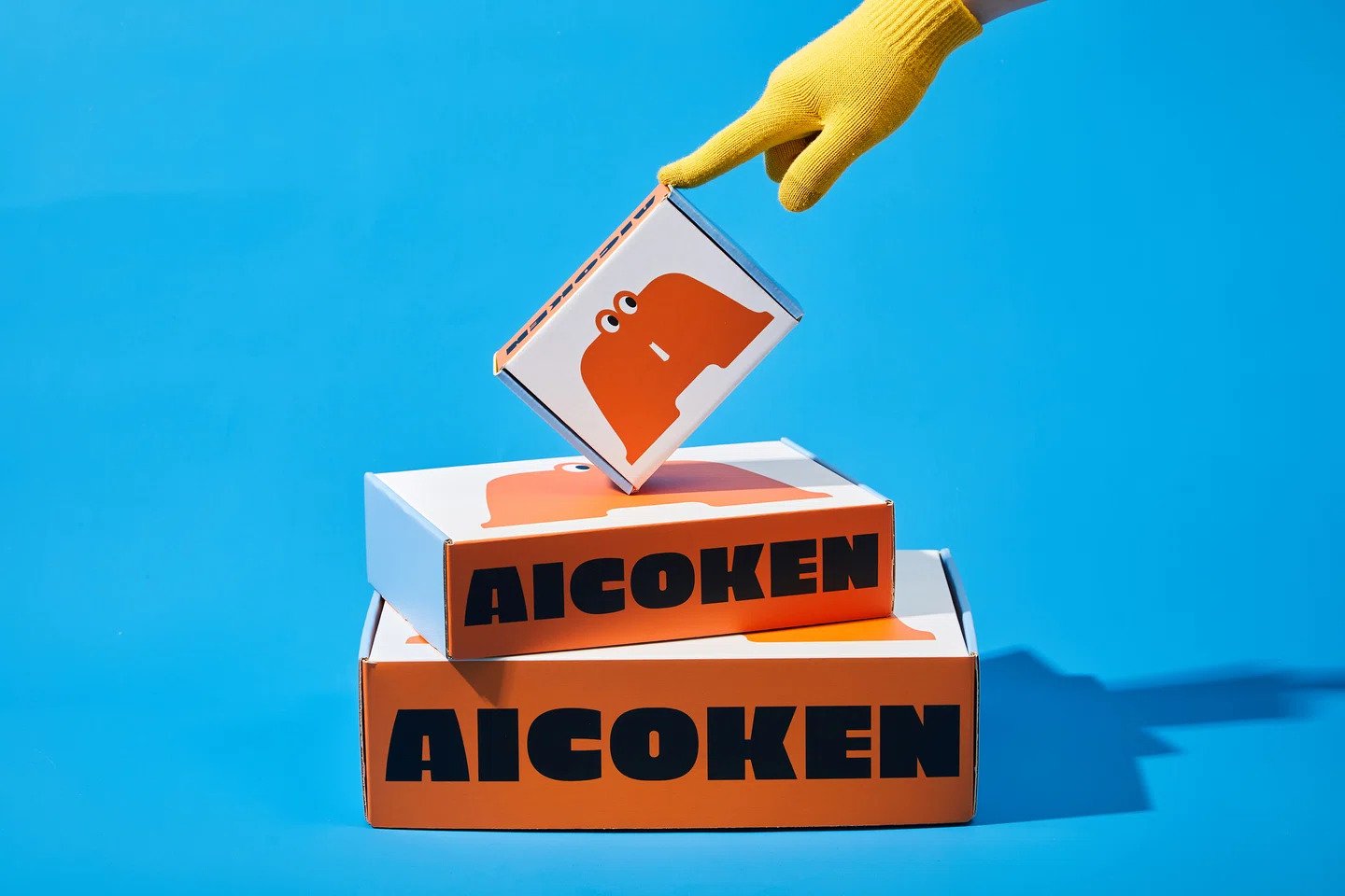
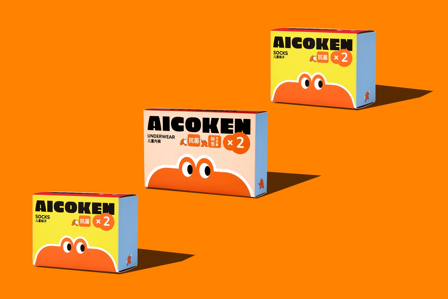
Innovative Packaging Design
In addition to the logo, Zhengrui also redesigned the packaging for Aicocken’s products. One stand-out element is the packaging for the brand’s socks, which features a compact triangular structure adorned with the logo character. The packaging folds out with bright yellow flaps, adding to the playful vibe of the brand. Zhengrui also designed a range of lifestyle products, such as brooches, balloons, and flags, all sporting the charming logo.
Simple Branding Done Well
Onnff’s rebranding of Aicocken is a perfect example of how a cohesive and visually appealing brand identity can be created while keeping children’s interests at the forefront. With the new logo, packaging, and lifestyle products showcase Onnff’s innovative and creative approach to branding, it’s clear that they will sure strike joy within any child and further emphasize the playful and fun nature of the Aicocken brand.