In recent months, soft drinks have undergone substantial rebranding for a modern and immersive experience, as well as an enhanced look and feel. But the underlying gameplay remains the same.
Soft drink brands, from Pepsi to Fanta to 7Up and Miranda, have reimagined their image. These loved brands have acknowledged their consumers’ tastes and visual trends in their rebranding. They have maintained and grown a loyal fanbase. Rebranding ensures that the brand remains the market leader. The new designs communicate to the consumer what type of soda they are picking up.
- Pepsi – it went back to its roots to bring about a retro look. The new design showcases a bold typeface, a signature pulse, and an updated color palette. It evolves the Pepsi brand to represent its most unapologetic and enjoyable qualities. The new logo and visual identity pay homage to the brand’s rich heritage while taking a big leap toward the future.
![]()
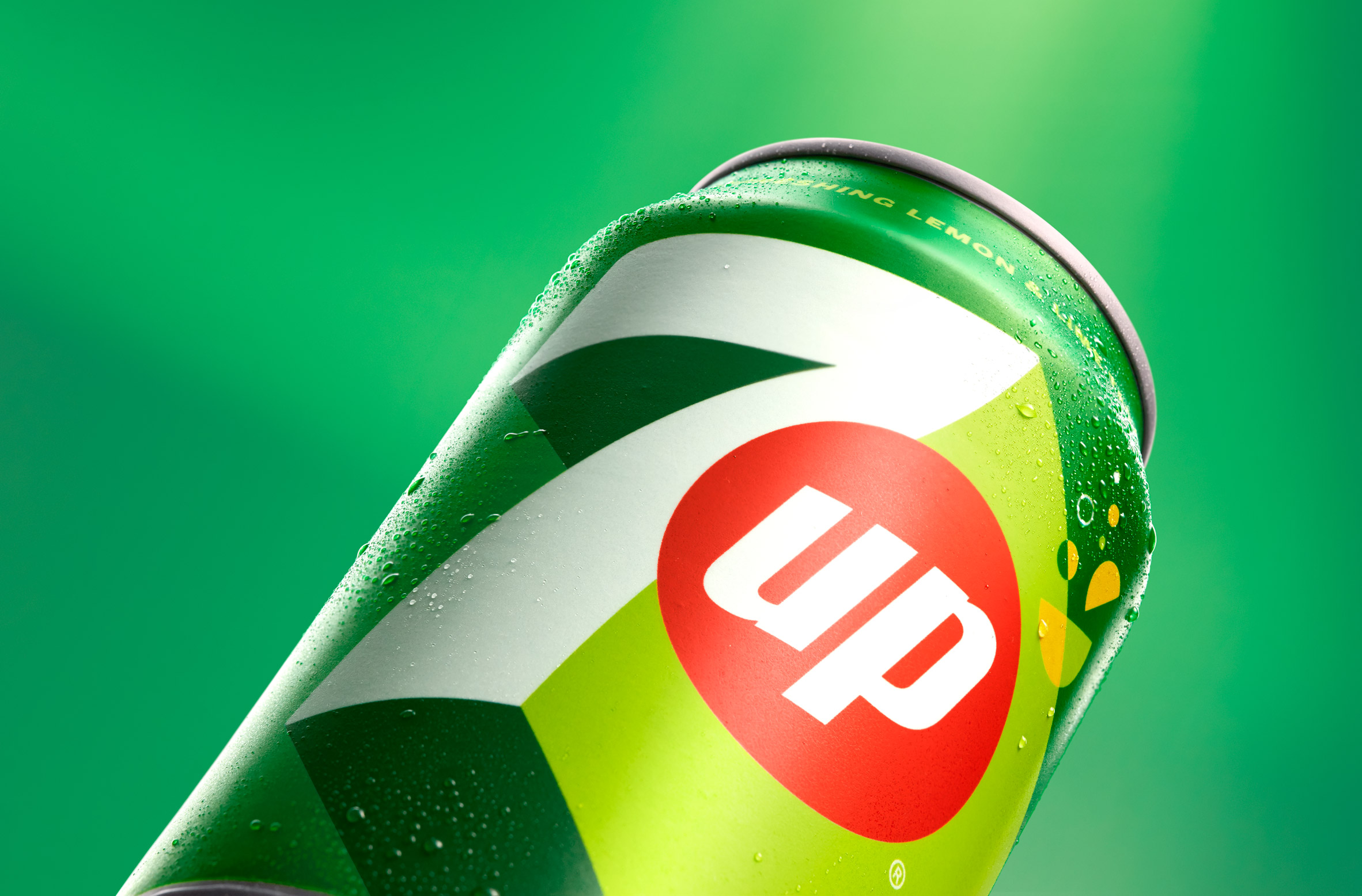
- 7Up – the rebranding gave 7Up a new international brand positioning and visual identity. The aim was to better capture the brand essence and minimal packaging to reflect the growing trend of brands flattening and simplifying graphics. 7Up’s new design moves towards a punchier and minimal execution. The logo was extended to appear three-dimensional with high-contrast lines, which creates the illusion of the 7 moving upwards.
- Fanta – the rebranding aims to inspire people to find the fun in life and make the plain playful. Fanta dropped the orange to make the logo work better across a range of different iterations of the drink. It also reflects that Fanta isn’t always orange in terms of flavor. The rebranding showcases playfulness and fun
![]()
- Tango – the British brand came up with a new flavor to demonstrate the power of its tangy fruit flavors. Tango has always pushed the boundaries on what’s acceptable for a soft drink. The brand celebrates those who break free from the shackles of expectations and unashamedly go all in and fully express themselves.
![]()
- Mirinda – the new visual identity ignites a sense of imagination. Mirinda said the new look inspires vibrant creativity and encourages Gen Z to harness its uniqueness as a superpower. It also empowers this generation to resist conformity and embrace self-expression.

- Zevia – its rebranding provides a cohesive look across the complete beverage line. It conveys a feel-good flavor and the brand’s powerful mission to create a world of better-for-you flavor that’s better for people and the planet. The new pack design features a contemporary colorway and clean, modern design that signals Zevia’s premium but accessible positioning.
Rebranding drives growth and sales. It helps businesses and products reposition themselves within their current market and broaden their appeal. Rebranding gives a fresh feel to the brand and keeps the company at the top of the industry.
Also Read: Minute Maid: 77-year-old Juice Brand Undergoes Refreshing Makeover