Moksi, a cancer-friendly skincare brand, has emerged as a beacon of empowerment and beauty, driven by the inspiring journey of its founder, Lies De Nyn. The skincare brand has now rebranded, transcending the traditional perception of cancer-related products. Let’s explore Moksi’s unique identity, impact, and empathetic approach to defining its ethos.
That Delicate Design Balance
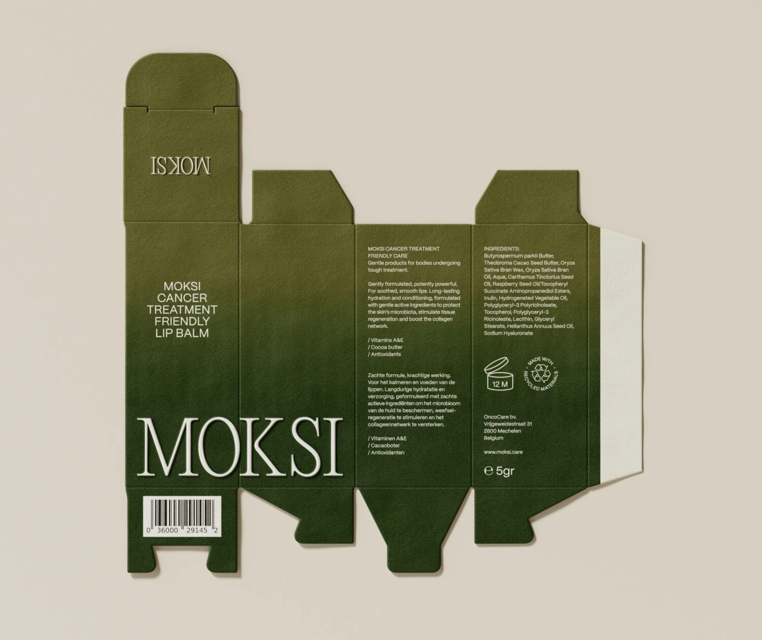
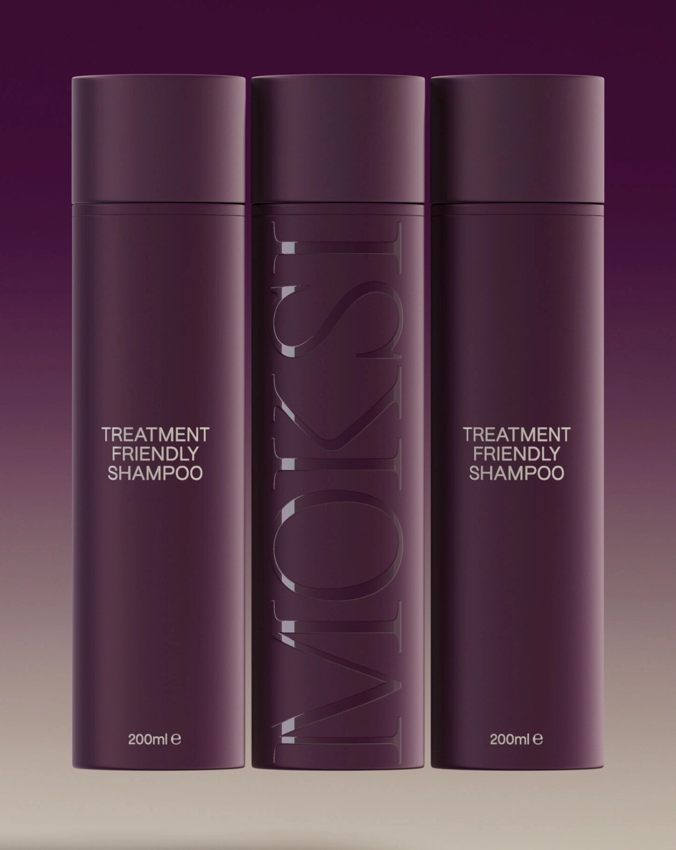
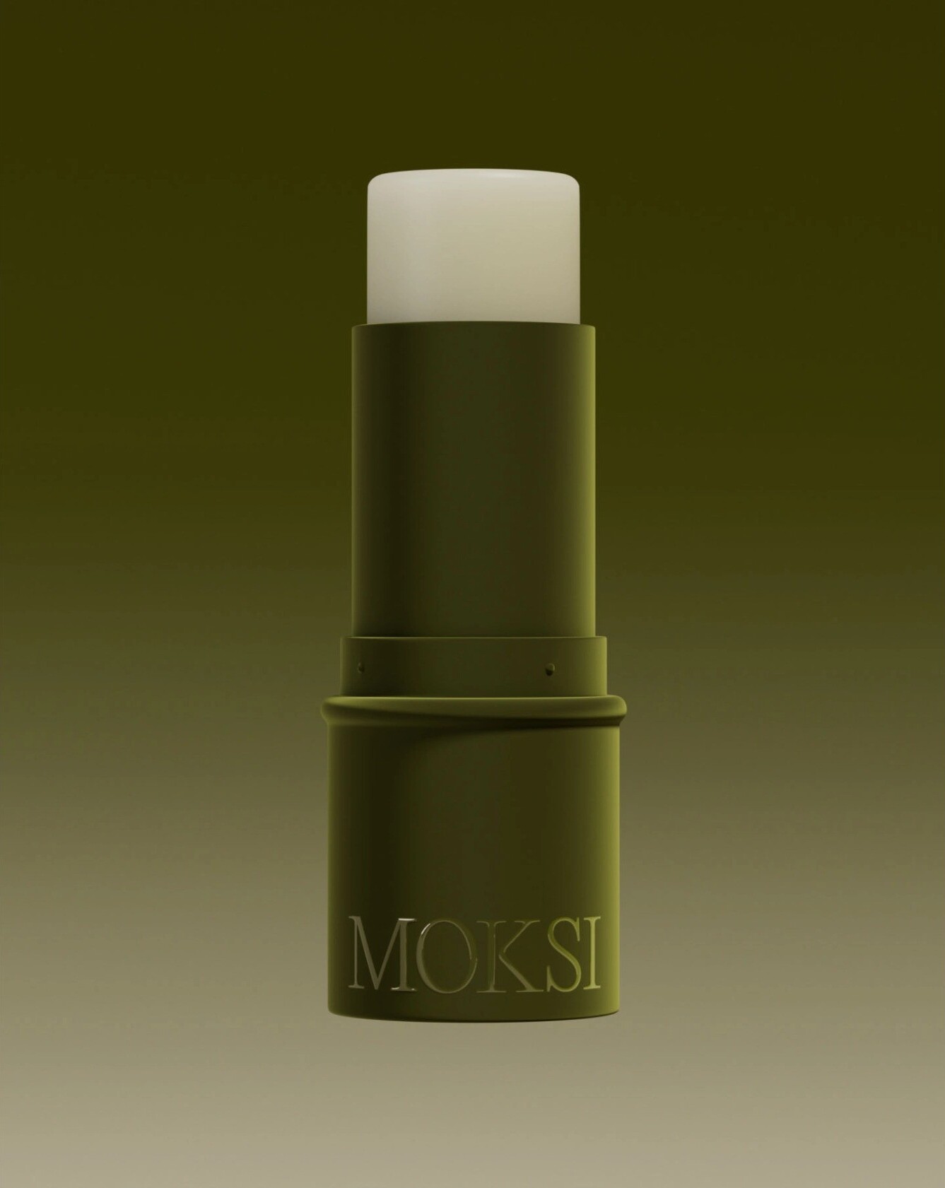
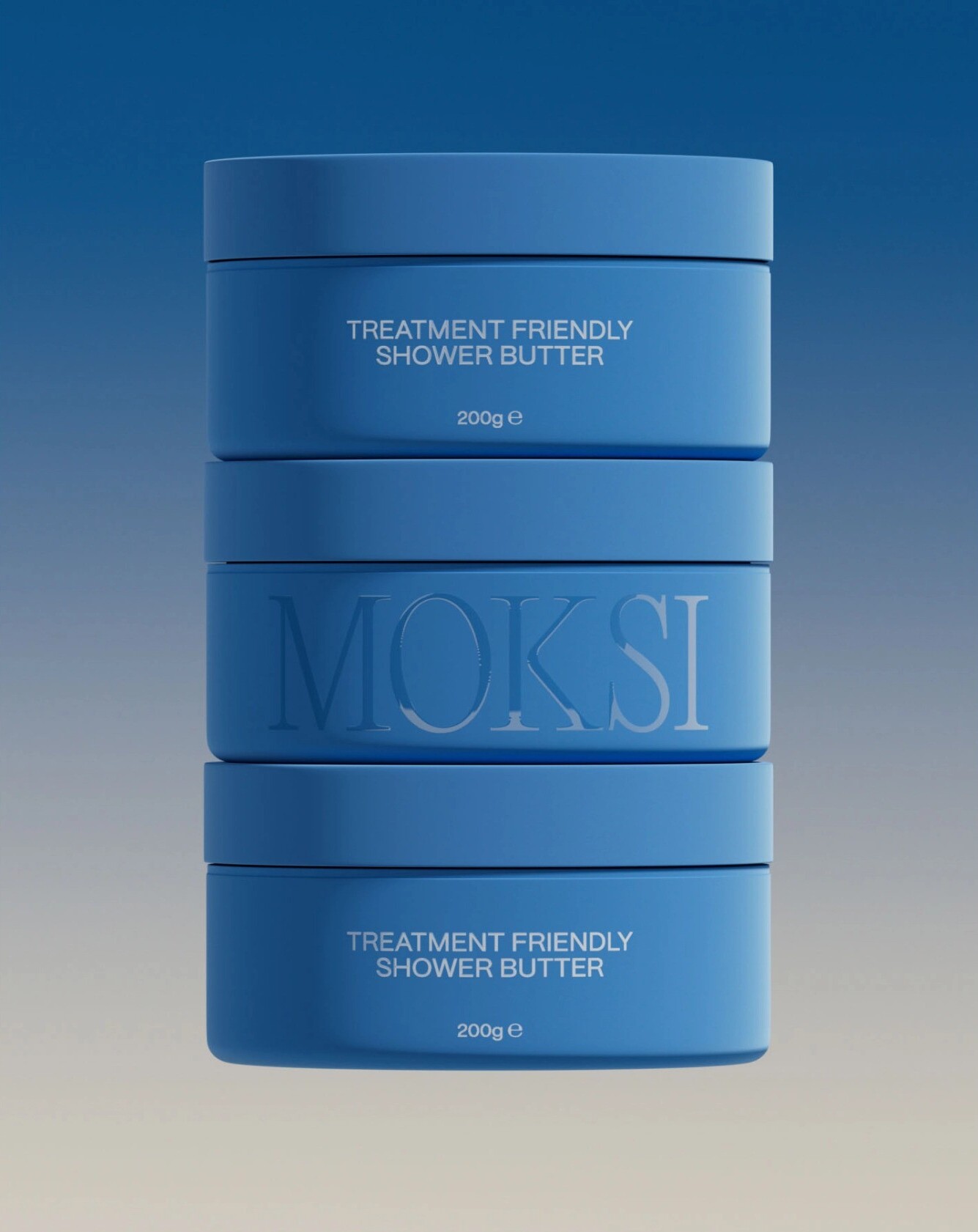
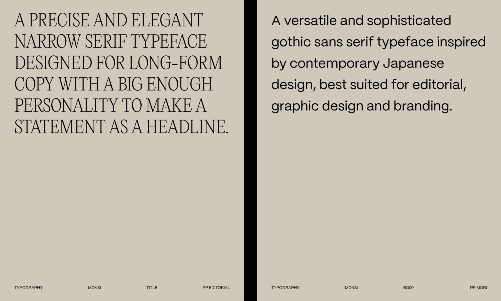
Design agency Fcklck Studio is the mastermind behind Moksi’s new identity. When Lies De Nyn approached Fcklck Studio to craft the brand identity for her new cancer-friendly skincare line Moksi, the design team knew they had a deft balance to strike. As Fcklck co-founder Tarryn Blackwood explains, “The current market for similar products often feels overly clinical.” Moksi’s look needed to eschew the sterile vibe, instead radiating vibrancy fit for those reclaiming their glow during and after cancer treatment. To achieve this, the designers leaned into vivid gradients with a ‘transitory quality’ that mimicked the fluid application of creams and lotions. Vibrant yet gentle, the packaging colors pack an intensity balanced by an underlying calm – a vibe that’s ‘positive when needed outside, peaceful at home’. The flexible palette allows the branding to shift from subtle to bold seamlessly.
Vibrant Yet Calming Aesthetic
Moksi’s genesis was rooted in Lies De Nyn’s personal experience with cancer treatment, propelling her to create products that resonate with individuals undergoing similar challenges. Fcklck Studio’s early involvement in shaping Moksi’s identity underscored the brand’s commitment to centering the needs of its audience. Departing from the clinical aesthetic prevalent in the cosmetics market, Moksi’s identity emanates radiance and positivity. Vibrant gradients and transitory elements infuse the packaging with a spirited yet serene essence, symbolizing a blend of intensity and calmness. The brand’s deliberate choice of base colors reflects a balance between boldness and subtlety, embodying a duality that resonates with users’ diverse needs.
The Power of a Simple Business Card
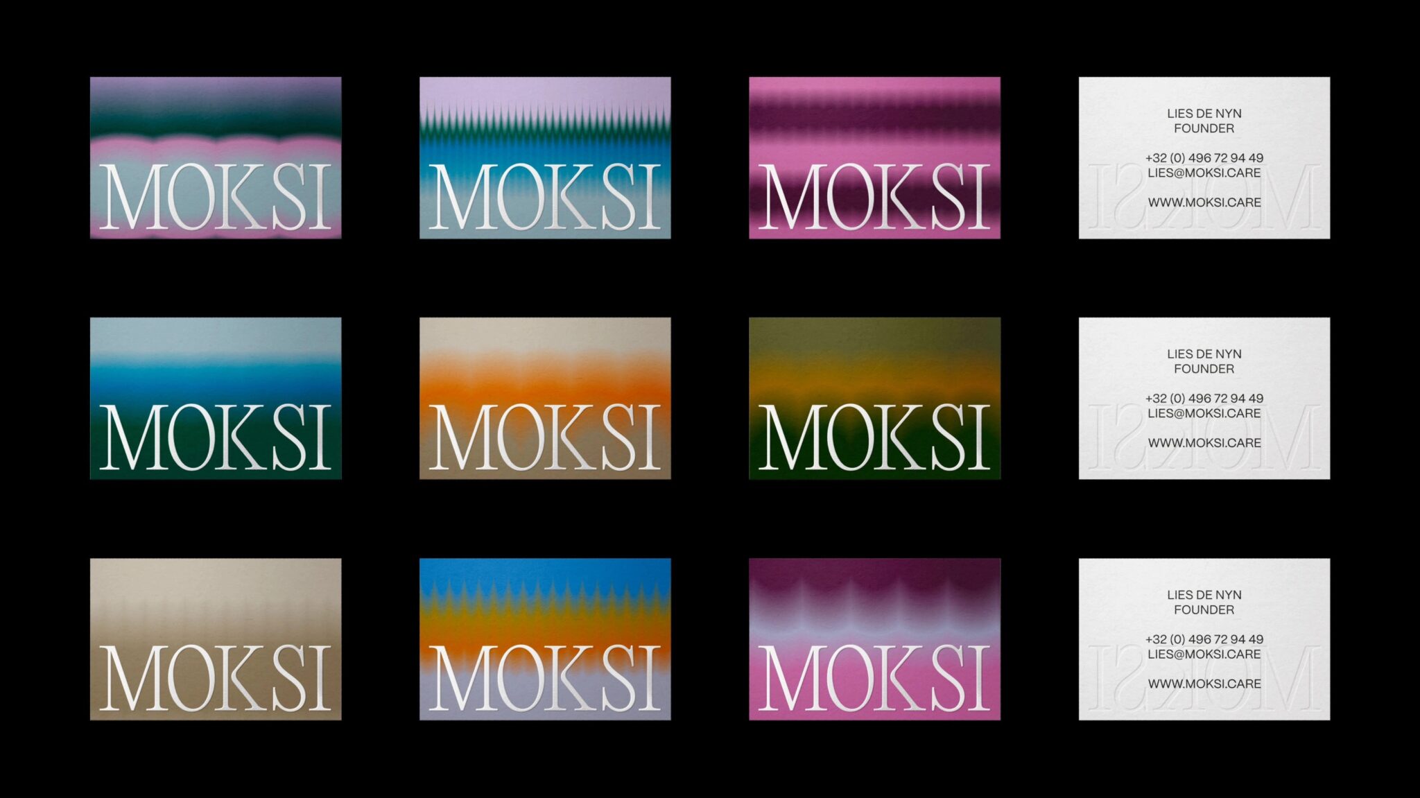
One of the most noticeable and surprising parts of the branding is the business cards. At the beginning of the project, Fcklck noticed that Lies was constantly engaged in daily meetings and events, networking and pitching for funding opportunities. The cards were a way to provide a first taste of the branding. They were low-cost but so effective and a beautifully tactile way to bring the brand to life.
Finding the Right Tone
The development of Moksi’s branding extended beyond visual elements, encompassing a thoughtful approach to communication and product representation. Fcklck Studio’s collaboration with individuals who have undergone cancer treatment facilitated invaluable insights that shaped Moksi’s tone of voice and messaging. Sensitivity regarding the portrayal of cancer led to the strategic decision to adopt the tagline ‘cancer-treatment friendly,’ emphasizing inclusivity and understanding. This deliberate choice aimed to ensure that Moksi’s products align with the experiences and preferences of its audience, offering a sense of comfort and normalcy in their daily routines.
Bottomline
Moksi’s radiant and empathetic rebrand, stands as a testament to resilience and beauty in the face of adversity. Fcklck Studio’s unwavering dedication to understanding and uplifting those affected by cancer has resulted in a brand that transcends skincare, embodying empowerment and inclusivity. As Moksi continues to influence and support individuals navigating the complexities of cancer, it exemplifies the transformative power of beauty and empathy.

