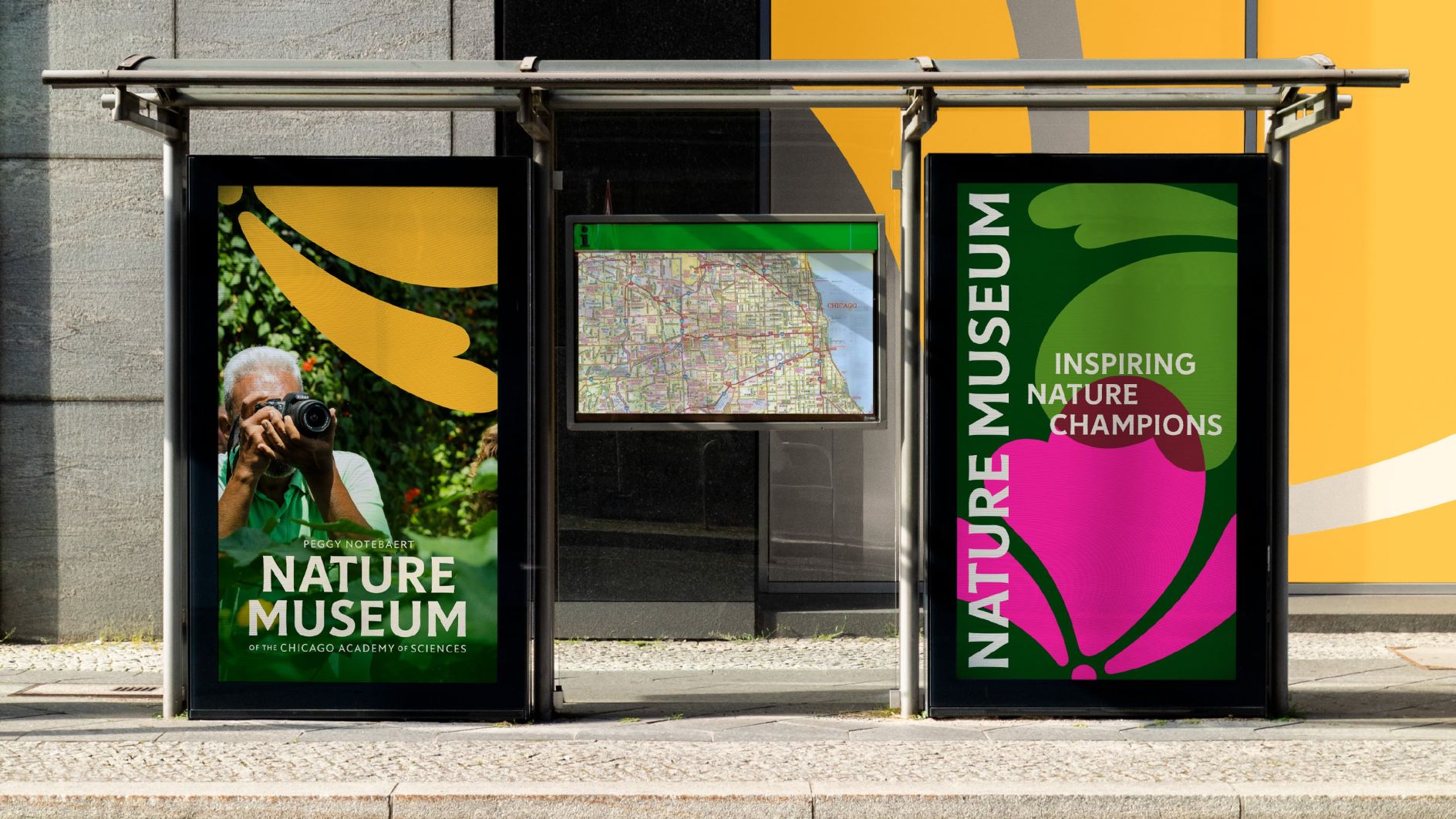
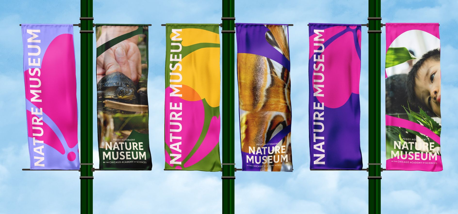
Chicago’s Peggy Notebaert Nature Museum, housed in the iconic Perkins and Will building and nestled within a restored native prairie, has received a stunning rebrand. The new identity ditches the predictable green-brown palette often associated with environmentalism and instead embraces the vibrant tapestry of hues found in Illinois’ native prairies.
Catering to Diverse Audiences
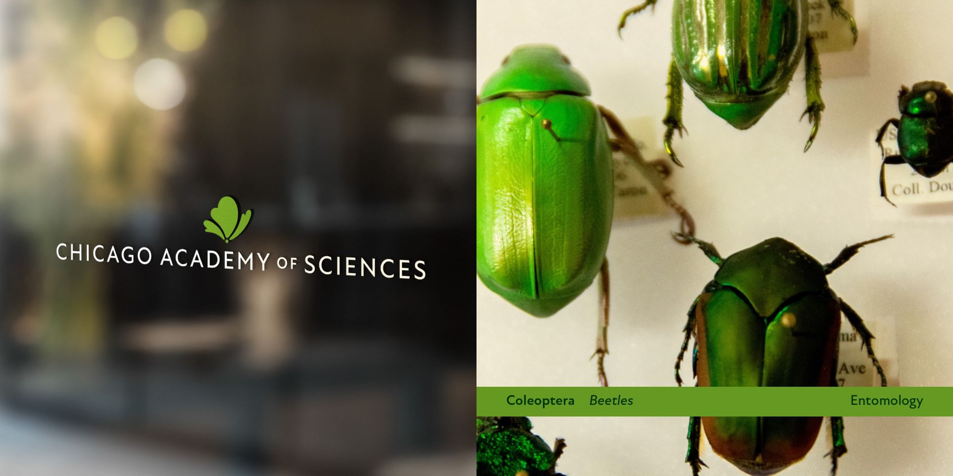
The new identity caters to the multifaceted nature of the museum. The Chicago Academy of Sciences, known for its academic rigor, received a more subdued color scheme, while the Nature Museum’s branding retains its vibrancy and sense of exploration. This two-pronged approach ensures the logo appeals to both science enthusiasts and families with children.
Bridging the Gap Between Museum and Academy
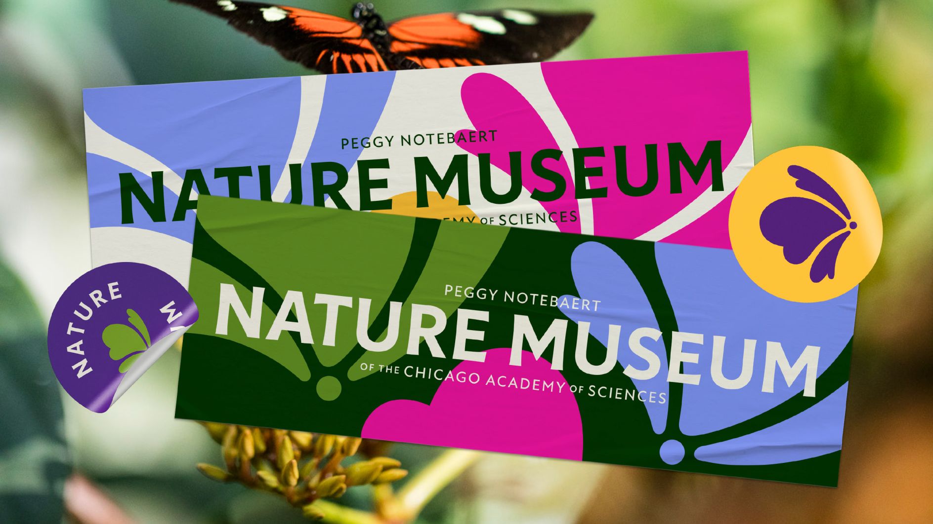
Previously, the museum and the academy appeared disconnected due to their disparate branding. Span, the design studio behind this remarkable rebranding, addressed this by introducing the phrase ‘of the’ to clarify the Nature Museum’s role within the academy. Also, the logotype incorporates elements set in New Atten, a typeface inspired by classical Roman inscriptions, subtly referencing the academy’s rich history.
Drawing Inspiration from Illinois’ Native Prairies
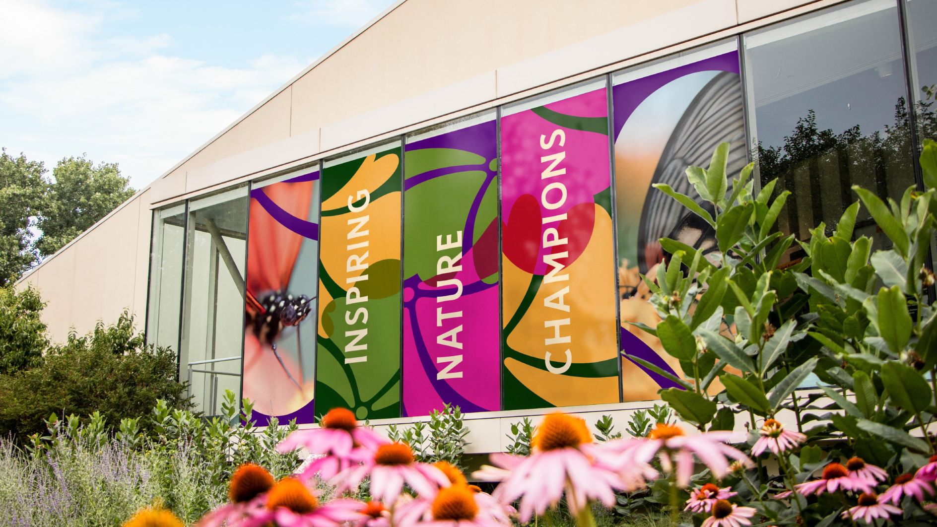
Departing from the conventional greenwashing approach that often reduces nature’s palette to monotonous hues of green, beige, and brown, Span, the design studio behind this remarkable rebranding, took a bold step by immersing themselves in the diversity of Illinois’ native prairies. These ecosystems, considered part of the temperate grasslands, savannas, and shrublands biome, served as the wellspring of inspiration for the museum’s new identity.

A Font Story Rooted in Nature
In crafting the museum’s brand identity, Span faced the challenge of appealing to a diverse audience, encompassing scientists, researchers, and visitors of all ages. Through meticulous research and insightful feedback from surveys, Span recognized the need to strike a balance between the academic focus of the Chicago Academy of Sciences and the lively, engaging atmosphere of the Nature Museum itself.
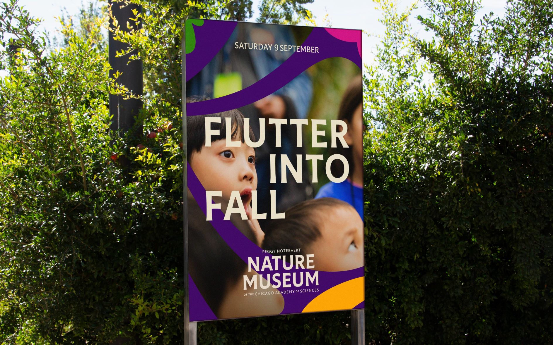
In a masterful fusion of historic and contemporary elements, Span meticulously crafted the museum’s brand identity. The logotype seamlessly blends the variable font Sweetlily, intertwining floral elements with letterforms, and the sophisticated sans-serif Tonka, characterized by its inky quality and flared stems. Adding a touch of classical elegance, elements of the logotype incorporate New Atten, a humanistic sans-serif inspired by the iconic Trajan Column inscriptions, paying homage to the museum’s rich history and legacy.
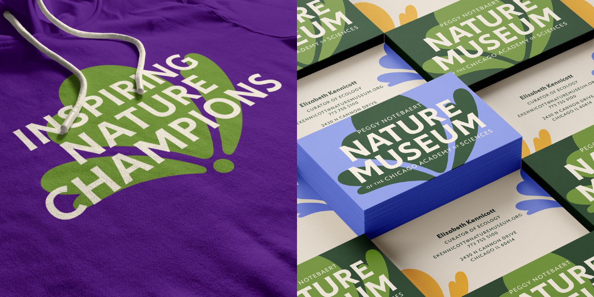
Span’s meticulous attention to detail extends to the fonts used. The Sweetlily typeface, with its intertwined flowers and letterforms, reflects the museum’s focus on nature. Tonka, a base font with ‘inky quality and flaring’, complements Sweetlily, while New Atten, inspired by the voice of Sir David Attenborough, adds a touch of history and scientific authority.
A Brand Identity Built with Purpose
The Nature Museum’s visual identity overhaul by Span represents a vibrant tapestry of hues and typographic harmony, reflecting the museum’s dedication to nature, science, and conservation. By infusing its brand with the essence of Illinois’s native prairies and creating a seamless visual connection with the Chicago Academy of Sciences, the Nature Museum’s new identity resonates with a diverse audience and reflects its core values and aspirations. Span’s innovative design approach has breathed new life into the museum’s brand, ensuring that it thrives in diverse settings and appeals to all ages, establishing a strong connection between its past, present, and future.
Also Read: Asda Stands Out: UK’s Leading Supermarket Adorns A Fresh New Look

