Cancer Research UK, the leading cancer charity in the UK, has unveiled a refreshed brand identity and logo. The rebrand aims to communicate its mission and progress in a clear and consistent manner. Let’s delve into the intricacies of this remarkable rebrand.
The New Logo and Brand Identity
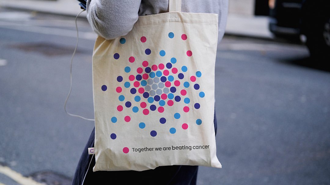
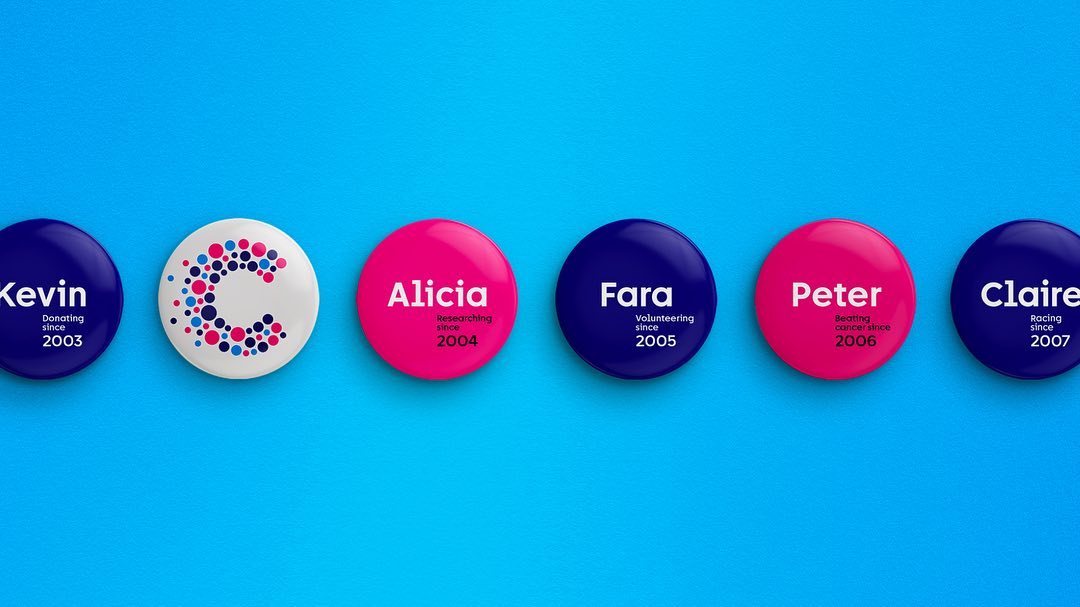
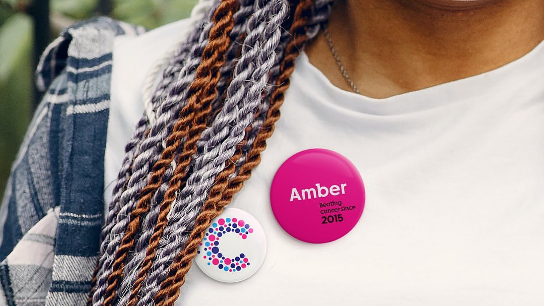
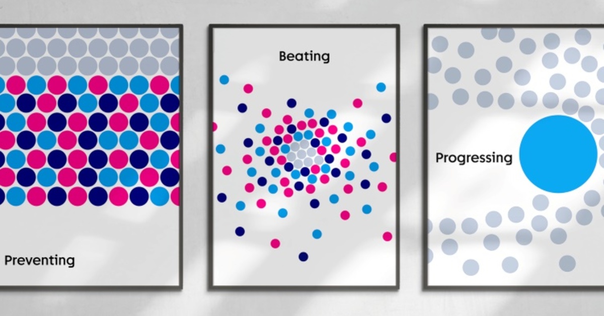
Cancer Research UK’s old logo was too complex for digital platforms. The new logo has independent circles in magenta, cyan blue, and navy colors. The circles represent life and moments in the fight against cancer. They form the letter ‘C’ and narrate personal and scientific stories. The logo is optimized for digital platforms and focuses on vibrant colors.
Updated Messaging and Strapline
Alongside the visual refresh designed by Design Bridge and Partners, Cancer Research UK has updated its strapline from ‘Together we will beat cancer’ to ‘Together we are beating cancer’. The new messaging conveys the continuous progress made through a collaboration between scientists, researchers, donors, and other partners. This subtle yet impactful shift in messaging speaks volumes about the charity’s mission.
The Power of Typography
Design Bridge and Partners harnessed the Hybrid font by F37 foundry, a unique blend of slab serif and sans serif letterforms. By modifying certain letterforms to mirror the angles of the brand symbol, the font was customized to exude gravitas for research-based or serious messaging, while also maintaining a human and quirky presence for positive communication.
Capturing Humanity Through Photography
Inspired by Cancer Research UK’s collection of photos, the studio embarked on creating a new bank of photography that portrays the humanity of Britain. These images eschew the manufactured or corporate appearance in favor of authenticity, showcasing genuine moments imbued with quirk, wit, or honesty from people’s everyday lives. The photography captures fundraisers, researchers, and individuals affected by cancer, emphasizing the charity’s human-centric approach.

Final Thoughts
Cancer Research UK’s rebranding initiative represents the first major overhaul in more than a decade. The new branding not only brings visual changes but also conveys the charity’s mission more accurately and powerfully. Design Bridge and Partners have succeeded in reinvigorating hope and purpose into Cancer Research UK’s brand identity by employing strategic messaging, refining the logo, selecting appropriate typography, and using authentic photography. Overall, the brand refresh brings Cancer Research UK into a new era after more than a decade with the previous identity.
