The Eden Project, a charity and visitor attraction in Cornwall, England, recently unveiled a new brand identity that highlights the connection between humans and nature. This is the first time in 22 years that the Eden Project has updated its visual identity. The timing of the rebranding effort is appropriate, given the increasing concern for the environment since the establishment of the Eden Project. With predictions that 2023 will be the hottest year on record, proactive measures are more critical than ever. Let’s take a closer look at their innovative rebrand.
Bringing People and Nature Together
What was once an abandoned clay pit has been transformed into a ‘global garden‘ known as the Eden Project. With its famous biomes housing the world’s largest indoor rainforest, the Eden Project serves as a symbol of human ingenuity combined with nature.
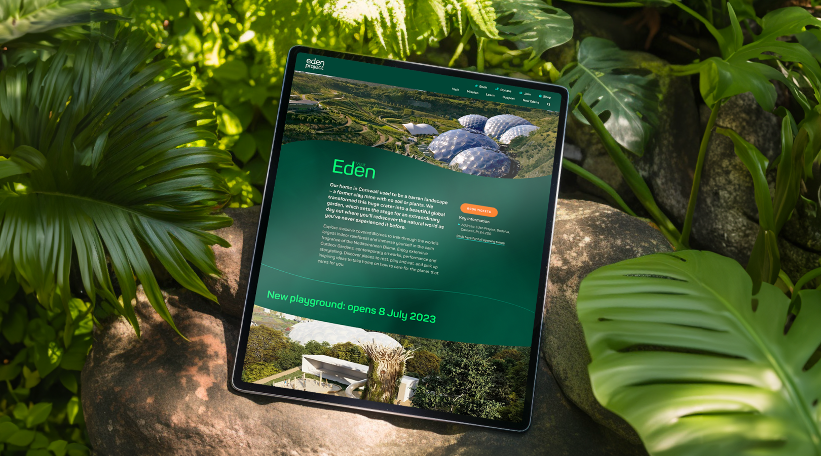
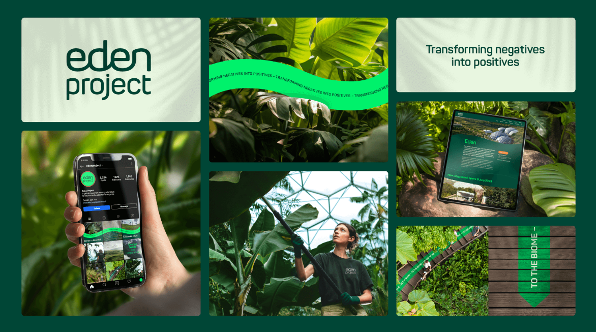
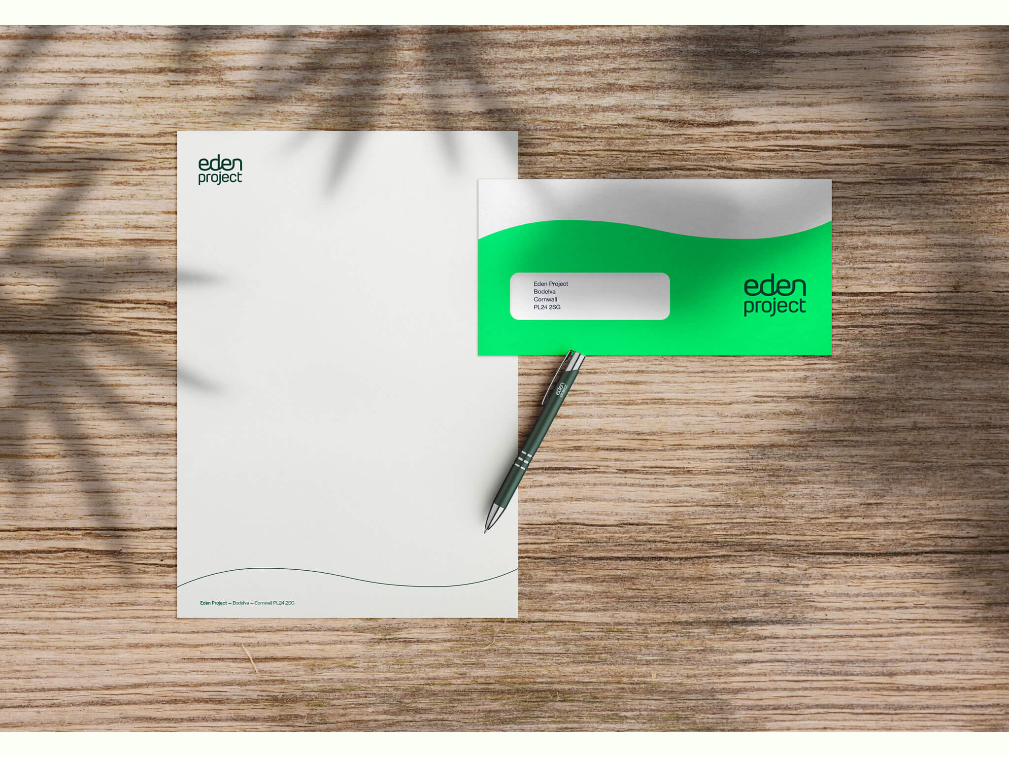
Created in collaboration with London-based creative agency SomeOne, Eden project’s new branding aims to reinforce the idea that humans and nature are intrinsically linked, not separate entities. The customized wordmark features rounded, interconnected lettering representing this relationship. Illustrations and animations also utilize curved forms to reflect natural shapes and evoke a sense of balance.
Expanding the Message
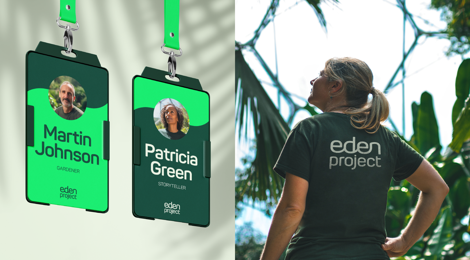
While based in Cornwall, the Eden Project is expanding to new locations in Morecambe and Dundee. The streamlined branding allows for easier co-branding as the organization grows its partnerships.
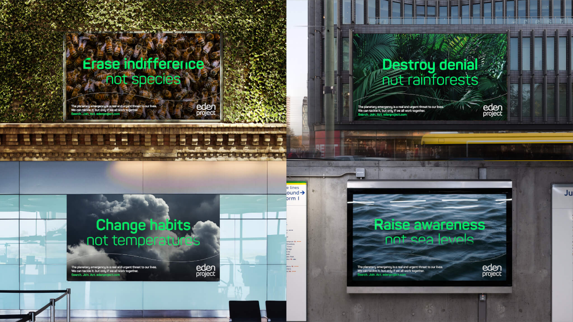
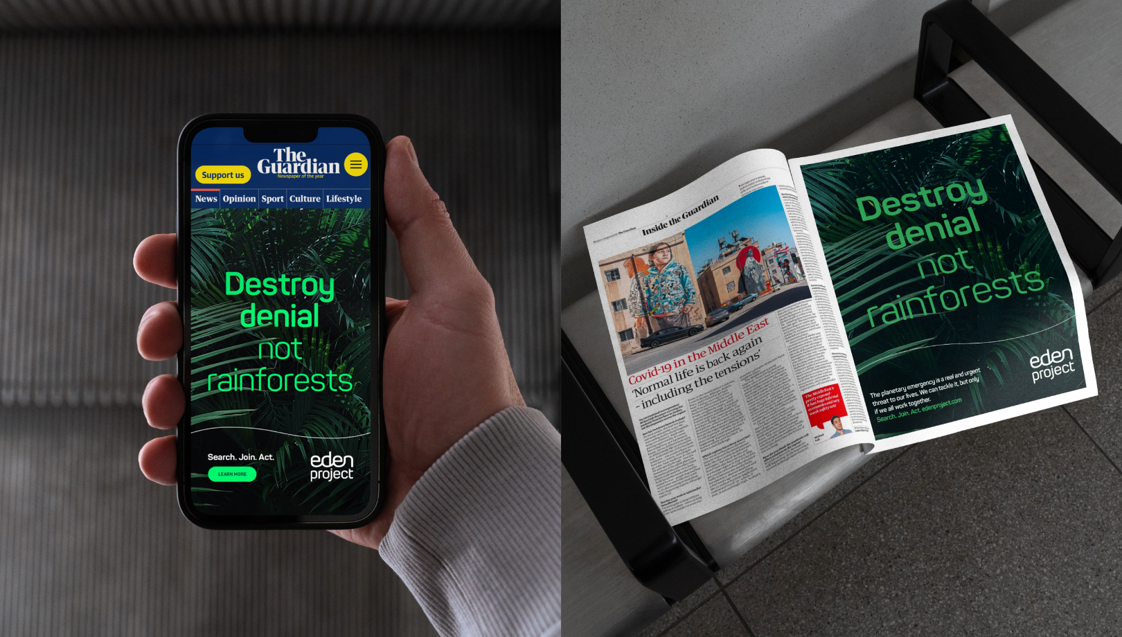
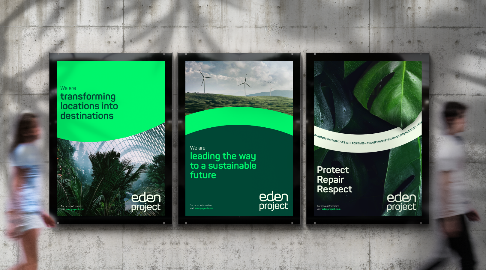
The rebrand also positions the Eden Project as a leading voice on environmental issues. The new visual identity and campaign messaging focus on the organization’s approach of “transforming negatives into positives” regarding today’s pressing environmental challenges.
Vibrant New Graphics
In addition to the core branding, SomeOne developed a vibrant identity for the Eden Project’s popular annual concert series, Eden Sessions. The bright purple color aims to differentiate the music events and add energy.
The new bespoke wordmark features interconnected, rounded lettering, highlighting the connection between humankind and nature. This reflects the Eden Project’s belief that humans and nature are not separate entities but are in fact ‘inextricably linked’.
A Journey of Highs and Lows
The identity also includes illustrations that adopt curved forms to convey ‘a challenging journey that will inevitably contain highs and lows’. A single curved line runs throughout the identity, evoking notions of balance.
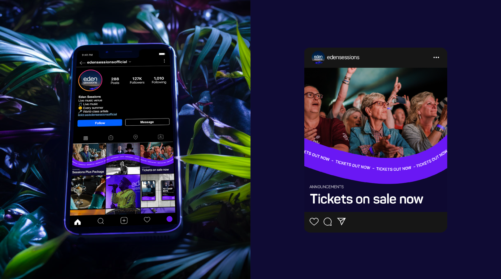
In addition to the brand identity, SomeOne also devised a new nationwide campaign for the Eden Project and an identity for Eden Sessions, a series of outdoor music concerts held annually against the backdrop of Eden’s famous biome domes.
The Big Picture
The Eden Project’s rebranding journey is not merely a visual transformation; it’s a profound reflection of their mission to restore the planet’s natural balance and foster an unbreakable connection between humanity and nature. The use of design elements inspired by nature and the overarching theme of transforming negatives into positives show the depth of their commitment to environmental causes. This rebrand serves as a beacon of hope in the environmental movement and a reminder that even in challenging journeys with highs and lows, a balance can be found. It’s not just a change in appearance; it’s a transformation of purpose and a testament to the power of design in conveying a powerful message.
