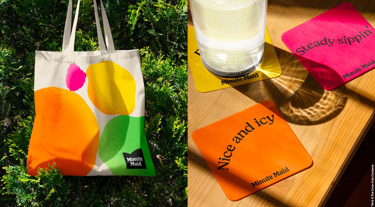
The world’s largest juice brand Minute Maid will now be seen with retro signatures and flat graphics which give a cheeky vibe. Minute Maid has united its disparate identities across the globe, del Valle in Latin America, and Cappy in Europe and Africa, with a singular look.
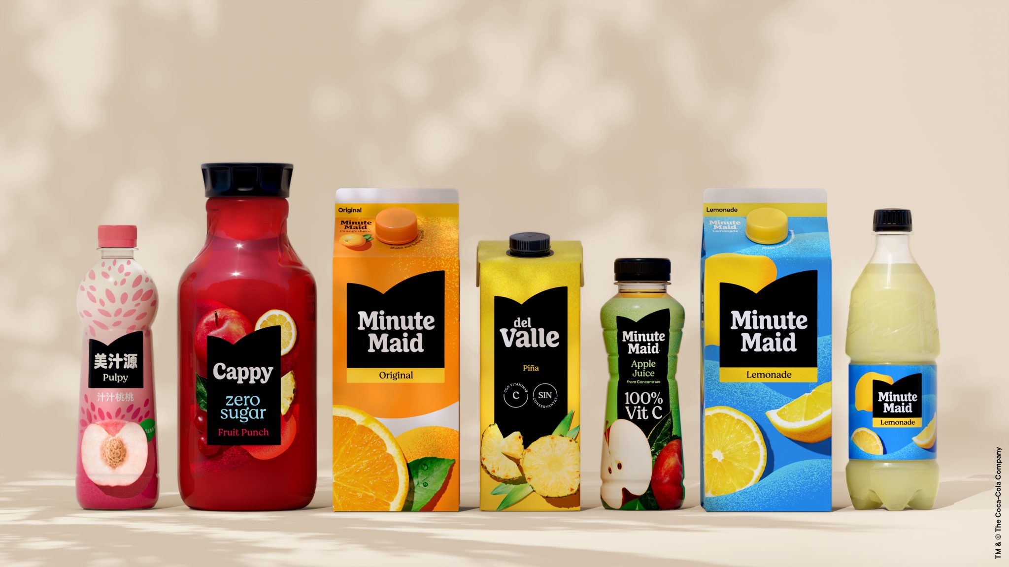
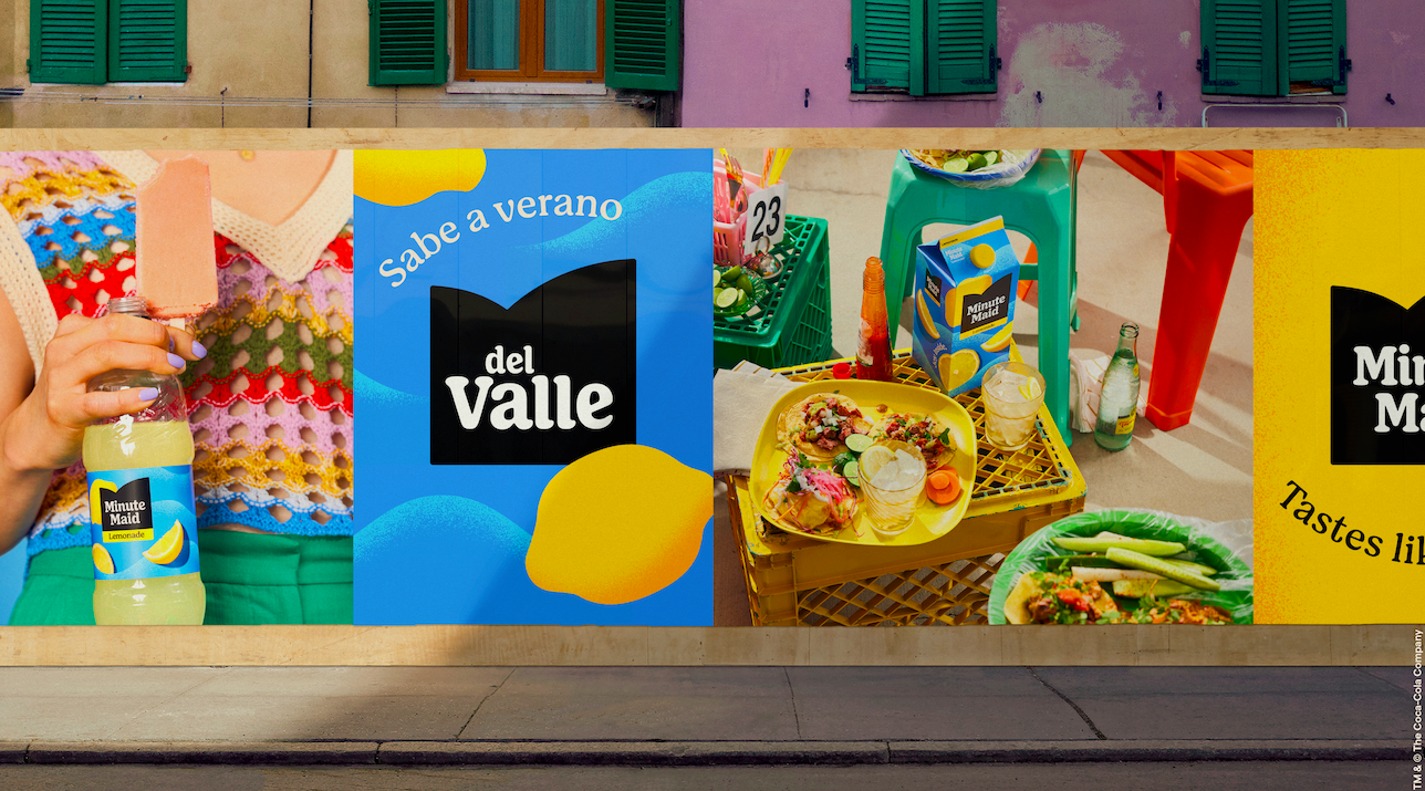
The new look is the works of Jones Knowles Ritchie, Grey, VMLY&R, and Landor&Fitch. It gives a simpler, cleaner look that gives a modern look, but the new logo is quite similar to Minute Maid’s first logo which was established in 1945.
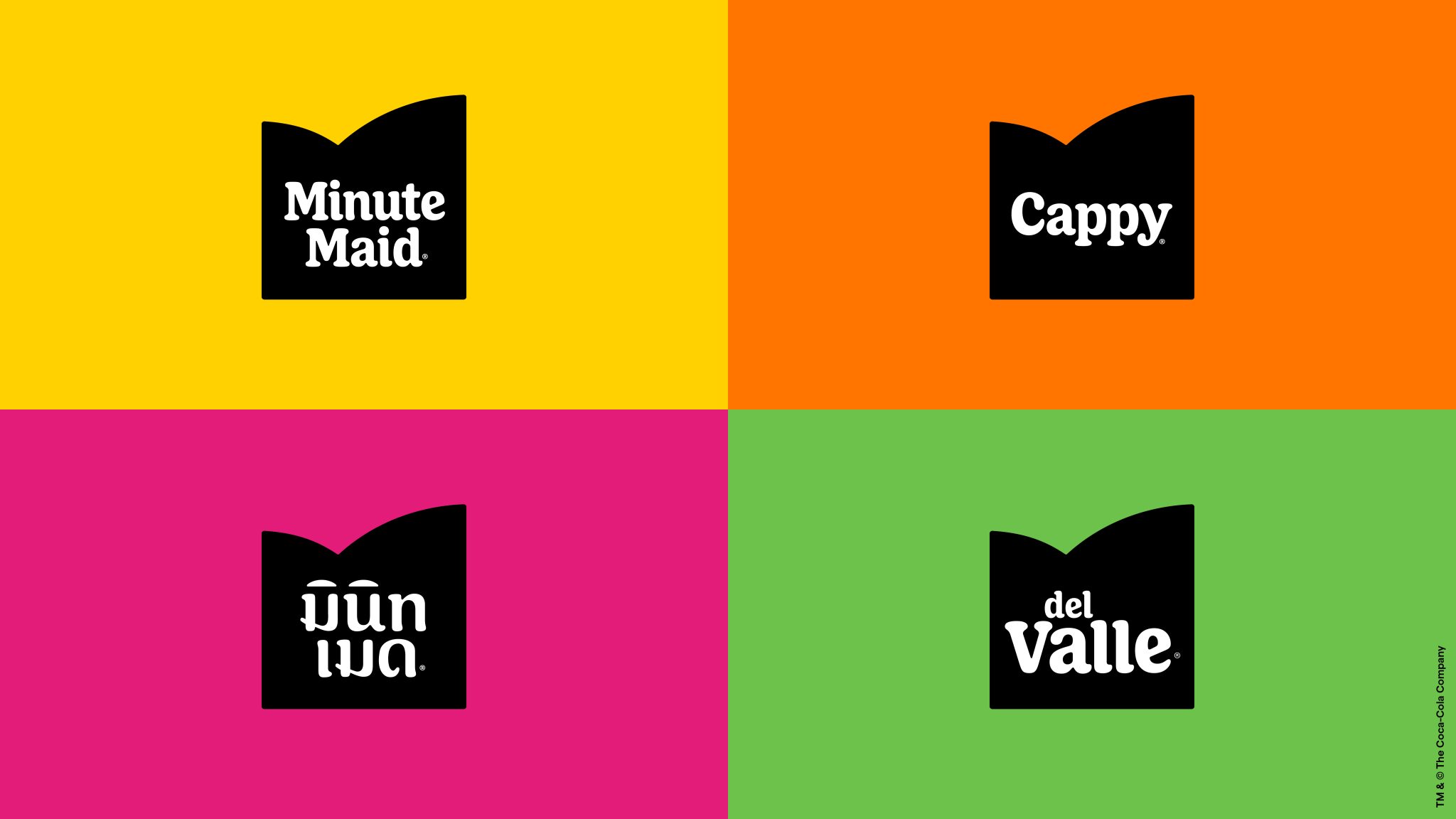
Rapha Abreu, global vice president of design of the Coca-Cola Company, said the Minute Maid family was due for an elevation to the icon it truly is. “With this move, we are thinking about our brand holistically, developing a flexible global design system centered on what makes Minute Maid unique, and defining and evolving our distinctive assets so they can be adopted locally to connect with consumers around the world.” Abreu said colors for the new look are inspired by nature and energizing photography to capture attention instantly and evoke the feeling of enjoyment. He explained the clean and clear typography enhances the visuals without detracting from them.
Katalin Czigler, global brand strategy director at Minute Maid, believes the experience people get from drinking Minute Maid makes them feel good. “Minute Maid wanted to bring that to life visually and in our communications worldwide. This perfectly reflects our brand mission to help anyone, anywhere and anytime, and feel alive, which is needed now more than ever.”
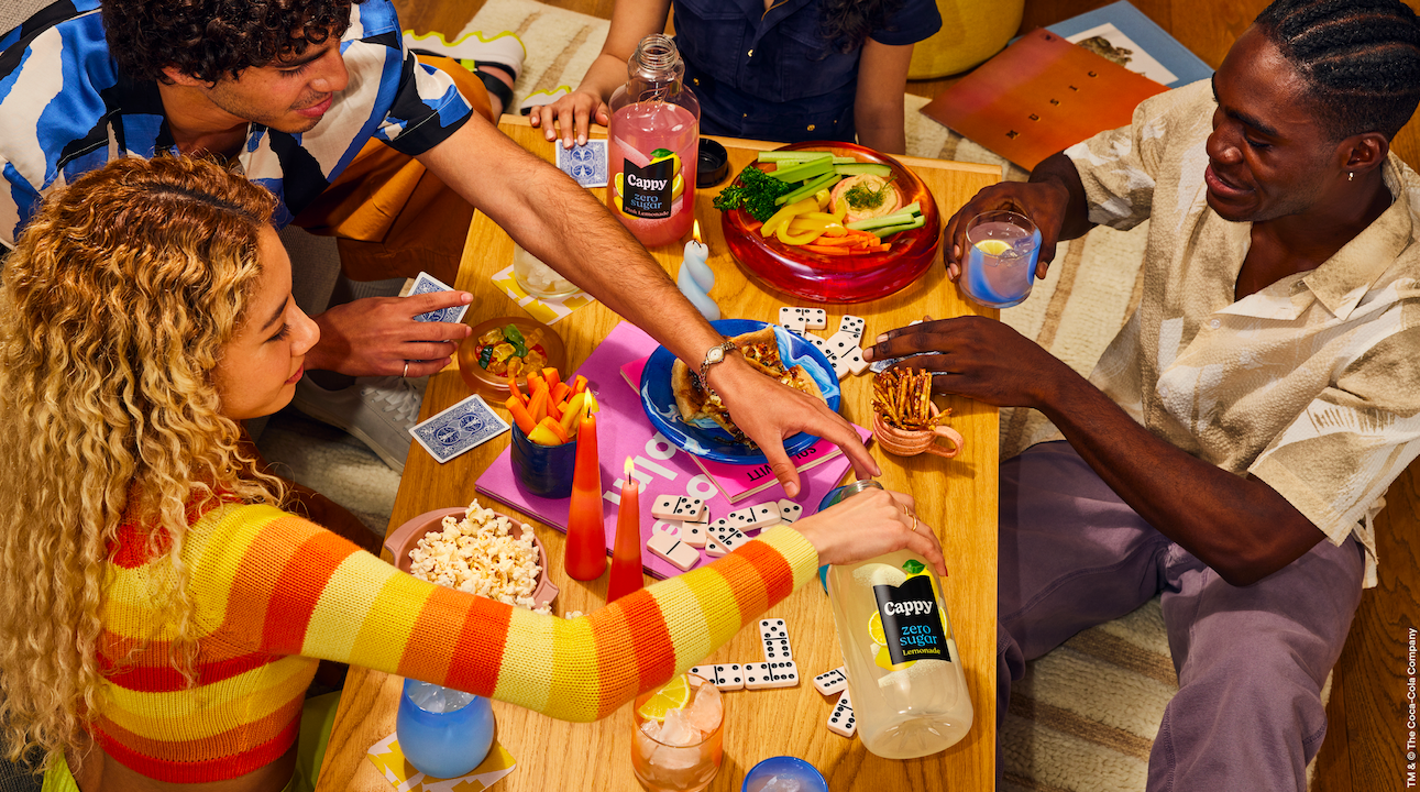
Minute Maid drew inspiration from nature for a selection of warm, lively colors, and energizing photography to capture attention instantly, and evoke the feeling of enjoyment. It takes an elegant approach to meet the consumers’ needs with ingredient depiction, color, illustration, and product characteristics.
